Thursday, November 29, 2007

Shoot-Thru Umbrellas

Lately, I've been using shoot-thru umbrellas fairly regularly.

I've been doing this for a couple of reasons: First, it's really quick and easy to set them up-- Setting up softboxes takes time I don't always have. Second, when compared to a reflective umbrella, shoot-thru's keep the light way more controlled; not as controlled as a softbox but controlled enough for many situations and applications.

I should point out that I'm using shoot-thru umbrellas strictly for edge-lighting the model and not as a mainlight.

Shoot-thru umbrellas produce a soft, non-specular light. Depending on the size of the umbrella, the light they produce remains fairly contained and controlled. Reflective umbrellas, regardless of the color of the reflective surface or their size, tend to scatter the light everywhere and this can be a big problem. Usually, I don't have time (nor do I carry the gear with me) to set flags to limit their scatter and spill.

Another nice thing about shoot-thru umbrellas is they're inexpensive. Compare the cost of a medium-sized softbox to the cost of a similarly-sized shoot-thru umbrella and you'll quickly see the money you save might overcome the advantages of a softbox over this type of umbrella.

The pretty girl at the top is another image of Ciera from the same set as the pic in my previous update. In this image, the shoot-thru umbrella I used behind Ciera is visible. Looking at the brick wall, you can plainly see that the umbrella's scatter and spill remains fairly well contained, certainly way better than what you'd see from a reflective umbrella and good enough for government work, that's for sure.

Monday, November 26, 2007

Spudtography (A Lesson in Photo History)

While photography is my #1 passion, I do have other interests: Archaeology and history being two of them. As a result, two of my favorite rags are Smithsonian and Archaeology magazines.

While Archaeology magazine regularly features incredibly poor, snapshot photography accompanying their incredibly interesting articles, Smithsonian magazine provides some amazing photography to illustrate their's. Smithsonian also features articles, on a fairly regular basis, that focus on the history of photography and/or historically important photographers.

I had a doctor's appointment the other day and, while waiting to see the Doc, I spotted a September, 2007, issue of Smithsonian lying in the waiting area. Somehow, I had missed purchasing that issue--I guess I should subscribe instead of buying each month from a newsstand--so I snatched it up and immediately decided to bring it home with me. Generally, I don't exhibit thieving ways but I made an exception in this case. (I hope that didn't cost me much in Karma points.)

There's an article in the September, 2007, issue of Smithsonian that roused my curiosity as both a photographer and history buff. It's titled, "Color Comes to Photography."

According to the Smithsonian's report, "The most improbable object imaginable--the lowly, lumpy potato--played a leading role in the Great Leap Forward of color photography."

It seems that, back in 1903, the Lumière brothers--notable figures in the history of photography and whose family name may or may not have been hijacked as a term for the the measurement of luminous flux, i.e., the perceived power of light called lumens--developed a dazzling, new, photographic process they called autochrome and we call color photography. The Lumières developed this exciting process with the help of some pommes de terre, which is what the French call potatoes before they're peeled, cut, cooked in hot oil, salted, and transformed into French Fries. (Another notable French achievement although, for some bizarre reason, the French routinely dip their fries in mayonnaise, rather than ketchup, and, IMO, lose gastronomy points for their odd and unappealing habit of doing so.)

Anyway, somehow and someway those clever Lumière brothers figured out they could grind potatoes and apply the potato dust to photographic plates and, in so doing and with long exposures of a minute or so, manage to end up with a color image. How people figure this kind of stuff out is a total mystery to me. (Potatoes? Go figure.)

The lumières' new autochrome photographic plates were an immediate success and soon their factory was working overtime to meet the demand for potato-infused, color-producing plates. Icon photographers like Edward Steichen, Alfred Stieglitz, and Alvin Coburn were quick to embrace the new process. The Smithsonian article features some great examples of early, 20th Century color spudtography, including a rare color image of Mark Twain.

The Lumières' autochrome process remained the King of Color Photography for over 30 years until it was dethroned by Kodachrome and Agfacolor film.

The pretty girl at the top, leaning against the brick wall and lost in her own, private, fantasy, is Ciera. (No doubt she's fantasizing about the photographer.) I captured the image last week using two lights: A large, white-lined, 4' umbrella for the main and a small, white, shoot-thru umbrella for the highlights. No spuds, potatoes, or pommes de terre were used in the production of the image.

Saturday, November 17, 2007

Hair Definition

A problem I sometimes see in images from less-experienced pretty girl shooters--a little too regularly I'm afraid--is lack of definition and detail in the hair. Sure, many photographers are pretty good at providing hair highlights (especially when shooting with studio lights) but, often enough, simply setting a hair light isn't enough.

The hair care industry is huge! Hair care products have the highest sale volume of all non-food items in the United States. Add to that all the money spent on cutting and coiffing hair and you're talking about some serious bucks! In America alone, we spend more money on our hair than the Gross National Product of quite a few countries. So, with all the time and money people spend on their hair, you'd think all photographers would realize that a model's hair is a critical component of their images: Possibly, one of *the* most critical!

Here's the two biggest problems I often see: Blondes with overly blown-out hair highlights and dark-haired models with little-to-no definition/detail in their hair.

Obviously, if you're going to provide hair highlights, the amount of light directed at a model's hair should be different depending on her hair color. There's no single, all-purpose, right way to light every model's hair regardless of its color. The blonder the hair, the less light required for optimal highlights. The darker the hair, the more light you'll need. Platinum blondes make it especially difficult to maintain definition as their hair blows out, highlight-wise, so easily.

When processing images, PS's Shadow/Highlight tool can be very helpful in enhancing or restoring definition to a model's hair. If you're not working with this cool tool, you should be. But remember: It's one thing to restore detail in the shadows with this tool, but it's often an exercise in futility when trying to restore detail to blown-out highlights. If there's no detail present, you're not going to suddenly get some with PS's Shadow/Highlight tool. In other words, there's no "fix it in post" solution that's easy to employ after you've completely blown the highlights in an image. Attention to detail and capturing things correctly in production is always your best bet.

Model is Nautica from a shoot last week. MUA Dehlia. Canon 5D w/85mm prime. ISO 100, f/5.6 @ 125. Three lights and a reflector. Shot on a white cyc.

Tuesday, November 13, 2007

Composition Begins in the Camera

I know this sounds like the most basic of basic advice but more than a few digital shooters (myself included) seem to too-often rely on cropping in post rather than framing in the camera to achieve distinctive composition. (An ailment probably brought on by the fact that most digital shooters perform their own post whereas, historically, way fewer film shooters did so-- Instead, they relied on labs to edit their photos.)

One problem with d-photographers over-relying on post-production cropping is we sometimes find ourselves without enough image to perform certain crops we'd like to make.

Let's use the venerable Rule of Thirds as an example: You snap a shot and, in the camera, you've composed your model fairly centered in the frame, i.e., with an approximately equal distance, on either side of the subject, to the vertical edge of the frame. Okay. That's cool and often works out just fine. With some minor cropping adjustments, you move the model from the center of the frame, giving the image a more pleasingly aesthetic composition.

But what happens when, once you're in post, you decide to crop the image a bit more interestingly, perhaps giving it a more unusual sense of composition? It happens, right? I know I do this often enough. So, let's say you decide to crop the image a little more radically, giving it a more pronounced Rule of Thirds treatment, but you find, when attempting to do this, that you've simply run out of image one side of the pic or the other. This can also be a problem when you need to level the image but, when you try leveling it, you find you've run out of image on one side of the frame or at the top or bottom. Bummer! (Less of a bummer, of course, if you shot the subject against a seamless or a blank wall, but way more of a bummer if you've captured the model in a complex environment-- one that would be difficult to make larger in order to perform the crop you'd like to make.)

I suppose this is another example of the fix it in post syndrome. In some ways, fixing or changing things in post has become so much easier and quicker and more economical that we've become sloppier and less attentive to details when we're shooting. But in so doing, we sometimes find ourselves producing less creatively-interesting imagery, mostly because some things (that we could accomplish in production) we pass on to post but, unfortunately, we neglected to give the image enough latitude to make some of those things work.

I hope this makes sense and I'm not simply rambling. I guess what I'm saying is it makes way more sense, overall and to me that is, to work harder at capturing images in the camera that are as close to what we hope to achieve (in terms of the final results) rather than over-relying on cropping and editing and post-processing to improve or change an image. BTW, you might also think about framing the shot a bit "looser" which allows for more flexibility when cropping in post.

The pretty girl at the top is Nautica. I shot this pic of Nautica at a studio this past Sunday. Since I was shooting on a white cyclorama, I could easily have foregone some attention to detail (in terms of framing and composition) as it would be so easy to add more background in post. But I didn't since, lately, I've been trying harder to remind myself to frame the model in the camera as close to the way I think a given pose will work in the final result.

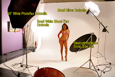
Below, for you "I like seeing the lighting" guys, is the basic setup I used for this set. (Although Nautica's wearing a different outfit in this BTS image.) I wish I had some black foamcore with me. Reflecting black often works nicely, especially when shooting on a white cyc. MUA was Dehlia.

Saturday, November 10, 2007

WoW!!! Thanks!

I'm thrilled and grateful over how many of you took the time to answer our survey! It was a much greater response than we expected. Thank you so much!

Now, of course, we need to play statisticians and put all this data together in some lucid, intelligible, and comprehensible way. Of course, we'll be keeping everyone's responses safely archived. You never know... this reality show idea might grow some legs and take off running towards production. The writers strike might even prove to be helpful: Reality shows aren't covered by the writers' basic contract and I've been told that producers (and would-be producers) of reality television are suddenly receiving even warmer welcomes at networks and cable-casters.

Thanks again!

You might recognize the Goddess of Glam at the top-- Playboy, Penthouse, and FHM cover girl, Tera Patrick. I applied a brown-toned treatment to the image. (Which I think needs to be browner, i.e,. deeper, darker, browner.) The pic is from a shoot a few weeks ago. Makeup and hair by Ricardo Ferrise. Leesa J, co-creator of our reality show concept, assisted and documented portions of the shoot with some candid, behind-the-scenes, pics. I used three lights and a reflector to light Ms. Patrick. Canon 5D w/85mm prime, ISO 100, f/5.6 @ 125.

Below is a BTS shot of the setup I used for the image at the top. The third light, missing from the pic and modified with a small, silver umbrella, is up on the second-floor landing providing hair-light and some other accents. The guy in the white tee-shirt, scratching the back of his head, is Ricardo, the MUA. The pony-tailed guy with his back to Leesa's camera is your's truly... but you already figured that, right?

Tuesday, November 06, 2007

Pretty Girl Shooter Needs Your Help!

Please keep reading. I'm not looking for a loan. It's not that kind of help I'm seeking. (Gratuitous donations, of course, are always welcome.)

Here's the deal: Today, which (coincidentally) turned out to be the day after the premiere episode of VH1's reality(?) TV show, "The Shot," aired, also happened to be the day we were already scheduled to meet again with our agent and a producer regarding our proposed, Pretty Girl Shooter, reality TV show. (Which, also coincidentally, contains some subject matter slightly similar to VH1's show.)

Here's the good news: After advising both the agent and the producer of the existence and imminent premiere of VH1's, "The Shot," both of them still showed up for the meeting! (They were both unaware of "The Shot" and, after breaking the news to them in an email just three days ago, we hadn't heard a word from them in response... not even a call to confirm the meeting was still on.)

Whew!

Here's the even better news: As a result of VH1's show, we made some adjustments, massaged the idea a bit, brainstormed for a hook that more completely separated us from VH1's show, and devised some new angles, ideas, and a format which, in all our minds, has produced an even stronger show idea which, according to the people we met with today, might have an even better shot at getting picked up by a broadcaster or cable caster... regardless of VH1's entry into the photography-themed, reality-show, market.

So what's the help we're looking for? Well, it's really simple and would only take a few minutes of your time. We would greatly appreciate you taking some time out of your busy schedules to write us a short email (to prettygirlshooter@hotmail.com) and, in your email, sharing whatever you're willing to share about whatever of the following would apply to you:

1. If you principally make your living as a photographer (a photographer of any sort) please advise. If you simply shoot pretty girls as a hobby, please tell us what you do for a living? If you make some portion of your living from photography, what kind of photography do you pursue for $$$? If you make a portion of your living shooting pretty girls, what is the purpose of these images? (e.g., model ports, MySpace or FaceBook pages, whatever.) If you are retired and you shoot models as a hobby (or to supplement your retirement income) please tell us what you did for a living before retiring.

2. How much time and/or resources do you devote to pretty girl shooting? Do you shoot models regularly? Do you attend workshops and/or seminars which include shooting models? If so, how often do you attend these events or how often do you shoot models that you hire or arrange to shoot? If you attend workshops or seminars, do you attend local events or do you travel to attend them? Do you participate in online photography forums where glamour and related genres of photography are discussed? How much time do you spend doing that? How much $$$ have you spent on photo gear in the past few years?

3. Assuming you have a significant other, how do they feel about your pretty girl shooting endeavors?

4. Why did you choose glamour (or a similar photographic genre, e.g., fashion, art nudes, etc.) as the focus of your photography?

5. Where do you hope your photography might take you?

6. This one's optional. (Although merely responding to any or all of the first five questions are optional as well... but this one is even more optional.) Assuming this TV show goes the way we hope it will go and ALSO ASSUMING you, as a pretty girl shooting photographer, might be interested in participating in the show -- sorry, we can't reveal the specific premise yet -- we'd love to see a snapshot of yourself along with one or two samples of your work. (Please feel free to watermark as boldly as you'd like.)

PLEASE NOTE: We're NOT just looking for accomplished photographers. Whether you're a beginner or you're quite experienced -- wherever you are on the pretty-girl-shooting learning curve -- we'd love to hear from you. And we also hope you'll share a few samples of your work regardless of the level of skill they might demonstrate.

That's it. Simple, right?

ANOTHER NOTE TO PLEASE NOTE: We might write a few of you back with some follow-up questions. But please, if you don't hear from us, don't assume your response was unappreciated nor does it mean, if you indicated you might be interested in participating in the show, that your response didn't interest us from that perspective. Also please note that we're not collecting email addresses as a means to sell you something. The data we're collecting is informational only and your names, email addresses, and/or responses will be kept in strict confidence.

For those of you taking the time to respond, we thank you. For those who, for whatever reasons, prefer not to respond, thanks for supporting the blog!

Monday, November 05, 2007

"The Shot" Misses the Mark

I watched the premier of "The Shot" last night, VH1's new reality show about ten, hopeful, amateur, photographers vying for cash prizes and a "shot" at becoming America's next top fashion photographer.

I'll admit I was predisposed to dislike the show. I'm happy to report the producers didn't let me down.

As you might have already guessed, I was predisposed to dislike "The Shot" because of purely selfish reasons: We're in the process--and I've written about that process here, on the blog--of pitching a show that's a little too similar to VH1's televised account of what it takes to make it as a fashion shooter. (Albeit, our show is about glam shooters and takes a different approach.) But half-way into "The Shot," I realized its producers sailed a very different tack with their show: "The Shot" focuses more on the interactions between the contestants (make that the conflicts and petty squabbles between the contestants) than what it takes--art and craft and what have you--to get "The Shot," fashion or otherwise.

Right from the start, it was obvious "The Shot" wasn't so much about actually snapping "The Shot," i.e., there was very little offered in terms of revealing what it takes to get that shot. Also, to label the contestants "amateurs" wasn't exactly accurate. Most the contestants already possessed some good photography skills and more than a few of them were already "working" photographers. (Although none of them were working fashion photographers.)

There was very little in the show that revealed anything craft-related regarding getting "The Shot." For instance, not one, single contestant, to my recollection, said a word about lighting the model. (We don't need no stinking lighting.) Neither, it seems, did the show's host: fashion shooter Russel James. Yeah, there was plenty said about interacting with the model, especially when the contestants were being chastised by Russel James for their incompetence at it. The fact the contestants couldn't work well together as a team was another source of contention for Mr. James. But I'd like to know how many fashion assignments James has worked where he was expected to do so as a team member (amongst a team of shooters) rather than as an individual shooter? Yeah, team skills are important for photographers, i.e., leading a team of MUAs and stylists and assistants. But this was a team of photographers trying to lead, or be led, as they attempted to shoot a multi-page layout... you see that a lot.

Back to lighting: I didn't see much going on with modifying or controlling light. When the contestants were shooting aboard a luxury sailing vessel, I think I saw one reflector pulled out for one shot and it was a pretty small reflector at that. James complained that some of the shooters were posing the model in direct sunlight but I couldn't help but wonder about how many times James has shot exterior, daylight, magazine layouts without the benefit of scrims, reflectors, silks, lights, whatever.

Nowhere in the show did I notice anyone working with a light meter. (I guess they were all shooting in auto modes.)

There also wasn't any interaction between shooters and MUA's or stylists revealed. One thing the producers did do that probably made "ratings" sense: They hired a busty Victoria's Secret model who went out of her way to show as much cleavage as the show's censors would allow.

My favorite bit from the show was when one of the contestants couldn't figure out how to zoom with a prime lens. (It looked like a Canon 135mm, f/2, "L" prime.) That little bit typified the show's apparent quest to render the photographers ignorant even though James mentioned, more than a few times, that he hand-picked each contestant for, amongst other things, the skills they already possessed.

I'll probably watch the remainder of the show's episodes since there's very little (if anything) on TV that focuses on photography and photography is what I'm mostly about.

In short, I'm smugly happy they missed the mark with this show, at least in my opinon they did. I don't see it going more than one season but what do I know? Network television has a long history of broadcasting crap. I guess I'll have to wait and see.