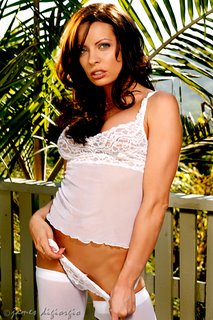
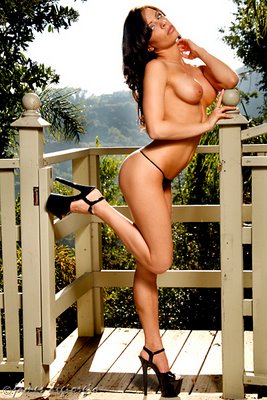
 I hate it when I can't quite capture the images I want. It's like the images are 90% there but that missing 10% really pisses me off. When this happens, the more I try to get that last ten percent, the more frustrated I become. Yesterday, that's what my day was like.
It's not that the images are bad. It's that they're not quite what they could be or should be or, more importantly, what I wanted them to be. To make matters worse, in most of the images I can't always put my finger on what the missing part might be. And it wasn't that each image had the same thing that wasn't right or seemed slightly not quite there, it was that each image seemed to have something different wrong or not quite going for it!
Was it the light? Exposure? Framing? Me? Her? The photo Gods? Something else?
 It's alwasy easier when I can blame the model. But, in this case, I can't. She was great: Easy on the eyes, quite sexy, experienced in front of the camera, workable, pliable, flexible, and amenable.
 I wanted to blame the sun because it was being difficult in terms of the time of day and the orientation of the location's property to it but that's just technical stuff and I should have been able to overcome that.
My assistant, Tim, was sensing my frustation and did his best to be my third and fourth hands. He also kept his mouth shut which is a good thing when I'm becoming flustered. Unfortunately, that didn't really help.
 I suppose, in the end, I can only blame myself. In fact, that's exactly what I'm doing. But blaming myself would be a whole lot easier if I could put my finger on what's missing or wrong or not quite there in the captures. In other words, I still can't really figure what it was I was doing that wasn't getting the goods and that really drives me nuts!
Oh well, by the time I shoot my next victim I'll have forgotten all about this set of almost good images. The client was happy and I suppose that's what mostly counts.
The model is Vanessa. The MUA flaked--which did'nt help--so Vanessa did her own makeup. Tim was my Aziz. Canon 5D w/ either a 28-135 or an 85mm prime. ISO 100, various apertures in and around f/8 or so @ 125th. Here's another of the lovely Vanessa.


7 comments:
not sure what it is about these pics that you don't like. not sure who it is you're trying to please. if yourself, then accept the fact that nothing is ever perfect. if the model has any input in it at all, i'm sure vanessa was quite pleased with the images -- she should be -- and will be happy to polish your nob for you in return for a wonderful job. if you're not interested, have her call me.
Nice work for a bad day, still better than my great days. One thing I have noticed is that they all seem to be missing one additional light/kicker some place. In looking over your other work, you look to use more accent/kickers than I am seeing in these images. Its probably my untrained eye, but thats all I saw missing from the classic JimmyD stylings. As always, love your work.
Cheers.
Scott
not sure what it is about these pics that you don't like.
it's like this, it seems like in every freakin' image either the light was striking her just right and her body pose or expression just didn't work or, when she was all lined up wonderfully, stray light was hitting her in weird places or Aziz didn't hit right with the reflector or some other something was wrong with it. i'm not saying there aren't some good images in the sets but there should have been way more really nice ones to choose from where everything fell into place.
One thing I have noticed is that they all seem to be missing one additional light/kicker some place.
you're right, scott. i'm really big on kickers, edge or rim-lighting, and carefully placed highlights. but there's only so much gear i'm gonna schlep with me to a location and, because i was shooting with limited lighting equipment, i couldn't shoot things the way i like to shoot them and that probably contributed to my photo-angst on the shoot. i guess i love the comfort of my studio where all my stuff is at my fingertips.
Jimmy,
DEFINITELY being too hard on yourself there. Personally, I love the third pic. And the others meet my personal standards as well. Maybe I'm too easy on myself? :)
GREAT blog. SimplyGreat. :)
Donovan Trent
The poses are right on. Sure, the model could use some rim lighting, which could be provided by a couple of small strobes with Pocket Wizards, but that's not, in my opinion, what reduces the impact of these images. Rather, it's the depth of field and hazy backgrounds.
For example, in the first image, I would have moved the chair away from the fence a bit more and opened up enough to blur the rear edge (camera left) of the chair--somewhere between f4 and f2.8.
In second image, I would have moved the model away from the fence another foot and opened up enough to blur the fence and to completely blur the palm fron behind her.
Images three and four lose their punch not only because too much of the fence is in focus but also because the background is desaturated due to the atmospheric haze--not much we can do about that in Southern CA!
Will
For example, in the first image, I would have moved the chair away from the fence a bit more...
except for that darn pool that i was already teetering on the edge of trying to get far enough away from her.
...and opened up enough to blur the rear edge (camera left) of the chair--somewhere between f4 and f2.8.
would have love to have been able to do that, unfortunately it was a very bright day and i was filling with a strobe bouncing off an umbrella plus an assistant bouncing in some sunlight for highlights and so it was a problem trying to keep the exposure balanced between the bright daylight and the light i could manage from the strobe. i didn't want to blow out the background. and as long as i'm making excuses for myself (hehehhe) i was under time constraints.
thanks for the suggestions. i agree with all of them.
Post a Comment