 The late cinematographer Conrad Hall (Butch Cassidy and the Sundance Kid, Road to Perdition, and more) once said, "Contrast is what makes photography interesting."
The word, "contrast," in its simplest definition, refers to things set in opposition in order to show or emphasize their differences.
Beyond differences in levels of brightness between the light and dark areas of a photo, there are other ways contrast can be depicted in the content of a photograph: colors, forms, and lines can be contrasted as can dissimilarities between entities or objects.
I'm not 100% sure which aspect of contrast Hall was specifically referring to-- Perhaps all of them? It's likely, given he was a cinematographer, he was mostly speaking about the differences between the light and dark areas of photographic images. It doesn't matter if the photographic images are motion pictures or still photographs. Contrast is contrast.
Sometimes, when there's less difference (contrast) between the light and dark areas of a photo, the image may appear overly gray and dull. (Generally, not a good thing.) Other times, reduced contrast, in the form of high-key lighting, can be visually effective and help send specific messages to viewers.
How light and dark areas of photos are contrasted appeals to the emotions of viewers. When high-key lighting is employed and the contrast is purposely reduced, much of the image's light values reside on the bright (or white) side of the exposure. As a result, the subjects are often perceived as having light, airy, or upbeat emotional values. In contrast, low-key lighting, where much of the image's light values reside on the dark (or black) side of the exposure, produces more immediately obvious differences between the light and dark areas of an image and are often perceived as being dramatic, shadowy, or mysterious.
Another element (or product) of contrast is focus. The areas of a photo where the contrast is most reduced results in those areas having, what appears to be, softer focus. Conversely, the greater the difference between light and dark in immediately adjoining areas of a photo, the sharper the focus appears. When you use Photoshop's sharpening tools, for instance, the focus isn't actually sharpened or increased. Instead, the contrast between adjoining light and dark pixels are increased. This provides the illusion the image is in sharper focus. With many genres of photography, illusion is as important as reality.
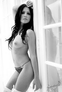
In glamour photography, illusion and fantasy are more important than reality. When you're pretty girl shooting, using contrast in various ways is another way to help you and your model create the fantasy.
The low-contrast, high-key, pretty girl at the top is Rebecca. I used a 5' Photoflex Octodome as a main light and let the large, overhead skylight, as well as the white walls, provide the rest of my exposure.

2 comments:
While I enjoy your banter and your articles, I would like to issue a challenge to you, mostly because it would be more helpful to me.
I am not sure the direction you want to take this blog, and if you want to include more technical information, but I would appreciate if along with the pretty girl photo, if you include a BTS (Behind The Scene) shot showing the light placements.
As photographers, we are visual creatures and while you try your best to explain the setup using prose, a picture paints a thousand words.
Maybe you can do it as a goal for 2011?
:)
@Lawrence: In the past, I've sometimes shot BTS images to illustrate the lighting but I wasn't consistent in doing so. It's been more like "when I think to do it." Now, probably more so since I've began authoring ebooks and have other educational plans, I'm going to try to always remember to do so. Many of the BTS shots won't be exclusive to ebooks and some of the other things I have planned. I'll also show them right here, on the blog. Thanks for the suggestion and the reminder!
Post a Comment