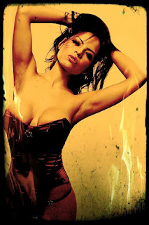
No sooner did I post my last update, an opinion piece regarding digital shtick and the popularity of adding it to our photos, than I came across this article from the UK's Mail Online.
It seems a recent poll of 1,671 Facebook users revealed that photo images with added digital shtick, i.e., shtick generated by digital photo apps, has knocked baby pictures off the throne of "Most Annoying Photos on Facebook."
In the poll, Facebook users said the main reason they hated apps such as Instagram was the "unnecessary photographic effects" added to the images. Who knew average viewers would have the audacity to tell us -- us passionate, knowledgeable, and artsy photographers -- what constitutes a good artistic photo? The next thing they'll be doing is telling us how they think we should expose and compose our images or what kind of stuff we should be pointing our cameras at!
How did the crowd get out of control? Don't these know-nothings know that, when it comes to photography, only us real photographers know what's cool, hip, and trendy? We know what works and what doesn't work (photography-wise) and, based on the never-ending stream of Instagram-enhanced photos I see posted on Twitter and Facebook, many of them coming from some pretty darn good photographers, I have to conclude that, when it comes to photographs, viewers don't know what they're talking about and only we do!
A quarter of the Facebook users polled said they found the apps "gimmicky" and three quarters of them said they had taken action to prevent annoying, app-enhanced, photographs from appearing in their news feeds. How dare they? What do they know? Screw them if they don't appreciate art, even if it's art mostly produced by a cell phone's or tablet's programmed algorithms rather than the creative geniuses wielding the devices. If serious photographers say those photos are cool and artsy -- and that's what they're saying given the popularity of making and posting so many photos with digital shtick added -- they're cool and artsy. Period. Like them or not. End of discussion.
The very cool, hip, and artsy pretty girl image at the top is one I snapped of a model named Yurizan some time back. (Click to enlarge.) It's made ever so cooler, hipper, and trendier by the artful addition of carefully selected and applied digital shtick courtesy of my Acer Android tablet and an app called Pixlr-o-matic. I thought the flames were a nice touch. They underscore the obvious-- You know, that Yurizan is a hot, sexy chick. D'uh, right?
Saturday, March 31, 2012
Thursday, March 29, 2012
Digital Shtick
I don't speak Yiddish but, like many people, I know a few words. I even sometimes use them, albeit more in my speech than in my writing.
The word, shtick, is one of those Yiddish words that manages to fall out of my mouth often enough. Shtick means gimmick or something that's gimmicky. Actually, it can mean more than that as there's more than a few ways you can use the word shtick. It also has a variety of nuances that can be called on in its use. But using the word shtick to describe something that is a gimmick or is gimmicky may be the most common way to define it.
Historically, shtick has been applied, probably most often, to comedians. Lots of comedians have their own, signature, shtick. Their shtick is either obvious or subtle. Whacky comedian, Gallagher, has built much of his career using a single, obvious, signature shtick: smashing watermelons.
Other types of entertainers use shtick as well. The legendary Pete Townsend of the rock band, The Who, used some pretty obvious shtick to help build the band's reputation. Townsend's shtick? Smashing his guitar to smithereens on stage, which kind of makes Townsend the Gallagher of rock musicians... or Gallagher the Townsend of comedians, take your pick.
Many photographers develop their own shtick as well. And I'm not just talking about today's digital photographers whose shtick is often digitally applied in post production. Iconic photographer, Edward Weston, may be best remembered for his shtick with peppers.
For photographers, their shtick generally falls into two categories: Production Shtick and Post-Production Shtick. Well-known contemporary shooter, Jill Greenberg, has that crying child shtick she's used in many of her photos. In fact, it's her crying kid shtick that's probably made her most famous. I would have to say Greenberg's shtick falls into both categories. Besides the kids crying, i.e., production shtick, there's some very obvious post-production schtick applied to her photos.
While the wildly popular photo app, Instagram, is well-known for it's photo sharing capabilities, it's also popular due to its ability to add digital shtick to the photos its users capture using Instagram compatible devices like iPhones and iPads. Hold your iPhone up, snap a pic, and then use one of Instagram's many effects to add a bit of digital shtick to your photo... then share it if you're so inclined.
Now before anyone starts thinking I'm about to speak ill of using digital shtick in one's photography, I'm not. I most definitely think it has its place in today's world of digital photography. And it can be a lot of fun adding digital shtick to our photos!
The image at the top (click to enlarge) is an example of some digital shtick I applied to one of my photos just yesterday. You see, I was messing around with my new Acer Android tablet and a photo app, Pixlr-o-matic, I had just downloaded. I didn't snap the photo with my tablet, altho I could have... or one similar to it. Instead, it's an image I shot a while ago which I had converted to B&W using Photoshop and then, just yesterday, copied it over to my tablet and used Pixlr-o-matic to add some digital shtick to it.
Did my application of digital shtick make it a better image? I suppose it depends on who you might ask. For me it did not. But I think it made it kinda fun and interesting in a gimmicky sort of way. It probably added some "wow" value to it, leastwise in the minds of viewers who know little about photography and are wowed by photos with digital shtick added. The best part? It only took four taps on my tablet to add the digital shtick: One tap to load the app, a second tap to load the photo, and the third and fourth taps to add the border and color effect. Voila! Instant shtick!
In the upcoming weeks, I'll probably be writing more about digital shtick using my Acer Android tablet to create it, I mean apply it, and that sort of stuff. I'm having fun playing around with it -- until my usual issues with attention deficit disorder kick in -- so I'll probably be sharing a bit more of that fun. After all, besides all the pics I've yet to shoot, I have many thousands of pretty girl photos stored on my hard drives all waiting for their turns in the new digital shtick world I've added to my bag of tricks.
Tuesday, March 27, 2012
Pajama Party
I have a client who hires me every few months to shoot pretty girls in their PJs. They don't want the models to look overly glammed up or the photos too slick. On the other hand, they don't want the models or the pics looking *too* amateurish or home-snapped either. They want something in between those two ends of the shooting-hotties-in-their-sleep-attire spectrum.
As you might expect, the models, even when they're not especially experienced, are very comfy in their PJs right from the start. Wearing pajamas, even in a studio, out in the lights, and in front of a photographer seems to have that effect on them. In fact, the more experienced the model, the more difficult it becomes to direct them to appear more natural and lose their automatic posing and emoting responses of going into seductive siren glamour model mode.
It's always a fun shoot. One that I enjoy quite a bit. No doubt because wearing PJs -- and I'm not talking about the sorts of PJs Victoria's Secret calls PJs but everyday PJs like those you might buy at WalMart or Target -- automatically helps create a more casual and laid-back photo-shooting atmosphere. The models still look sexy in their pajamas, even when the PJs are flannel and not purposely designed to arouse. It's more a girl-next-door kind of sexy rather than your typical glamour sexy.
Perhaps next time I shoot for this client, I should wear some pajamas too? After all, Hef goes around in his PJs all the time! If I also wear pajamas the photo shoot will be as much a fun PJ party as it is a photo shoot.
On second thought, that might not be such a good idea. Making the models comfortable is always an extremely important factor for successfully shooting pretty girls. Seeing me in a pair of pajamas might scare them more than anything else.
The pretty girl in her PJs at the top is Kyleigh from this past Saturday's pajama party shoot.
Sunday, March 25, 2012
You Can't Bid Against Stupid
There's a familiar adage which states, "You can't fix stupid." True that. And when it comes to bidding for used photography items on eBay, I've decided a new observation, one in a similar vein, is appropriate: "You can't bid against stupid."
I've bought a number of items from eBay sellers lately. Most of them have been computer related. But since I was already perusing eBay for those items, I also looked around for some photography gear that might interest me. None of it has been things I really need. Instead, they've been items I might want for various reasons. There is, of course, a big difference between "need" and "want" and I kept that in mind while bidding.
It didn't take long before I noticed that, when it comes to used photography gear, some people get really stupid with their bidding. How do I define stupid? Stupid is when people bid for a used item and their bids exceed the brand-new, retail purchase price for the exact same item.
You may be thinking that some bidders I've labeled "stupid" might live in geographic areas where there are few retail outlets for those sorts of items. I agree. But since those bidders have web access (as evidenced by their ability to bid for things on eBay) it means they also have web access to online photography retailers like B&H, Adorama, Calumet, Samy's, Midwest Photo Exchange and more. How hard is it for someone bidding on a used item on eBay to check the retail price for the same item, new, from any of the online retailers I just mentioned? Easier still, all they have to do is copy-and-paste the name of the product item into a search engine like Google and the results will immediately enlighten them on what the item typically costs, brand new with a warranty and all that, from various retailers.
It's really frustrating bidding against stupid. It happens way more often than I would have believed. I don't know if the same sort of stupid bidding holds true for many other types of products -- it does, BTW, for high-tech devices like computers, tablets, and more -- and it certainly happens way too often with photo equipment.
It's true you can't fix stupid. Apparently, it's also true you can't bid against it either.
The pretty girl at the top is Brittany.
Wednesday, March 21, 2012
How Much Does Technical Skill Matter?
British mathematician, Sir Erik Christopher Zeeman, once said, "Technical skill is mastery of complexity while creativity is mastery of simplicity." Sir Erik is someone I quoted in my e-book, Zen and the Art of Portrait Photography, using his words to drive home some lessons I've learned and shared, hopefully in helpful ways.
While Sir Erik wasn't talking about photography when he spoke those words, his observation is very applicable. When the digital revolution first began conquering the world of modern photography, photographers were faced with ever-increasing needs to master technical skills of greater complexity. Do you recall the first time you shot with a dSLR? Did terms like color temperature, pixel, and histogram send you scurrying to the web to figure them out and what they might mean to your photography? How about the first time you opened up Photoshop and began using it? I'll bet it was more daunting than taking a roll of film to a lab for processing.
Lately, it seems we're returning to more simple ways of capturing images which generate viewer interest. Instagram is a good example. Simply pick up an appropriate mobile phone device, one with the Instagram app installed, snap the image, apply the treatment of your choice to the picture and voilá! Instant creativity! Or so it would seem.
If you're like me and you make your living, all of it or some part of it, with cameras in your hands, you already know that doing so is going to take more than a mobile phone with Instagram installed. Leastwise, in terms of gear and equipment as well as creativity and technical skill. That knowledge takes us back to Sir Erik's observation about technical skill requiring mastery of complexity and creativity being a product of simplicity.
Technical skills matter. They matter a lot. In spite of camera and other hardware manufacturers, as well as post-production software developers, all trying their best to make the technical side of photography as no-brainer as possible, the vast majority of those no-brainer applications are more limiting than freeing. They're often designed to mimic creativity rather than enhancing it. The person most responsible for making the technical complexities of photography no-brainer is you, the photographer. How do you do that? Through practice and repetition.
I used to play golf. When I first started playing golf, one of the first things I' realized was the importance of the golf swing. A golf swing is technical. It's not some free-form swing you can get especially creative with. Sure, there are variations to the golf swing but not too many of them. How does one master a golf swing? By doing it over and over and over: practice and repetition. Same holds true for photography. How do you master the technical elements of photography? By applying those technical elements and performing them over and over and over, just like you do with a golf swing. It's only then, after much practice, that things as diverse as golf swings and snapping pictures becomes something close to no-brainer. They become automatic.
It's not enough to learn by reading and observing the technical elements of photography just like it's not enough to read about and observe a technically proficient golf swing. You have to do it. You have to do it often. And once it becomes automatic and akin to being no-brainer, you can better focus on mastering simplicity and increasing your ability to realize your creative powers.
The pretty girl at the top sporting a 70's style Afro wig is Marie. I snapped it about 5 years ago. Five years! Sheesh! I wish I could master time, leastwise master it enough to slow it down.
Sunday, March 18, 2012
The Incredible Canon 85mm f/1.2 L
A friend of mine, Rick Horowitz, stopped by the location house I was shooting at last week. Rick had rode his bike, a very cool Victory touring motorcycle, down from Fresno to attend some sort of lawyer's conference in Los Angeles. American made Victory motorcycles, if you're not familiar with them, are V-twin muscle bikes similar to Harley Davidsons. Design-wise, they look a fair amount like Harleys only their not; not Harleys that is. No problem. Victory bikes are cool. At least Rick didn't ride down on some rice-burning crotch-rocket.
Anyway, yeah, Rick's a lawyer. A criminal defense lawyer. He's also a photographer. And while Rick was down here in LA attending a gathering of criminal defense attorneys, Rick cruised on over to Samy's Camera and bought himself a Canon 85mm f/1.2 L prime. If you've never heard of Samy's, think B&H... but in LA.
I'm guessing there's plenty enough crime and criminals in Fresno to keep Rick fairly busy. After all, he just plunked down over two-grand on a piece of glass. But what a piece of glass! And Rick, being the cool guy that he is, offered to let me shoot some with his brand-spanking-new, two-thousand-dollar-plus lens. I mean, Rick hadn't yet shot with it himself and he was willing to let me bust its cherry! Like I said, Rick's a cool guy.
So, I popped Rick's new Canon 85mm L prime on the front of my more than 3-year-old Canon 5D and started snapping. I have two words to say about that lens: "Holy shit!"
The two, side-by-side, photos at the top are from the same capture. I didn't do much of any processing on the images. They're pretty much how they came out of the camera. Obviously, I re-sized them for the web. You can see I shot my model, Anna, in a 3/4 body shot for that one. I then cropped it only to reveal her face in close-up. Click it to enlarge it and check out the detail in her face. Is that freaking lens amazing or what?
But it isn't just about the detail. I was shooting Anna under an overhang attached to the house. As a result, she was standing in the shade. Dark shade. I had the modeling light switched on on my main light but it wasn't making much of a dent. With all that bright mid-day sun in the background, Anna looked like a silhouette in my viewfinder. Did that have any impact on the 85's ability to auto-focus? Not even a little bit. I could barely make out Anna's features in my viewfinder but that lens effortlessly, silently, and quickly locked focus.
Like I said: "Holy shit!"
Do I want one of those Canon 85mm f/1.2 L primes? You betcha I do! Can I afford one? Not at the moment. Unless, perhaps, I become a criminal... in which case I'll probably need Rick's services because I'm pretty sure I'd make a fairly inept criminal. You know, what with me not having attended some prestigious business school and gone to work on Wall St. or having some similar background. But if I suddenly find myself able to justify spending a couple of grand on a lens, by becoming a successful criminal or otherwise, that 85mm L prime is now on the top of my wish list.
Thanks again, Rick! It was fun having you on my set for a few hours. And thanks much for letting me try out your new lens. I hope it does for your photography all you hope it will. And to everyone else, let me say something I've said before: Forget about every new camera body that comes along. You want to seriously upgrade your images? Spend your money on glass. Good glass. Awesome glass if you can afford it.
Friday, March 16, 2012
Learn to See with Tunnel Vision
Sometimes, my clients tell me exactly where they want me to shoot. Other times, they say things like, "Just pick a spot and shoot."
When I'm at a location house and I can shoot wherever I want there's a number of things I'll consider when deciding where to shoot. (For this update, I'm focusing strictly on interior areas of a location house.) My decisions, of course have more to do with backgrounds and environments than anything else. Sure, available light, i.e., daylight coming in through windows or skylights, might be part of that decision but, even then, the background/environment is the #1 factor. Plus, I'll be artificially lighting my confined shooting environment so available light generally matters even less.
When I say, "Learn to see with tunnel vision," as this update's title suggests, I'm talking about rectangular tunnels, not round tunnels or tunnels with one or more sides rounded or curved. In other words, tunnels that match the dimensional aspects of your viewfinder.
Since I mostly shoot glamour, odds are I'll be using short to medium telephoto lenses when shooting the pretty girls in front of my camera. That means my tunnels are fairly confined. Human eyes see what's in front of them with a wider panoramic view. Human eyes see similarly to a fish eye lens's field of view but without the distortion. The human eye, combining it's forward and peripheral vision, offers a wide angle perspective. A lens like, say, an 85mm prime, "sees" what's in front of it with a much narrower field of view, i.e., as if "seeing" through a much narrower tunnel.
As I roam about a location house looking for suitable places to shoot, I have to put my imaginary blinders on. I need to make myself see with a narrower field of view. If I don't do this, I might automatically discount places in the house that might be great places to shoot even though, when looking at them with my normal human vision, that is, my normal field of view, they might not seem like such good and worthwhile places to shoot.
The image of Anna, the "pretty in pink" model at the top, is a perfect example of what I'm talking about. (Click to enlarge.) It may not look like it but it's the foyer of the house I was shooting in. What looks like a wall or some sort of panel on the right and behind her is actually the front door of the house. The panel behind her in the center is a frosted and tinted glass panel next to the door. The panel behind her on the left is an interior wall which sits at a 90° angle to the glass panel and the front door.
The pink and off-white piece of furniture Anna is sitting on is a couch. I decided to keep her at one end of the couch and only reveal less than half of its length. I was shooting from the living room with a focal length in and around 75mm. There was one step going up from the living room floor -- where my ass was plopped on an apple box -- to the entrance way's floor. This helped me get a little lower without having to actually kneel, sit, or lie on the floor. I wanted a slightly low angle, especially with the model also sitting. If that step wasn't there, I would have had to get down on the floor... getting down on the floor while shooting is something I prefer to avoid, mostly because I'm a lazy ass.
So that's it. When you're looking for good places to shoot inside a house or the interiors of many structures, try to put on those imaginary blinders and make yourself see with tunnel vision. I think you'll find there's many good places to shoot in almost any location as long as you envision those places with a narrower field of view.
Friday, March 09, 2012
What a Difference a Light Makes
Yesterday, while shooting at a location house high in the Hollywood Hills, I experienced a few technical problems. The first set I shot was out by the home's pool. That's the San Fernando Valley, by the way, in the background in the two photos above. Also by the way, on the other side of those mountains faintly seen in the distance lies the Santa Clarita Valley. That's where I live.
The two shots, side by side, are of Anna, my model for the day. Both images are unprocessed. That's how they came out of the camera save for resizing them for the web. I didn't adjust levels or do anything else to them in post. The image on the left is one where my main light failed to fire. Obviously, the snap on the right is one where it did fire. D'uh, right? I suppose I could do something with some of the images like the one I posted on the left if, and this is a big "if," I were shooting some sort of quasi art nudes. But I wasn't. I was hired to shoot pretty girl pics, i.e., glamour pics, for a web site.
By the time Anna got out of hair and makeup it was about 11 A.M. or so and not the most ideal time of day to shoot exteriors in bright sunlight. While Anna was in makeup and I was setting up my lights -- a 4' Photek Softlighter for my main and couple of smaller Softliters for kickers -- I discovered one of my cables, one that attaches my Pocket Wizards to my strobes, was missing. Bummer! That meant I'd need to rely on the built-in optical trigger for one of my lights, and I was going to have to rely on it in bright daylight.
I hooked up a PW to each of my kickers hoping they would trigger the optical sensor on my main light. It worked great! Until, that is, I slightly moved my main light. It seemed the two kickers would only fire the main light if the main light was exactly where I serendipitously placed it when I first set up my lights. (Wow! It's not often I get to use a word like, "serendipitously.")
The solution, of course, was simple, if not perfect: Keep the main light where it was when I first set it. As usual, I was under time constraints for each set I shot during the day so I didn't have much time to spend overly dicking around with the placement of my lights. I needed them to consistently fire more than I needed them to in the EXACT spot and angled EXACTLY how and where I'd prefer them to PERFECTLY be doing so.
As it turned out, out of a set of about 150 exposures for this first set, my main light only failed to fire about a dozen times. Later, back home and while editing the day's work, I realize some of the photos (where the main light failed to fire) represented some good examples of what my kickers were doing, on their own, when they fired. Since I'm always looking for something to write about, I thought a photo where the main light failed to fire, shown alongside one where it did fire, and with the model engaging in nearly identical poses, might be a good way to illustrate what I often do with my kickers.
I'm a big fan of three light setups. The most common 3-light setup, also called triangular lighting, utilizes a main or key light, a fill light, and a back light. For glamour, I often use a variation of the standard 3-light setup but with a main or key light plus two kickers or back lights. Often, I set my kickers, or back lights, at 45s behind the models. Sometimes, I might decide to move one or both forward, almost on the same axis as the model, to provide more highlights on either side of her body. That's a taste thing, a personal preference thing, and there aren't rules or anything else that tells me when to do that. I just do it if when the photo spirit moves me to do it.
In the image at the top, the kicker camera-right is closer to the axis of the model while the kicker camera left is positioned closer to a 45 behind her. Why? Because I felt like it. BTW, when I want to add front fill, I usually do so with a reflector of one type or another rather than adding a 4th light into the mix. For the shot above, I didn't use anything for fill opposite my main. There was plenty enough ambient daylight to keep the image free of too many shadows on her front side, not that there's anything wrong with shadows per se. There's not. But again, I didn't want to see much shadow for these shots... you know, just because.
As I already mentioned, the just about completely naked pretty girl at the top is Anna. (Click to enlarge.) I captured Anna with my Canon 5D with a Tamron 28-75mm f/2.8 XR Di lens hanging off the front of it. ISO 100, f/8 @ 160th. The kickers were set to fire with about a half-stop more power than my main.
Here's two more from yesterday's shoot with Anna. These images do include some processing, but not a whole lot of it.
Saturday, March 03, 2012
Darkness and Light
If you have 90 minutes to spare and you haven't already seen it, a great way to spend that hour-and-a-half would be viewing PBS' 1995 American Classics documentary, "Richard Avedon: Darkness and Light." Even if you have already seen it, it's worth a second viewing.
"Richard Avedon: Darkness and Light" isn't so much a biographical film about Richard Avedon. It is Richard Avedon himself. And much of it in his own words! (And, of course, the words of others as well.) This Avedon documentary is required viewing, or it should be, for every photographer intent on bettering their work, specifically portrait work. I've seen it twice. Both times, Mr. Avedon taught me new things, new ways of looking at my photography, new ways to approach my work and the people in front of my camera.
Avedon reminds us those people, our models and subjects, aren't just there being photographed. They're giving us gifts. Not just gifts of their likenesses, but gifts in the form of moments where they share something more about themselves with us, allowing us to occasionally photograph them, if we're lucky or clever or deserving of the gifts, in ways they may not often share with others.
If you're interested in people portraiture, whether it's glamour, fashion, commercial, art, or something else, I can't recommend enough you view this documentary. If you don't come away from this learning experience with new ideas or new ways to approach your work, you weren't paying attention. If that happens, I'll gladly refund the price of admission. Oh. Wait. You can watch it for free! Forget about the refund. None required.
The young lady in her PJs below is one from a set I shot last night. When I arrived at the location and set up a single light, my client asked me, "Jimmy, where's your other lights?" Fortunately, he's a good friend of mine so when I answered simply by saying, "I'm only using one light tonight," my friend looked at me for a moment and said, "Okay." (Albeit with a bit of hesitation in his voice.)
In the end, my client/friend was happy with what I shot. For most of it, I had the model go through all the usual glamour poses and expressions, in and out of the PJs. If you don't think a model can make wearing a pair of pajamas with rubber duckies on them fun and sexy -- and not by playing it like she's too young for such photos -- you're wrong. For a few shots, like the two below, I asked her to quit being the sexy, energetic, eye-candy model she usually is in front of a camera and let me see some stuff she doesn't often share. (Click to enlarge.)
Subscribe to:
Posts (Atom)