 A year or so ago, I directed and shot some TV/Cable spots for one of those telephone "party" lines. You know the kind I'm talking about-- One of those phone services where (supposedly) drop-dead gorgeous girls hang out on their phones "partying" because they have nothing better to do than talk with strange guys who are incredibly optimistic about where the conversations might go. Often, these services cost a buck or more a minute and, to me, that's a pretty expensive phone-habit. But whatever floats your boat! (If you get my drift.)
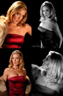
One of the drop-dead-gorgeous model/actress girls (with nothing better to do) who appeared in the spot was Laurie. Laurie looked to me like a potentially perfect subject for some old-time glamour shots-- Old time as in retro as in 40s and 50s Hollywood-style glamour. (e.g., George Hurrell and shooters of that ilk.)
I asked Laurie if she'd like to come back to the studio to shoot some classic Hollywood glamour. Of course she said "Yes." After all, I was the director and the guy who cast her and the guy who was paying her for her role in the TV spot. Hey! Nothing wrong with having a little "juice" with the talent!
I wanted to shoot this stuff as much like those photographers of yore did and that meant hotlights. Not just hotlights, but hotlights with fresnels.
For those of you who aren't acquainted with fresnel lenses, you can learn about them HERE.
The day Laurie and I shot, she told me her Dad had once shown her a book of George Hurrell's work. Perfect! She had an idea of what I was looking to do and she brought along some wardrobe that worked out nicely.
Laurie is an experienced model. She knows what she's doing in front of the lens. She "works" the camera. She "feels" the light and knows how to "cheat" herself in and out of it. She knows what expressions work for her and which do not. She has poise and charm and charisma and she knows how to work her body for the camera. In short, she's the kind of model who makes the job easier, allowing shooters to focus on the shots rather than hand-holding an insecure, inexperienced, and uncomfortable newbie.
 Getting back to the shoot.
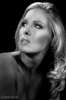
This was my first time attempting to shoot in this style and I had already decided most of what I was going to shoot would be converted to monochrome. Personally, I'm a big fan of B&W images. I think there's more soul to B&W photography, especially when shooting people. On your right is a head-shot of Laurie from our shoot. She's fairly easy on the eyes, no?
Speaking of B&W, my preferred method of conversion is to use Photoshop's Channel Mixer. If you want to learn how to convert with the channel mixer, try Googling using these key words: Photoshop, B&W, conversion, "channel mixer." Or, come up with your own search words. I'm sure you're clever enough to refine these search parameters and find some great tips on converting color images to monochrome. (In Photoshop or for any other image processor you might be using.) I'd tell you how I do it but I don't want to turn this blog into a "How To" blog... there's enough of them already out there and I'm sure you can easily find them.
I have a stage area built in my studio. It's a raised platform, i.e., what's called a riser. This riser has an archway flat behind it and is surrounded by walls painted black. This is where I decided to shoot Laurie. She could be seated in some of the shots, standing in others, or lying down. Regardless, she'd be raised up and the riser allowed me to move freely around her.
Unfortunately, I didn't think to photo-record my lighting setups for these images. Hey! It was a year ago. Who knew I'd be writing this blog?
I decided I would use the old, tried-and-true, Three-Point lighting setup for this series.
Three-point lighting is what you learn in Lighting for Cinema and Televison 101. Okay, I guess you learn it in photography classes too. It is *THE* classic lighting setup and most lighting guys, when they're lighting someone on a set, often start out by placing a key, a fill, and a backlight. After that, they go on to add other lights into the mix.
The three points of this lighting triangle consist of a key or mainlight, a fill light, and a backlight. For some of the shots, I removed the key and/or the fill light, that is, I removed the lighting source(s) and used bounce-boards for key and fill. In other words, I allowed light from, as an example, the backlight, to bounce off the key and/or fill reflectors, producing a more subtle light.
Shooting hotlights meant I'd be shooting at higher ISOs, wider apertures, and slower shutter speeds. Higher ISOs usually mean more noise. More noise, BTW, is not the same as more grain as in film grain. But noise can simulate film grain to a certain extent (especially if you manipulate it in post), so I wasn't worried about the noise. I figured, after the conversion, it might look even more like the old, Hollywood glamour style. I also wasn't worried about the wider apertures and slow shutter speeds. First off, I was looking for a short DOF (Depth of Field) and if the shutter speed became a problem, I could always put the camera on sticks. Besides, for this kind or work, Laurie would be posed in some fairly static positions. Sometimes, when I'm shooting modern glamour, I let the model move around somewhat freely. But for these pictures, I was keeping Laurie glued to where she was posed and asking her to hold still once I postioned her where I wanted her.

In the shot above, I boomed in the backlight so I could set it fairly tight behind Laurie and make it "edge" her from the rear. Note: Be careful how close you place these lights to the model. They don't call them "hotlights" for nothing. The particular lamp I was using was a 1k. 1Ks get pretty darn hot! I also removed the key and fill lighting sources and replaced them with bounce-board and lit her from the front with light reflected off the backlight.
Anyway, I'm quite happy with this shot and it turned to be Laurie's favorite. She told me her Grandmother had a portrait of herself (when she was much younger) just like it. Laurie planned to give her Grandmother a print of this image.
If you haven't tried shooting in this style, I highly recommend you give it a shot! I think you'll have fun and a great time of it and you might end up with some images you're quite proud of.
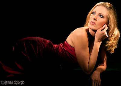
Here's another image of Laurie to leave you with. This one I left in color cuz I liked the deep, dark, red satin dress.


2 comments:
Very nice. I'm inspired :)
I am a little late getting started on your blog. I have read to here so far and it is becoming an eye opening "Day Books", if you will...
Post a Comment