Friday, December 31, 2010

Happy 1-1-11 and the Rest of 11 Too!

Well, another year comes to a close and, along with it, the first decade of the new millennium lies behind us as well. You'll have to wait a thousand years for another 1-1-11 to come along!

Here's wishing all of you the very best for the coming year and the coming decade and, well hell, I'll go for broke wishing that 2011, as well as all your years beyond, are all you hope them to be!

The pretty girl in the pic is Roxy, studio-snapped a while back. Shot her in front of a green seamless. I also clipped a piece of green gel in front of the kicker to the left to kind of connect her, lighting wise, to the background.

Thursday, December 30, 2010

Photography and Instant Pudding

As the first decade of the new millennium comes to a close, I find myself asking where might it go from here? More importantly, at least to me, is where I might go from here? I'm guessing a few of you might be wondering the same; not about me but about yourselves.

The first decade of the 21st Century saw many changes in the world of photography: some have been exciting, some not so.

While photographic technologies leaped forward in amazing ways, the business of photography was pushed against a wall, certainly from the perspectives of many who ply the trade as their vocation. What digital photography has done for photographers is similar to what instant pudding must have done for those who practiced the fine, culinary art of traditional pudding making. That is, it put making good pictures into the hands of the masses much the way instant pudding put good pudding into the mouths of many more pudding lovers. Some see developments like these as being positive. Others see them from less appreciative perspectives.

Don't get me wrong. I thoroughly love many of photography's technological advances of the last decade. But, at the same time, these advances have made making a living with cameras in my hands much more difficult.

Sure, cream rises to the top. And if cream I be, I'll rise. Perhaps not to the very top but in a generally upward direction. I'm not sure where that rising will take me but, hopefully, somewhere that makes me happy and content.

I don't pretend to have an accurate crystal ball, one that allows me to predict where photography will go in the next decade. Every time I watch an old science fiction movie, movies I'm quite fond of viewing, I'm amused by their (more often than not) inabilities to accurately predict where technology has gone in the last 30 or 40 or 50 years. Sometimes, of course, the writers and producers of those movies saw the future and predicted it with accuracy. Often, they did not.

I do have a wish-list for the future of photography. It's not about cameras and software. Instead, it mostly has to do with consumers of the pictures photographers make. I hope that quality will again trump mediocrity. In other words, I hope those people who hire photographers will raise the quality bar (from where it's been lowered to) and appreciate and embrace the work and results of skillful shutter snappers. I'm not saying that appreciation has completely fallen to the wayside but, in many ways, it's nowhere near where it once was.

Anyway, just some thoughts that popped into my head.

The pretty girl at the top is Rosemary from last night's shoot. Rosemary is Indonesian and, as such, she popped my Indonesian cherry, pretty girl shooting-wise.

Tuesday, December 28, 2010

*The* Photography Story of 2010

I came across the fascinating story of Vivian Maier today. Forget about whatever cameras or other gear were released this past year or the many incredible photographs that were snapped. In my opinion, this is *the* photography story of 2010.

The story is equally fascinating from two perspectives: 1) the photographic life of Ms. Maier and 2) how her work was discovered and what is now being done with it.

Ms. Maier, deceased, was a nanny, a globe-trotter, and an apparently solitary and private person who also took pictures. Thousands and thousands of pictures on the streets of Chicago and elsewhere.

Maier is described by those whom she once cared for (as a nanny) as a Mary Poppins sort of character. What few people seemed to know about her was that she was also a photographer-- a lone photographer who did not seem interested in sharing her work and, in retrospect, who may have been one of the greatest, most gifted (albeit unknown) street photographers of the 20th century!

I know this site is mostly about glamour photography. And glamour photography is what I shoot most. But I'm a photographer first and a glamour photographer second and when I come across an amazing story like this, well I can't help but be inspired, fascinated, and motivated to share it.

Here's a video segment from a Chicago TV program called "Chicago Tonight." I think you'll be as amazed as I was watching it. You can also learn more about the photographer by visiting the Vivian Maier blog.


The gratuitous eye-candy at the top is Dana from last night's shoot. It's certainly not street photography altho the location house where I set up the seamless and my lights and photographed Dana is, after all, on a street.

Monday, December 27, 2010

Inspiration Is For Amateurs

According to American painter and photographer, Chuck Close, "Inspiration is for amateurs. I just get to work."

Close's statement seems to reject the notion that a person (other than the artist himself or herself) or a thing or an activity is what inspires art. It also also seems to reject the divine as the source of inspiration.

If all that is true, where does inspiration come from? Is everything that might (seem to) inspire us already within us, somehow embedded in our psyches? Are we born with the seeds of inspiration already a part of us? Is basic artistic talent another way of explaining off what some might label inspiration? Are we simply waiting for the seeds of inspiration to germinate and bloom? Do we really just need to "get to work" and results that seem "inspired" will follow? Is inspiration something more easily recognized in the past tense? In other words, after creating something that seems "inspired," is it only then that we can recognize something external (from us) that might be responsible for a seemingly "inspired" creation? Or, is inspiration just a vague way of describing how we are or were moved to create something that already resonates in ourselves and then, through the "inspired creation," resonates in others?

Sorry. That was a lot of questions. And I'll bet each one could take a book to answer. If not a book, certainly much could be written in response to each of those questions. In fact, a lot has already been written which addresses those questions and more: It's called "philosophy."

Perhaps what Close meant was that artists (which include photographers) should simply get to work, get busy, get out and do it and, after it's accomplished, then worry or ponder whether whatever was created was inspired or simply happened as result of the effort?

A well-known phrase amongst photographers is the to-the-point adage, "Shut up and shoot." I think it closely resembles what Close was saying.

The pretty girl at the top is Tegan. She definitely inspires me! But more towards ideas and thoughts that are less of an artistic nature and more of a human nature. Just sayin.

Tuesday, December 21, 2010

Pre-touch or Re-touch?

A friend sent me a link to a thread on Model Mayhem which in turn led to an interesting link that featured some photos with mark-ups for retouching. (For a few Playboy centerfold pics.)

In that thread, well-known glamour and fetish photographer, Ken Marcus, commented about his days shooting for Playboy. In his comment, Ken said, "During the 11 years (1974 - 1985) that I shot centerfolds, calendars, pictorials and editorials for Playboy, there was a policy against retouching anything except the cover (to make sure text would contrast properly and be easily readable) Our policy during those days was: Pre-touch, rather than Re-touch."

Ken's words got me to thinking about the current state of glamour photography (in the digital age) and it's seeming dependence on post-production tools for making, leastwise hoping to make, impressive images. Often enough, heavily processed and re-touch-driven images either go beyond my ability to suspend disbelief or they simply suck as a result of the excessive and ridiculous amounts of processing and re-touching some photographers apply to their work.

I've probably beaten this subject to death in the past but nothing in the present has changed my opinion in terms of re-touching-- That is, that less is often more.

What I mean by "less is more" has less to do with the time and effort spent re-touching images and more to do with its obviousness.

When I was an editor (I'm talking video editor) one of the important things I learned about editing, be it film or video, was that the best editing is invisible. In other words, great editing doesn't call attention to itself: Cuts and dissolves and other edits all flow naturally, seamlessly, and invisibly. That's why motion picture editing is often referred to as "the soul" of a motion picture. It's there but viewer's aren't overly aware it's there.

In more than a few ways, I think re-touching photographic images is best accomplished when the re-touching is nearly invisible, calls little attention to itself, and seems natural. There are exceptions, of course. But those exceptions, in my opinion, generally refer to images that are as much digital art, perhaps more so, than they are photographs.

In order to produce photographs of high-caliber, the emphasis should be, as Ken Marcus mentioned, on pre-touch rather than re-touch. What that means is photographers should be learning all they can about the front-end of photography and doing everything they can, while in production, to reduce their reliance on re-touching to improve the quality of their photos.

In other words, pre-touch rather than re-touch.

Henri Carier-Bresson said, "The picture is good or not from the moment it was caught in the camera." That simple statement holds much truth!

Cartier-Bresson also said, "Your first 10,000 photographs are your worst." So, with that in mind, be patient. Keep working at improving you production skills. It doesn't happen overnight but, if you keep at it, it will happen. When it does, I think you'll find that pre-touch will trump re-touch in terms of producing good photos, glamour or otherwise.

The pretty girl at the top is Alexis from a shoot last night. I had about 15 minutes with Alexis and spent less than 5 minutes re-touching the above image. Could I have done more? Re-touching that is? Sure. Would the image be vastly improved? I'm not so sure. Improved, yes. Vastly improved? I don't know. Sometimes, things like re-touching (photographically) adheres to the law of diminishing returns.

Saturday, December 18, 2010

Stylistic or Not?

When I'm shooting for clients, I have to decide how stylistic my images should be or can be or might be. Another way to look at it is this: I decide what stylistic elements I might get away with, that is, sneaking them into my shooting approach, and I do so at my own risk.

Most of my clients aren't exactly art aficionados. They want to see pics of their models posed in sexy, seductive ways, well-lit and properly exposed. ("Well-lit" being entirely subjective from many points-of-view.)

My clients generally rely on their post-prod people to either add stylized elements to the photos or not. If I begin stylizing my photos to a noticeable degree, they might love them or hate them. Regardless, they prefer them not being too stylized. If I do add much in the way of style, I better do so in ways that allow their post-prod people to undo my efforts and return the images to un-stylized levels should that be how they want them. (And that ain't an easy thing to do.) I often feel like I'm teetering on a balance beam between infusing a personal style into the pics or shooting them in more generic ways.

Generally, my clients aren't big fans of shadows or too much contrast. Not all shadows and contrast: A modicum of shadow and contrast is okay. But too much emphasis on shadow and contrast and they're liable to freak out... unless they really love the images, shadows/contrast notwithstanding.

For example, if I want to add a fair amount of personal style, and if that personal style might include a fair amount of shadow and contrast, I risk my clients being unhappy with my work unless, of course, they happen to like what I captured with a specific model.... stylistically, that is.

Shooting brightly-lit models, near-shadow-and-contrast-free, is always the safe way to go. There's less for clients to dislike. In fact, if they don't like the flat, brightly-lit images, their dislike usually has more to do with liking or not liking the model than it has to do with liking or not-liking how I captured the model. And since they're the ones who hired the model, I'm generally off the hook, liking the pictures-wise.

On one hand, shooting safe might be a somewhat good idea from of a client-relations perspective but, on the other hand, it risks me, the photographer, becoming more replaceable in their eyes. In other words, practically anyone with a fair amount of photography experience can light up a model brightly and with little contrast, producing competent, if lackluster, images. Because of that, there's less impetus to hire me again simply because so many other photographers can easily produce the same (near-style-free) results. It's like a glamour photography Catch 22.

For those not familiar with Joseph Heller's novel, "Catch 22," think of it as being dammed if you do and dammed if you don't.

Anyway. Just sayin.

The pretty girl at the top is from last night's shoot. It's almost like she's doing a one-handed juggling act with her breasts, giving them an unusual lop-sided appearance. (Which their normally not... lopsided, that is.) Her name is Yurizan. (First time I've ever heard that name, Yurizan being her real name I should add.) For this gig, which is an ongoing gig, the models are all shot in front of a seamless. I usually have about 20 minutes with them. I went with a bit more shadow and contrast with Yurizan, adding some small amount of style to the images. We'll see what the client has to say after they see the pics.

Thursday, December 16, 2010

Blur-a-Holics Anonymous

Hi. My name is Jimmy and I'm a blur-a-holic. It's been 3 years since I used a total face or body Gaussian blur mask.

Sometimes it's hard. I look at my pictures and think, it's only going on the web. At 72 dpi, whose gonna notice? Besides, the women I photograph don't all have porcelain skin. What's a little virtual porcelain between friends? There's a reason Mattel has been so successful with their line of Barbie dolls. If people didn't like plasticized Barbie skin they would have already stopped appreciating (and buying) those dolls and Mattel would have already changed their manufacturing process and added pores to Barbie's skin, right?

Okay, I'll admit that sometimes... sometimes I might use a blurring tool on a pretty girl's skin. But only a tiny little bit and only in a few places. It's barely noticeable, if at all. What's the harm in that, right? It's glamour. It's all about fantasy. If a little blurred skin helps create the fantasy, what's wrong with that? It's not like anyone is getting hurt if I do. As long as her eyes are sharp and focused, right?

Besides, I don't always have time to carefully and meticulously "heal" every freakin' blemish on every model's skin. Dammit, Jim! I'm a professional photographer, not a plastic surgeon! Most of my models don't have sick skin anyway. They might have an occasional blemish, scar, pimple or other flaw, things that could use a bit of post-production TLC but, for the most part, there's usually not *that* much to heal. She is what she is!

A model's epidermis is her largest organ. Okay, maybe a few of my models have mammary glands larger than their epidermises but that doesn't mean their entire skin organ is in trouble. If the whole damn thing needs healing, her skin I mean, maybe she needs a doctor? You know, a dermatologist. Maybe she should take better care of her epidermis? Maybe she shouldn't even be modeling or I shouldn't be showcasing my pictures of her.

The model at the top is Bella from last night's shoot. No model was injured in the production of this photo. No post-production blur was used in the processing of the picture. (Not even a tiny bit.)

Saturday, December 11, 2010

Just Thinking Out Loud

Biz-a-ness first. Ed Verosky has a "limited time" holiday sale going on for all his ebooks. Use discount code N5H74 at checkout and instantly receive 30% off. I have all Ed's books featured in the right-hand column of this page. Click any of them to purchase. Use your discount code and receive 30% off! Or, click on any from these links:

Taking Your Portraiture to the Next Level,

100% Reliable Flash Photography,

1
0 Ways to Improve Your Boudoir Photography Now,

25 Amazing Boudoir Photography Techniques.

I have two projects I'm currently working on. One of them is all writing and the other is writing and shooting. I'll probably begin shooting for project #2 right after Christmas. As you might imagine, having two simultaneous projects is taking up a fair amount of my time. But hey! Business sucks. (In terms of being a "gun-for-hire") so I've got the time. Might as well spend it doing something productive, right?. In this case, doing two things at the same time that are productive.

I've been giving a lot of thought to expanding my photographic horizons and pursuing work other than glamour and tease. It's not that I don't love shooting beautiful, sexy women. I do! But there's less and less work coming my way so, beyond my personal projects, it's probably time to branch out. I mean to seriously look to branch out!

Course, I have no freakin' clue in which direction I might move. It's definitely not going to be things like weddings, family and event photography and that sort of stuff. I still shoot headshots as part of my quest to continue making a living with cameras in my hands. And I still get hired to hold a video camera. In fact, Next week I'm scheduled to shoot some web-commercials for a new dog-training device that will soon be marketed to consumers.

Still, my passion is photography and, beyond the decreasing glam work, the headshots, the video shooting, I think I need to figure out where, as a photographer, I want to direct myself. Suggestions, as always, are welcome even though it's unlikely anyone will suggest an area I haven't already thought about.

I would love, of course, to be shooting simply for myself. But I wasn't exactly Mister Fiscally Responsible for most of my life so I still need to earn. That's not a complaint, by the way. I'm ready, willing, able, and enthusiastic to continue pursuing a career. Authoring and selling ebooks has been great. I've done quite well with that so far. It's not enough, however, to support myself. Even with the shooting gigs I'm still getting there's not enough to comfortably live. I'm definitely at that age where comfort is important. That's why I'm looking outside my own, little, comfort box, hoping to expand to a bigger, wider, taller comfort box, if you will.

That's Tera Patrick up top in some very Xmas-ee lingerie. (Obviously, more "X" than "mas")

Sunday, December 05, 2010

What Our Photography Says About Us

Photographers are often going on about the story in a photo. You know, the editorializing the photographer engaged in when creating the pic. But if you step back and look at a photographer's work from a distance, as a body of work, does it say something, perhaps a lot, about the person with the camera in his or her hand?

Generally, I divide photographers into two, overall categories: Those who observe and document and those who observe, document, and express. That's not to say there's not an abundance of gray between my general binary perceptions of photographers, often there is, but sometimes it helps to categorize and generalize for the purposes of sharing personal observations.

Photographers who observe and document seem less interested in style. That's not to say some amount of style doesn't exist in their photos but, for the most part, they seem less interested in expressing style than they are in documenting an event or a thing. Photo-journalists often fall into this category as do those who shoot nature. Certainly, all photo-journalists and nature shooters aren't merely style-free documentarians but many of them seem to be.

Photographers who observe, document, and express are looking to share something beyond documentation. They're as interested, if not more interested, in developing a personal style or using stylistic elements or points-of-view that add expressive nuance to whatever it is they're photographically documenting. In this way, they are often saying something about themselves as much as they are saying something about what's in front of them.

When viewing a photographer's portfolio, the first thing I notice is if there's an overall theme to the photographer's images, a common denominator. It doesn't matter what genre the photographer mostly shoots although a photographer's preferred genre might also be revealing in terms of who the photographer is and what he or she might be about. At the very least, it poses questions about the photographer-- Questions that might, themselves, be revealing.

Is someone who prefers to shoot landscapes or still life images also someone who is less of an intimate, social, or people person? Edward Weston photographically bonded with peppers. What does this say about Edward Weston? Was he more an observer than a participator? How do you participate with peppers beyond growing them or eating them? Weston found a way.

These sorts of questions are the kind of stuff that has always made, and continues making, photography so fascinating to me. Not just as a photographer but as a viewer as well.

I know I'm generalizing but sometimes generalizing allows us to discover truth. That's probably why truth is so often described in general, universally-applied and non-specific terms.

The truth is rarely pure and never simple. - Oscar Wilde.

Or to bring it home to the art and craft of photography, leastwise a specific genre of photography: It seems dangerous to be a portrait artist who does commissions for clients because everyone wants to be flattered, so they pose in such a way that there’s nothing left of truth. - Henri Cartier-Bresson.

Cartier-Bresson, recognized as the father of modern-day photo-journalism, certainly included much expressive style in his work. Yet, in the quote above he (in a sense)
takes style to task, complaining that it obscures the truth. A very complex man, Henri must have been.

But Henri's right: Style obscures the truth! (Not that that's necessarily always a bad thing, certainly not in the world of photography.)

My apologies if I seem like I'm rambling on, writing in an eclectic style, searching for a point to make. But then, a photographer's life is rather eclectic. One of constantly being on the look-out, in search of, a point to make with each photograph we snap. Sometimes those points are obvious, sometimes they're subtle, sometimes they indicate what we're searching for even if whatever that thing is remains elusive and undiscovered.

It is exciting, of course, when we discover what we're looking for and artfully make our points: Points that hope to tell some truth even if that truth might be shaded (with expressiveness and personal style) in ways that obscures other truths. At the same time, obscuring truth with expression and style reflects something about ourselves. In other words, through photography, and beyond the techniques we use to snap our subjects, we also capture some truths about our attitudes and perceptions about whatever is in front of us.

Other times, of course, we simply make seemingly pointless photographs of whatever we momentarily deem "interesting" or, perhaps, are commissioned to shoot. I suppose that says something about us as well. What, I'm not sure.

The gratuitous eye-candy at the top is Aleta. Does the pic say something about me? Perhaps that I'm a gratuitous eye-candy kinda guy? Regardless, the pic was captured with my Canon 5D and a Canon 17-40 f/4L. I used a wide-angle lens to slightly distort the perspective. I suppose that was my way of further distorting the truth about who this model might be. You know, to further help the model's pose and expression and wardrobe (or lack of it) remove, as Cartier-Bresson said, some truth about her. (Although removing the truth about how sexy Aleta is would be fairly difficult.) Two lights were employed: Mainlight modified with a 5' Photoflex Octodome and a back/side light modified with a small, shoot-thru, umbrella. ISO 100, f/8 @ 125.


Friday, December 03, 2010

Diagonal Lines

Edward Weston once said, "Consulting the rules of composition before taking a photograph is like consulting the laws of gravity before going for a walk."

Point well taken.

Composition, good composition, is one of those things that, for serious photographers, should become instinctive and automatic: You know, like one foot in front of another without, prior to walking, feeling the need to brush up on Isaac Newton's Law of Universal Gravitation
.

Although we don't need to learn the laws of gravity in order to walk, it's a pretty good idea to know something of the rules of composition -- what works and what doesn't work -- in order to, at some point, become photographers who naturally, instinctively, and automatically apply the rules of composition (or break those rules) in effective ways.

In both my ebooks, Guerrilla Glamour and Guerrilla Headshots, I wrote a fair amount about composition. While going on about the various elements of composition, I placed special emphasis on diagonal lines. Not simply because I tend to incorporate diagonal lines in my images whenever I can, but because diagonal lines are, in a word, powerful. Make that, visually powerful.

The power of diagonal lines can be obvious or subtle. Regardless, they add much value to almost any photograph-- whether they're applied to genres as diverse as architectural photography and glamour photography or even, when they can be, employed when snapping headshots.

In glamour photography, backgrounds, shooting environments, wardrobe and accessories aside, diagonal lines can be produced by pose. People have arms and legs. Those arms and legs, in their most basic state, represent lines. The lines represented by arms and legs can be directed to create diagonal lines within the vertical and horizontal rectangular dimensions of your viewfinder. Those diagonal lines help lead the viewer's eyes to where you want them to go. In fact, they nearly force the viewer's eyes in certain directions. That's why diagonal lines are such powerful constructs to apply to your photos.

Getting back to Edward Weston's quote, calling on the rules of composition (diagonal lines included) doesn't need to be something that is consciously considered. In fact, the more instinctive and second nature it becomes, the more it seems a natural element of the image rather than something that is forced or obviously intentional. (That's not to say forcing compositional elements or having them appear intentional can't be done to great effect.)

How do employing compositional techniques like diagonal lines become automatic? Well, the same way, as babies, we learn to walk. At first, our minds and bodies are carefully, purposefully, and cautiously taking steps. Soon, those steps become more fluid and natural. Finally, walking becomes near thoughtless and automatic. The same chronology applies to employing effective composition. After some time of consciously and purposefully framing your pictures with nods to various compositional techniques, you will eventually begin automatically framing your images and directing your models in ways that reflect those "rules" of composition without even thinking about them.

The pretty girl at the top is another of Faye. (I used a Faye pic in my previous update, "Focus.") This image of Faye, unlike the previous, is a one-light shot using a 300WS monolight in front, modified with a shoot-thru umbrella. Faye has posed her body in a standard, "S-Curve," glamour pose. There are a number of diagonal lines represented in the image. They all work to add visual value to the photo. The diagonals formed by her arms lead the viewers' eyes to her very pretty, freckled face.

Wednesday, December 01, 2010

Focus

Manipulating focus is a great way to force your viewers' eyes where you want them to go. D'uh, right?

Yet, I see so many glamour images that could have been greatly improved with a bit of focus manipulation when the photographer was shooting. I know, I know... it's a creative decision and those photographers chose not to use depth of focus as one of their creative tools for that shot.

Sorry, I don't buy that. I don't think all of those photographers much considered how they might exploit focus to enhance their images. I'm guessing many of them decided to shoot at small apertures because they were thinking more about keeping their models in sharp focus. Unfortunately, a lot of stuff in their backgrounds was kept in nearly as sharp focus. That's not necessarily a bad thing. Sometimes, it's the right thing to do. Other times, it keeps the photo in the realm of mediocrity.

For glamour photography, make that for the majority of people photography, sharp focus on the models or subjects is often important. (Unless you're going for a fuzzy, soft-focus, artsy look.) Usually, the sharpest focus should be on the model's eyes. (D'uh again.) We sure don't want blurry glimpses through those windows to the soul even if the models' souls aren't what many viewers of glamour images are gawking at.

Personally, it's rare for me to shoot a model above f/8 unless I'm purposely looking for more depth of focus... which isn't that often. I mostly prefer in and around f/5.6, plus or minus a stop, and, occasionally, wider than that. The more open the aperture, of course, the shallower the focus. The closer my framing, the more I generally prefer a shallower focus.

Just because your powerful strobes can deliver plenty of lighting power, allowing you to shoot at very stopped-down apertures, doesn't mean you should always be using that power. The most powerful monolight I own delivers a mere 500WS of power and I rarely have used that strobe at full capacity. In fact, the strobe itself gets used less than my 300WS strobes because I can't dial it down enough while keeping it in close to my models and still achieving very soft lighting. (Which most of my clients prefer when I'm shooting glamour and tease for them.)

Just some Hump Day tidbits for thought regarding the role of focus in glamour shooting.

The pretty girl at the top is Faye. I used two lights: A 300WS main light in front modified with a small, shoot-thru umbrella and a 300WS bare-bulb strobe from behind for highlights. For glass, I was using a Canon 85mm f/1.8 prime. Exposure was ISO 100, f/2.5 with a 200th of a second shutter. Mark Twain might have been talking about Faye when he said, "A face without freckles is like the sky without stars."

Monday, November 29, 2010

Contrast

The late cinematographer Conrad Hall (Butch Cassidy and the Sundance Kid, Road to Perdition, and more) once said, "Contrast is what makes photography interesting."

The word, "contrast," in its simplest definition, refers to things set in opposition in order to show or emphasize their differences.

Beyond differences in levels of brightness between the light and dark areas of a photo, there are other ways contrast can be depicted in the content of a photograph: colors, forms, and lines can be contrasted as can dissimilarities between entities or objects.

I'm not 100% sure which aspect of contrast Hall was specifically referring to-- Perhaps all of them? It's likely, given he was a cinematographer, he was mostly speaking about the differences between the light and dark areas of photographic images. It doesn't matter if the photographic images are motion pictures or still photographs. Contrast is contrast.

Sometimes, when there's less difference (contrast) between the light and dark areas of a photo, the image may appear overly gray and dull. (Generally, not a good thing.) Other times, reduced contrast, in the form of high-key lighting, can be visually effective and help send specific messages to viewers.

How light and dark areas of photos are contrasted appeals to the emotions of viewers. When high-key lighting is employed and the contrast is purposely reduced, much of the image's light values reside on the bright (or white) side of the exposure. As a result, the subjects are often perceived as having light, airy, or upbeat emotional values. In contrast, low-key lighting, where much of the image's light values reside on the dark (or black) side of the exposure, produces more immediately obvious differences between the light and dark areas of an image and are often perceived as being dramatic, shadowy, or mysterious.

Another element (or product) of contrast is focus. The areas of a photo where the contrast is most reduced results in those areas having, what appears to be, softer focus. Conversely, the greater the difference between light and dark in immediately adjoining areas of a photo, the sharper the focus appears. When you use Photoshop's sharpening tools, for instance, the focus isn't actually sharpened or increased. Instead, the contrast between adjoining light and dark pixels are increased. This provides the illusion the image is in sharper focus. With many genres of photography, illusion is as important as reality.

In glamour photography, illusion and fantasy are more important than reality. When you're pretty girl shooting, using contrast in various ways is another way to help you and your model create the fantasy.

The low-contrast, high-key, pretty girl at the top is Rebecca. I used a 5' Photoflex Octodome as a main light and let the large, overhead skylight, as well as the white walls, provide the rest of my exposure.

Tuesday, November 23, 2010

Spray-and-Pray

A while back in an article in Digital Photo Pro magazine, long-time National Geographic photographer, Jim Richardson, admitted he snaps between 20,000 and 40,000 images for a given assignment. He does this, he says, in hopes of capturing a very small number of amazing photos.

Generally, Richardson's assignments take 8 to 12 weeks to shoot. A lot of those days are spent doing things other than capturing the twenty to forty-thousand pictures he mentioned. According to Richardson, about 20% of his assignment time is spent with cameras in his hands. The rest of it is spent on logistics-- planning, coordinating, researching, and more. Still, 20k to 40k photos is a whole lot of images to shoot then edit!

None of the above is intended to infer that photographers of Richardson's caliber are employed by businesses like NatGeo simply because they are sprayers-and-prayers. It isn't about luck and it isn't about how many pics he snaps. NatGeo doesn't employ proven photographers like Bill Richardson because the odds are in favor of him getting lucky and capturing a few great photos out of thousands. They hire him because he's good. Really good. And because they know he's going to deliver great photos, whether he shoots hundreds or thousands.

I would imagine many of the subjects Richardson shoots for NatGeo aren't "directable."

"Could you lower your head a bit and cheat your trunk to the left? I'd like to see both tusks in my frame."

In fact, the numbers of images Richardson captures for his assignments probably has lots to do with him being, as a photographer, more of an observer documenting what's in front of him than a photographer with much control over what's in front of him.

Someone like me, a glamour photographer, has plenty of control over what I'm photographing. That's why I don't shoot anywhere near thousands of photos for my assignments. I can control not only how my camera is capturing what's in front of me, I can also control what's in front of me... if that makes sense. You know, I can control my lighting, I can place the model where I want her, I can direct her pose, her expressions, her emotional projections... that sort of stuff. I imagine someone like Bill Richardson shooting for NatGeo doesn't often have those luxuries.

Still, I see and hear about photographers shooting models and capturing thousands of images during their time with those models. In other words, they're spraying-and-praying. When I've been in the presence of sprayers-and-prayers, I've noticed they tend to be shooters who communicate less with their models than someone who, well, who isn't a sprayer-and-prayer.

I don't know about any of you but I refuse to depend on luck or prayer to help me capture good images. Sure, sometimes I do get lucky and capture something with unintended elements and that unintended capture results in an amazing photo. But I can't count on that sort of thing happening with any sort of consistency or dependability.

Besides, most of the time I don't have time to capture thousands of images... not that I'd want to. Who wants to edit through thousands of images if you don't have to? I know I don't.

Glamour photographers have two options: Capturing excellent photos by design or capturing excellent photos by luck. The choice is obvious if you ask me.

The gratuitious eye candy on the stairs is Brook, captured in a location house near Los Angeles.

Monday, November 22, 2010

Making Your Photos Sing


From my ebook, Guerrilla Glamour: "You can have the best gear that money can buy and still shoot photos that suck. (That really sucks, doesn't it?)"

If you think better gear, make that the latest and most expensive gear, is going to automatically make you a better shooter, you've been misled by the marketing and advertising guys who make their livings hyping and pimping all that stuff.

There's only one thing, above all else, that will help make you a better shooter.

Shooting.

When it comes to enhancing and refining your photography skills, the latest-n-greatest cameras, the newest versions of Photoshop or Lightroom, those high-tech digital strobes married to nifty devices that trigger them while allowing your camera to "talk" to your lights, pale in comparison to the actual and oft-practiced experience of shooting.

Anything I write (or that anyone else writes) intended to help you reach higher levels of photographic excellence will do little to help you if you don't get out there and employ those suggestions by shooting.

There are many things in the world that cannot be skillfully and artfully learned from teachers and mentors, by reading books or articles, by viewing videos or listening to podcasts, by attending workshops and seminars, by building flashy websites, by blogging, by networking and meeting-up, or by Tweeting, MySpacing, or Facebooking. Photography is one of them.

I'm not down on better gear. I'm not marginalizing learning methods, traditional or otherwise. I'm simply saying if you truly want to improve your photography you need to get out there and shoot. You need to shoot often. It doesn't matter if you're shooting with a Canon 5D Mk2 or a little point-n-shoot. Any camera is capable of providing you with added experience that translates into improved skills.

Yes, post-processing can help make your photos "sing." Sometimes, it can even do so when the raw photo appears mute and incapable of visual music. But skillful production, later coupled with skillful post-processing, will make your photos sing loudly and beautifully. It will make them into music for people's eyes.

Okay. I just thought I'd kick Monday off with a little pep-talk.

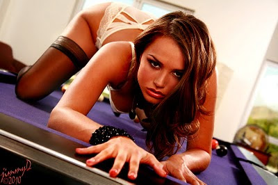
The pretty girl on the pool table at the top, coming towards me like a sexy feline, is Penthouse Pet, Tori Black.

Saturday, November 20, 2010

Frame Wars Part 2

According to Nikon, upgrading your camera body might be a thing of the past. As a possible solution, one that addresses the rapidly changing technology in digital camera sensors, Nikon filed a patent application (in Japan) for an interchangeable sensor.

Hmmm...

If I were having coffee-and-a-convo with a Nikon camera marketeer (and assuming language wasn't a problem) one of my first questions might be, "Is sensor technology the primary reason most photographers opt for a new camera body?"

I'm all for modular cameras. That's why, probably like you, I shoot with cameras designed to accommodate interchangeable lenses. I mean, who wants to shoot with fixed-lens cameras? Well, I suppose that depends on the camera and what your goals are shooting with it. Plus, as Chase Jarvis often reminds us, the best camera is the one that's with you. The pros and cons of fixed-lens cameras as well as Jarvis's advice aside, many of us appreciate being able to swap out one lens for another on our camera bodies. Now, leastwise at sometime in the future, Nikon says we'll be able to swap out sensors as well.

It's true the Big Two camera makers regularly release new camera bodies. They do it so often, in fact, that (IMO) many photographers, myself included, are somewhat cautious about buying a new camera body because of the likelihood that something better (i.e., better for me or anyone else considering purchasing a new camera body) might be just around the corner. That's probably one reason camera makers tend to be so secretive about new cameras on the horizon: They don't want to hurt sales of whatever they're currently touting as their must-have camera. What's coming next is in addition to the more important question, "Do I really need a new camera body?"

Maybe I'm reading too much into this interchangeable sensor stuff? Perhaps Nikon is simply protecting their R&D investments with their patent application rather than heralding the dawn of the age of interchangeable sensors?

I don't know about you but a camera's sensor, interchangeable or not, is only one factor when deciding to upgrade my camera body. Beyond full-frame-sensor versus cropped-frame-sensor decisions, there are other attributes of any latest-and-greatest camera body that come into play when trying to make such decisions. Things like video capabilities, processors, auto-focusing technology, burst modes and buffers and more.

I suppose we'll just have to wait and see where this goes.

The eye-candy at the top is Alexis. The schematic further below is the mechanical design for Nikon's interchangeable sensor technology. Personally, I'd rather examine Alexis' semi-naked form than Nikon's mechanical function. But maybe that's just me?

Friday, November 19, 2010

Zen and the Art of Photography


I've been reading the book, "Zen and the Art of Motorcycle Maintenance," by Robert M. Pirsig. Many people read this book years ago but, somehow, I never did. Now, I am. Not because I happen to be a Harley-Davidson motorcycle owner/rider (I am) but, if truth be known, the book's title, all on it's own, has always beckoned me. Why it's taken so long for me to finally purchase a copy and read it is something I can't explain.

It's slow going, the reading that is. Not because I'm a slow reader: I'm no Evelyn Wood but I can read at a fairly speedy pace. It's slow going because so much of what Pirsig wrote truly resonates with me. It resonates in ways that makes me want to constantly ponder what he's saying. To use a much used phrase, it's thought provoking. (When I'm thought-provoked, I usually advance at much slower rates.)

Pirsig's book, of course, isn't intended as a guide to motorcycle maintenance. Motorcycle maintenance, while being an integral part of the story, is used as analogy and metaphor. There's even an occasional simile thrown in. Mostly, Pirsig's book is about life and how we perceive it.

If Robert Pirsig were a photographer, he could have easily titled his book, "Zen and the Art of (insert any genre) Photography. He could have used whatever genre of photography he enjoyed shooting most as the analogy for the topics he wrote about in his book. His book has a universally applied feel and appeal that way.

One of his discussions (he calls them chautauquas) talks about classical versus romantic perceptions. Pirsig says most people view things in one of two ways: either from a classical perspective or a romantic perspective. I think this is especially true for photographers.

Those who see things from mainly a classical perspective understand (or seek to understand) their underlying form. For photographers, it might mean they're most interested in the science of photography-- why, from a technical point-of-view, one picture works and another might not. If you, like me, often visit photography forums, you probably already realize that many photographers seem (almost obsessively) focused on photography from this classical perspective. (Gear, technique, etc.)

Romantic perceptions are more immediate and focus on the appearance of things and less on how that appearance was achieved. Romantic perceptions are, as Pirsig notes, "...primarily inspirational, imaginative, creative, intuitive." Feelings, as opposed to facts, dominate romantic perceptions.

It seems to me truly great photographers find a unique balance between the classical and the romantic. They find a balance between the art and science of photography. They realize both are important, equally important. They know that no amount of classical thinking or classical application, as it's applied to photography, will suffice or will produce memorable results. They know great photographs must appeal, first and foremost, to the romantic; regardless of how that appeal was achieved or the underlying forms and functions which generated the romantic appeal.

I've thought about authoring another ebook, one titled, "Zen and the Art of Glamour Photography." It would mostly concern itself with the romantic side of photography and from more of a philosophical perspective. I'm not convinced, however, that many would be interested in reading such a book. I have no problem running apart from the pack. While the vast majority of photography ebooks concern themselves with the classical, technical, and science of photography (and less on the romantic, creative, and intuitive) I don't relish putting my heart and soul into something that doesn't produce tangible rewards... as materialistic as that might be.

Sorry if I've gone all philosophical today. It's a bit dreary outside-- overcast, drizzling, and chilly. (i.e., chilly for Southern California... which probably ain't that chilly for many people in other places.) These kinds of days often have this effect on me.

The pretty girl at the top is another from my set with Penthouse Pet, Tori Black, on a pool table.

Thursday, November 18, 2010

Frame Wars

One of the big buying decisions photographers make these days is whether to purchase a full-frame or cropped-frame sensor camera. Back in the day, a 35mm SLR was a 35mm SLR.

Today, a small format, 35mm dSLR is one of two things: It either matches the frame dimensions of analog 35mm SLRs (full-frame) or it records a smaller portion of the traditional 35mm frame via a cropped-frame sensor. (APS-C size sensor.)

Often, the decisions of which to buy is decided by money: Full-frame dSLRs cost more than cropped-frame dSLRs. (D'uh.)

Some photographers, depending on what they mostly shoot, let their preferred genres be their big deciding factor. Someone who shoots a lot of nature (flora and fauna) might choose to go with a cropped-frame camera. Someone else who shoots a lot of nature (landscapes) might choose to go with a full-frame camera.

Generally, the kind of glass you mostly use helps make the decision. If you're most interested in shooting the flora and fauna side of nature, you might opt for a cropped-frame because you want to extend the reach of your long lenses. (You don't actually extend their reach, i.e., lengthen the focal length of telephoto lenses, but it seems like you do.) If you're most interested in photographing the landscape side of nature, you might opt for a full-frame because a full-frame lets you take full and best advantage of your wide angle glass.

With people photography, the decision to go with full or cropped-frame becomes a little less obvious. (Money aside.) For shooting glamour, I much prefer my full-frame dSLR. (A Canon 5D.) Since I shoot most of my glamour with a telephoto lens, i.e., anywhere from 85mm to 200mm as my focal lengths, using both prime and zoom lenses, I want to be able to utilize the full frame.

Even though I might be shooting full-body shots with a long lens, the 5D's full-frame means I don't have to back up as far in order to frame the model, head-to-toes, in my viewfinder. That's not to say, of course, that terrific glamour photography can't be produced with a cropped-frame dSLR. It can and often is! I'm mostly talking about convenience and efficiency.

For most portraits and headshots I don't care as much if I'm using a full-frame or cropped-frame camera. When I'm shooting headshots, for instance, using a long-ish telephoto lens, I'm only framing the subject's head and some portion of their upper torso. The frame-size characteristic of the camera, in this case, becomes less important.

There are other factors when considering full-frame versus cropped-frame cameras.

Full-frame cameras generally produce less noise than their cropped-frame kin. That's because camera-makers use smaller pixels on their smaller sensors. Full-frame sensors also record greater dynamic range. They "see" into shadows better and also have greater abilities to handle the details in highlights. (Dynamic range is also a product of pixel size.)

In a nutshell, what all this noise and dynamic range and pixel stuff means is that full-frame sensors will capture images with greater quality and resolution. This becomes more and more obvious as you enlarge images captured with either full-frame or cropped-frame cameras. The images from a full-frame camera will noticeably trump those from APS-C sensors as you make the images bigger and bigger.

I talk a lot more about cameras and glass and other gear in both my ebooks, Guerrilla Glamour and Guerrilla Headshots. I also talk a lot more about stuff that's even more important; more important than gear, that is.

The pretty girl at the top, the one demonstrating her butt-flossing technique, is Penthouse Pet Tori Black. I snapped Tori with my Canon 5D and an 85mm prime lens. Had I been using a cropped-frame camera, it would have been difficult to get as much of Tori into the frame (as shown) because, when I shot this, my back was nearly to a wall in the room where I was photographing her.

Tori captured at ISO 100, f/5.6 @ 125. Three lights plus lots of ambient employed: Main light modified with my 5' Photoflex Octodome, a couple of kickers, way behind her on either side, modified with small, shoot-thru umbrellas. There was lots of big windows in the room plus a large, overhead, clear-glass skylight so I was able to take advantage of all that ambient.

Wednesday, November 17, 2010

The Man Who Shot the 60s

I don't know about any of you but I truly enjoy watching excellently-produced documentaries about photography and, even more so, photographers.

This morning, I stumbled on a gem! A one-hour documentary (which, I believe, aired on the BBC) detailing the life and work of legendary British fashion and advertising photographer, Brian Duffy. It's titled Duffy: The Man Who Shot the 60s.

Duffy, along with famed photographers David Bailey and Terrence Donovan, were dubbed, The Black Trinity. To say their innovations changed the artistic landscape of fashion and advertising photography is an understatement: They melded high fashion, celebrity chic, and a healthy dose of Swinging 60s sex and counter-culture.

I love one of the comments made in the film by popular 60s fashion model, Joanna Lumley. Lumley was one was one of Duffy's favorites. " ...the photographers were the stars back in those days, not the models." (Of course I love that comment-- I'm a photographer!)

In 1979, Duffy suddenly retired from photography and the first thing he did was burn nearly all his negatives! Apparently, he was making a fiery statement reflecting his personal sense of feeling "burned out." Fortunately, because his neighbors complained about the smoke, some of his negatives were spared an inferno's fate.

Duffy didn't pick up a camera again for 30 years. In 2009, at the encouragement of his son, a reunion of Duffy and camera took place. That reunion is captured in the film. Brian Duffy passed away in May of 2010. (RIP)

If you're at all like me and you enjoy learning about iconic photographers who helped define this thing we do, this thing that represents one of the world's most-viewed arts (and you have an hour to spare) I'm confident you'll love this documentary.


THE MAN WHO SHOT THE SIXTIES from CHRIS DUFFY on Vimeo.

Tuesday, November 16, 2010

Pocket Wizard AC3 Zone Controller Thoughts

Okay. This Pocket Wizard AC3 Zone Controller system looks pretty cool. Especially for lazy photographers like me. And the lazier I get (which is by-the-day) the cooler this gadget looks.

But there's one little snag-- it's called my wallet. Let's say I buy an AC3 Zone Controller for $69. Since I don't already have more than one FlexTT5 transceiver -- I have only one of them -- It appears I'll have to buy a few more of those units to make this system work. You see, my other 3 Pocket Wizards are Plus IIs.

Unless I'm missing something here (which happens often enough) it looks like I'll need to buy 3 more Flex TT5s or 2 more TT5s and one TT1. (I don't think Mini TT1s will work as receivers mounted under the Speedlites... but I could be wrong.) Anyway, let's say I buy the three TT5s. That's another $229 x 3 which equals $687. Add to that the $69 AC3 and I'm well over $700. But hey! I'm lazy! So why not? Besides, if I buy them, considering I already have three Plus IIs, I'll have a total of 7 Pocket Wizards of various types! And dontcha know? I shoot with 7 lights all the freakin' time! And who wants to rely on optical triggers for any of them?

(Removing tongue from cheek.)

Let's say I shoot with, as an example, Alien Bees or White Lightnings. I don't but let's just say I do. If I don't already have them, I'll have to buy three AC9 AlienBees Adapters @ $62 each. That's another $186 to the well-past-seven-hundred-bucks I've already invested in my 3-Zone Controller system. Add tax, maybe shipping, and I'm at about a grand for this system, assuming I want to be able to remotely control three light sources with it and I'm using ABs or White Lightnings. (Isn't "white lightning" moonshine? Ya think Mr. Buff was thinking to emulate moonlight instead of sunlight? Nah. That would be dumb.)

I'm looking at the Pocket Wizard AC3 video again and I can't help but think-- Is well over $700 or nearly $1000 worth the three or four steps the photographer, perhaps most any photographer, would have to trudge to manually change the settings on their lights?

Anyway, I'm not down on this device. It's a very cool toy! Especially for gear heads. Personally, though, if I have a spare grand lying around, I'm spending it on glass or maybe my Harley.

The pretty girl at the top is Paris. In spite of my considerable laziness, I manually adjusted my three light sources.

By the way, a little birdie told me you can get 30% off Ed Verosky's ebooks if you buy two. That's two at 30% off. All you have to do is use discount code ANYTWO at checkout. (But you don't have to type it in red.) This discount sale started this morning and, the little bird added, is good for the next 48 hours. All Ed's books are only a click away. You can find those places to click in the right-hand column of this page.

Monday, November 15, 2010

WoM Power

What's WoM Power? That's easy. WoM is Word of Mouth. How is word-of-mouth powerful? That's easy too: It's one of the most powerful ways photographers become working photographers or working photographers become photographers who are working even more.

I wrote a fair amount about WoM power in my latest ebook, Guerrilla Headshots. In it, the ebook that is, I wrote how word-of-mouth can score you work (and how you can create it) and how it was the spark that initially ignited my photography career.

Besides offering suggestions on how you can create WoM and take advantage of it when marketing and branding yourself, I also told the story, in the ebook's intro, of how WoM transformed me, approximately 30 years ago, from a hobbyist to a professional. Leastwise, a professional from the perspective of getting paid, regularly, to shoot a camera.

Sure, there's many ways to market yourself as a photographer. Some of them even work! Even some of the old school ways continue to work. But almost nothing, marketing-wise, will do more for you than positive word-of-mouth.

Today, WoM takes a variety of forms. It still involves other people communicating with other people about your work. But that talk isn't always from one person's mouth to another person's ears. Often, today, it's the results of one person's fingers on a keyboard reaching other people's eyes. WoM is alive and well on the internet just as it remains alive and well in many peoples' day-to-day, "real life," interactions. And, as always, it's as powerful as ever.

Sometimes, word-of-mouth works quite simply. You take a picture. Someone is shown the picture with accompanying positive words about you. The someone viewing the photo likes what they see and also what they hear and, consequently, decides you're the photographer for them!

Other times, the results of your work create positive WoM in even more powerful ways. In the example I'm about to share, it really doesn't matter whether your work is truly and directly (or indirectly) responsible for the results that create the uber-WoM. You still get enough of the credit for those results for it to create powerful marketing all on it's own-- marketing that costs you nothing yet is working for you in big, big ways!

Here's the example I mentioned above: You snap a pic of an actress. She starts using it as her new "Hollywood Headshot." After doing so, she suddenly gets cast in something. She tells all her other acting buddies about her good fortune. Somehow, right or wrong, the photo you snapped is given a fair amount of the credit for the actress getting the audition and suddenly becoming cast in something. WoM ignites! Your phone starts ringing with other actors wanting you to snap their headshots. After all, right or wrong, it seems the headshots you snap are headshots that get results!

That might sound like WoM depends on luck. Not so! While luck might create WoM at times, there are ways you can intentionally set out to create WoM even though it's true that WoM mostly works when it's created by others. You can toot your own horn till your blue in the face but, until others begin tooting it, it doesn't usually become overly powerful. But if you incorporate marketing strategies that encourage others to toot your horn -- almost, in a metaphorica sense, by putting the horn to their lips -- there's a good chance the tooting will yield terrific rewards! (Instead of using your horn as a spittoon which, unfortunately, can sometimes happen... especially if you're not working at having it play rather than gathering spit.)

The pic at the top is one that created just the right WoM: WoM that, subsequently, resulted in a whole lot of work for me. Why that pic? I don't know. Is it an incredibly memorable image? No, it's not. Not even close. It's simply a good glamour/tease pic. Leastwise, I think so. But I've shot plenty of good glamour and tease pics. (And plenty that suck too.) But that specific photo, singularly, was responsible for some very positive WoM that later resulted in a boatload of work for me.

There's been a number of individual photos I've snapped throughout my life as a photographer that I'd label "seminal images" from a business and marketing point-of-view. Perhaps it's been the same way for you? Images that became catalytic, in positive ways, regardless of the many others snapped and regardless if some of those other images might have been better photos. The few seminal or catalytic images I've shot did more for my career (always because of the WoM they created) than so many thousands of others I've snapped.

Friday, November 12, 2010

The Blurring of Technologies


It hasn't happened yet but I'm confident, before long, I'll find myself on a set where the flick is being shot with the same brand and model of camera I'm using to shoot the stills.

I have mixed emotions about this and my mixed emotions have to do with money.

As adult video production continues in decline and budgets continue to nosedive and people (make that clients) demand more and more from the money they're spending on cast and crew, it's not hard to envision a scenario where something like this is said: "Hey Jimmy! As long as you're shooting stills with the same camera we're using to shoot the movie, why don't you shoot some video footage in between shooting the stills?"

Sounds reasonable? Yeah. I suppose. If they're paying me to shoot 2nd camera, that is.

But I'm guessing that's not how they're going to see it. (They being producers and directors and production managers and those sorts of people.) There's a good chance they're going to think, "Well, he's here anyway and he's lucky to have this job and he has that camera with him so why should we pay him to hang out at the craft services table or chat with cast members when he's not shooting stills?"

From their perspective, I suppose that does sound reasonable. And frankly, I can guarantee if I balk at adding 2nd camera to my job description (without adding a 2nd pay rate) there will be other shooters who will gladly do this for them.

Potentially, it gets worse, leastwise from my perspective.

Not only might they expect me to shoot 2nd camera without additional remuneration, they also might expect me to toss the use of my camera in without a rental fee. They will, of course, gladly pay a rental house for the first camera but, after all, I do have the 2nd camera with me anyway so it's not like I'm not already being paid (in a sense) for its use.

I'm also thinking that, since I might now be shooting 2nd camera for free plus tossing in my camera for free, I won't have much time to download images to my laptop and organize them into folders and do some quick editing. (In between, of course, visiting the craft services table or bullshitting with performers.) That means I'll have to take that part of my responsibilities home with me and put even more time into the job without further compensation.

Sorry if I'm on a rant here. I'm sure people in other industries and careers are experiencing or anticipating similar sorts of scenarios.

What a lot of this means is that while they, the employers, get more bang for their bucks, they also get less quality in the results. In the long term, lesser quality will, most likely, mean fewer sales. But then, American business has never been overly concerned with the long-term. It's usually about the short-term. Short-term attitudes have probably been in effect since well before instant pudding was invented.

Again, sorry for the rant. Sometimes, it helps to try and purge myself (with words, that is) of negative, depressing, or pessimistic thoughts.

The behind-the-scenes image at the top is from a Vivid Entertainment production. That day, we were shooting in the morgue of an abandoned hospital in Los Angeles. The former hospital is used as a production location for many Hollywood flicks, TV shows, music videos, adult films, and more. That's Sasha Gray on the table playing dead. BTW, I don't mean to infer that Vivid has ever asked me to shoot 2nd camera without additional pay. (I've shot 2nd camera for them often enough -- in addition to shooting stills -- and they've always bumped-up my day-rate.) This update, like many of my updates, can be classified under "just sayin."

Thursday, November 11, 2010

You, Your Camera, the Law

Just read a good article based on a convo the writer had with photo-attorney, Carolyn Wright: Top 10 Misconceptions about Photography and the Law: A Conversation with Attorney Carolyn E. Wright.

Far be it for me to tell anyone what to do with their time but, if you're a photographer, you might find this info worth reading. (Not to mention useful.)

I often hear photographers spouting the law. (As it applies to photography) Sometimes, I might even be the one doing some of the spouting. But, like many things, the best info often comes from the experts-- the experts being the best and most informed people to communicate information born of documented facts rather than speculation or opinion.

Check out the article! It might help you avoid a hassle later on.

The eye candy above is Maya. If her name represents her ancestry, I sure hope her ancestors didn't sacrifice any who looked like her. Lit her with a 5' Photoflex Octodome for my main and a couple of kickers, either side, from behind. Three point lighting: simple and effective. (ISO 100, f/5.6 @ 125 focal length of 90mm)

Tuesday, November 09, 2010

De-Emphasizing Backgrounds

The most commonly-seen way photographers de-emphasize backgrounds is with aperture. By shooting at open apertures we reduce the depth of focus. Nothing wrong with that! It's an effective strategy forcing viewers' eyes where you want them-- on your model.

It's not the only way, however, the effect can be achieved.

Often enough, I've found myself in shooting environments where I can use a background element to de-emphasize whatever is behind the model. A sliding screen door, for instance, does a nice job of diffusing and de-emphasizing the background. It works even better when you can take advantage of sunlight behind the model.

When sunlight is behind the model, yet the model is inside and you're using a screen door as a background element, the screen will not only de-emphasize the background but will act as a scrim, knocking-down the natural back light.

Many videographers use screens in the background when shooting "talking-head" interviews. Video cameras, with their shorter focal length lenses, aren't always agreeable to reducing depth of focus optically when shooting at open apertures but with wider framing, that is, with the lens zoomed out. A screen behind the "talking head" can create an effect which helps videographers de-emphasizing the BG and keeping viewers' eyes on the person who is speaking.

Some companies make and sell collapsible screens, just like they do with collapsible seamless backgrounds, often in green or blue for making composite shots in post-production. ("Chroma Green" or "Chroma Blue" screen effects.) Often, these collapsible screens are on the large-ish side, in the 5' x 6' or 7' diameter ranges, so they can cover a fair amount of background space. Certainly, enough space for a nicely composed medium close-up that works well for interviews and/or on-screen announcers or narrators.

Photographers can also employ these same collapsible screens for shooting portraits and headshots. Or, a simple trip to Home Depot, Lowes, or any hardware store will yield inexpensive materials to make your own, DIY, background screen. All you'd need is some lengths of PVC and four right-angle corners, plus some of the same screen material you'd use to re-screen a door. Your PVC frame could easily be assembled when setting up for shoots. The screen material could be affixed to your DIY frame with A-clamps and the whole thing placed in the BG attached to a couple of light stands or some other way to prop it upright.

With the screen placed a nice distance behind your subject, focus on the screen is reduced even at smaller apertures. This means less chance the texture of the screen will be revealed. Instead, the screen remains, basically, invisible while causing the background (the background behind the screen) to be de-emphasized. It also allows the photographer to shoot at smaller apertures where critical focus is more easily maintained.

The pretty girl at the top is Nikki. I shot Nikki in a location house in front of a sliding screen door allowing me to still see through to the exterior flora, but that exterior is de-emphasized by the screen. Sunlight is providing the back-lit highlights on her hair and shoulders and a 5' Photoflex Octodome is modifying my monolight main light. It almost seems like an exterior shot but it's not. As you can plainly see, this technique really helps "pop" the model.

Saturday, November 06, 2010

Feathering Isn't Only for Birds

Generally, the brightest area of a directional light source is at it's center. On a strobe, it's where the flash tube is positioned. As such, as you move away from that center (to the right, left, up or down around its perimeter) the intensity and efficiency of the light diminishes. In other words, the light begins to fall-off or gradually decline in brightness from its source or, in the parlance of photographers, feather.

There are a variety of ways to feather the light outside of its natural disposition to do so around its perimeter and extending outwards.

Beauty beauty dishes, for example, are specifically designed to fall-off, or feather, sometimes as much as a half-stop from the center of the dish to the outer perimeter of the dish. (That's how Mola beauty dishes behave.) Obviously, as you move even further away from the outer perimeter of the dish, the light will fall-off even more dramatically.

Using a Fresnel lens and focusing or unfocusing the light is another way to feather or produce a graduated fall-off around the perimeter of the lens. Focusing of Fresnel lighting instruments is accomplished by moving the lamp (or whatever is providing illumination) closer or further away from the Fresnel lens.

When you feather the light you'll notice a fall-off (or diminished exposure) from the brightest point made by the light to the dimmest. The more gradually or subtly the light falls-off the more aesthetically pleasing it often appears. The more pronounced the feathering, the more dramatic the image will sometimes seem. Feathering is another technique which belongs under the broader heading of Light Control.

If you're using a light source that is not designed to produce fall-off, like a beauty dish or Fresnel lens, you can still feather the light by angling it away from the subject. The degree to which the light is feathered will depend on the angle it is turned away from your subject or model, as well as the distance between the light source and model. A light source placed close to the model will produce light with the softer (or more subtle) feathering. The elements of angle and distance work in concert to produce more or less obvious feathering.

If you're using modeling lights, you should be able to see the feathering effect on the subject when you play around with varying degrees of angle coupled with various distances between the light source and the subject. If you're shooting digital, as most of you probably are, a quick review of the images will tell you how pronounced the feathering effect becomes as you adjust the position and direction of the light.

Large soft boxes are sometimes difficult to use when attempting to produce a noticeable feathering effect. Some soft boxes are designed to minimize brightness in the center (i.e., less of a center hot spot) by using a 2nd, internal baffle. They are also shaped to disperse the light evenly over a larger surface. In other words, the larger the source the more difficult it will be to produce a feathered effect across a small target area like a model's face. A smaller source, therefore, will produce more noticeable feathering. I sometimes use a a bare bulb with a small reflector (and with a small, honeycomb grid affixed in front of it) to produce more obvious fall-off across a small target area. By angling this light source and adjusting the distance to the subject, I can see the amount of feathering it's producing.

Next time you're model shooting and, while setting your lighting, try feathering one of your lights. You might like the results!

The pretty girl at the top is Margo. I used a single light source, modified with a Fresnel lens and aimed and focused on her face. You can see the feathering or fall-off of the light. To me, and beyond the model and her wardrobe, it helps give the image a retro feel-- Sort of like from a Hollywood "B" sci-fi movie. I expect to see a big, hairy, gorilla's hand coming in from somewhere off-camera to grab her.

Monday, November 01, 2010

Guerrilla Headshots

I was really hoping this post wouldn't even mention ebooks. But just last night, I released my 2nd ebook, Guerrilla Headshots.

After working on it for nearly two months, how can I not announce that's it's now available?

Because it is.

Available, that is.

If you want to check it out, maybe even purchase it, you can do so by CLICKING HERE or on the banner I just put in the right-hand column.


BTW, if you have a few spare moments to read a review of Guerrilla Glamour by someone out there in the blogosphere, it's right HERE. I can barely fit my head through the doorway after reading that short review and I promise I didn't bribe the blogger. (Nor did I send him a free "review"copy of the ebook. Apparently, he bought one.)

Ok. I'll keep this announcement mercifully short. In fact, I'll end it right now. Thoughtful, aren't I?

The pretty girl at the top having a crazy hair day is Aurora.

Thursday, October 28, 2010

25% Discount On All Ed Verosky's eBooks AND MORE!

At the risk of this blog sometimes appearing like a text infomercial for ebooks, a good deal is a good deal and I like passing on good deals to people. Especially, when it's an even better deal on an already good deal!

From now, till October 31, you can purchase any or all of Ed Verosky's ebooks for 25% off their normal price by using the discount code PHOTOBOOKS at checkout. Your discount will be automatically deducted from the purchase price.

Here's the links (below) to Ed's terrific ebooks. Or, you can click the ads in the right hand column of this page. Either way, it will take you to the same place. I like having options, even when it's simply about where I can click and yet still arrive at the same place.

100% Reliable Flash Photography


10 Ways to Improve Your Boudoir Photography Now

25 Amazing Boudoir Photography Techniques

Once again, simply provide the discount code PHOTOBOOKS at checkout.

As long as I'm talking about ebooks, I'll have a new one released in the coming week. It's called Guerrilla Headshots. It's finished (just doing a bit of editing and proofing) and provides the same kind of road map to awesome headshot photography that Guerrilla Glamour does for pretty girl shooting. The new ebook has about 10 pages more than Guerrilla Glamour contains in its 101 pages. It tackles the subject of shooting headshots in the same sort of conversational tone as its predecessor, with plenty of examples and tips and suggestions. It's headshot photography from soup to nuts, even with a chapter on how to score gigs and how to make occasional G-Jobs ("G" stands for gratis) an effective part of your marketing strategies.

Photography being photography, there's some information in Guerrilla Headshots that will be familiar if you read my glamour ebook. (Although its been revised to reflect the new subject matter.) But the big majority of the book is new and fresh. It's taken me almost two months to write this new ebook. Guerrilla Headshots is aimed at photographers new-to through intermediate level with headshot photography.

I've been shooting headshots, mostly for Hollywood hopefuls and other entertainment industry up-and-comers, since about 1980. I also shoot business folks and other professionals. Headshots has remained my second bread-and-butter job, second to glamour photography, for a long time. If you're not going after the many opportunities headshot photography represents, this new ebook might motivate you to do so. If you're already shooting headshots, perhaps it will help you increase your production efficiency as well as the quality of your work.

BTW, as far as I know, you can still purchase Ashley Karyl's How to Photograph Nudes Like a Professional for 25% off with discount code PGSNUDES at checkout. You can also purchase any book at Pro Photo Publishing for 10% off until midnight, October 31, 2010 with discount code FRIENDSOFPPR.

Okay. Enough about ebooks already. The pretty girl portrait at the top -- I think it's more a portrait than a glamour shot, albeit with nudity - is Cindy. It's lit with three lights: Mainlight modified with a Mola "Euro" beauty dish, a kicker to the left, behind her, modified with a medium strip box, and a subtle hair light, boomed overhead, modified with a small, rectangular softbox, slightly from the right, up high and from behind. Platinum blond hair, like that on Cindy's head, can be a real challenge to keep from blowing out!