
 For those expecting--due to the title--a fetish theme for this post, sorry.
 Anyway, I shoot a lot of models against a seamless. Possibly many of you do so as well. Some of my clients prefer it that way as, later on, a graphic designer is going to cut the model out of the background and drop her onto some other backplate. This is often the case with clients who will be using the images for clamshell (insert) artwork on DVDs. If I'm shooting magazine stuff or internet content, then some kind of set or location or exterior is preferred. (Usually, those people will be using the images complete, rather than cutting out the model.)
 Sometimes, a client requests certain colors for the BG as the artwork will have a predominant color scheme to the backplate. When this is required, I like to tie the model to the color of the seamless with gels and let some of that colored light fall on her. This creates the subtle illusion the BG is reflecting some of its color onto the model. (In reality, some of the color does reflect.)
Sure, the graphic designer can artificially create a color bleed onto the model but I think it looks more real if I create some of it in production.
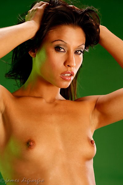
Green and blue are great colors to do this with as green and blue are primary colors not represented in skin tone. That's why green and blue are used in production for matte keys. (e.g., green screen and blue screen for video and motion picture CGI effects.)
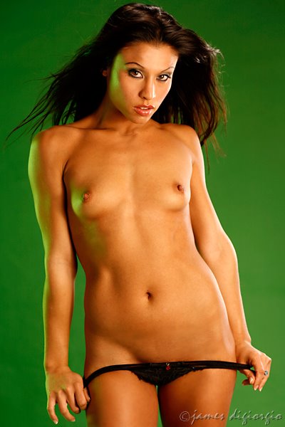 If the client wants green, that's great. The graphic artist can later manipulate the green without effecting skin tone. Same goes for blue. I'm not talking about those times when they want to "key" another image using the green or blue. That requires a different lighting approach. One where the BG needs to be lit separately, brightly, and as evenly as possible. Also, with lighting designed to separate the subject from the BG in order to get a clean "key." Proximity to the BG is also an issue as you don't want the green or blue bleeding onto the model. When this happens, it's a recipe for disaster in terms of making a good, clean, "key."
Instead, I'm talking about working with a specific color and having that color appear, realistically, as a "bleed" onto the model in the final artwork. Note: If you get called on to do this kind of work its even more important that you better understand post-processing. What you do in production should aid the graphic designer, not make their jobs tougher on them.. Plus, the graphics people are usually speaking with your clients after your job is done. A good word or two from them helps get you more work. What you don't need is the graphics people telling the client your work sucks and makes their lives miserable.
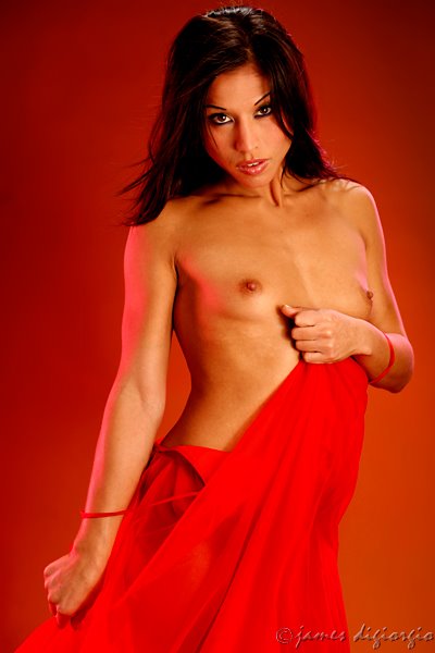 Sometimes other colors are requested: Colors that are represented in skin tone. This means a bit more attention needs to be paid to how you're working the gels as post-production manipulation of that color will, most likely, effect skin tone.
The model accompanying this post is Jana. She was also featured in yesterday's post in case your forgot her already. Anyway, Jana is providing actual and educational examples of the use of colored gels and BGs, rather than simple eye candy-- Hey! This is an educational blog, right? None of you come here just to see the pretty naked chicks, right? MUA Lilian. All shot with a Canon 5D w/85 prime. ISO 100, f/4.5 @ 125th.
No comments:
Post a Comment