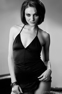
Believe it or not, some models aren't humble people. Who would'a thought? In fact, some of them are outright obnoxious in their "Yes! I *AM* all that!" attitudes. I'll admit, the majority of glamour models I've met are not Divas but I've met enough of them who are to make it worth mentioning and writing about.
I've found there are two, basic ways to deal with Divas: 1) Behave as if they are all they think they are or 2) Be very assertive in dealing with them. (In other words, a good defense is an agressive offense.)
Knowing when to apply either strategy is, of course, the trick and, frankly, that's not something I can illuminate anyone on: It comes from years of experience and it's not an exact science. Often, anyone's guess is as good as anyone else's guess.
My instinctive response to dealing with Divas is to be assertive. Sometimes this is a huge mistake. After all, the goal is to get the goods and to use any means (short of physical force or threats) to get those goods, i.e., quality images. (Not that I haven't considered the use of force a few times.) Fortunately, Divas often have fragile egos and, in spite of their attempts to appear otherwise, a few carefully-aimed, subtle attacks on the Diva's ego will sometimes straighten them out a bit; at least temporarily and, hopefully, long enough to get what you need from them.
Here's an example:
Me: What size shoes do you wear?
Diva: Six
Me: Really? Your feet look so much bigger. It must be the cut of those shoes.
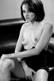
There are more than a few sub-categories of Divas but, generally, they all can be lumped into one, overall, SDB, classification. (SDB = Self-Deluded Bitch.)
In some cases, I can assess the Diva-ness of a model by listening in on the conversations taking place in the makeup chair and observing the model's interaction with the MUA. Usually, the first person a Diva reveals herself to--as a Diva--is the MUA. The Diva may do this either through rude or condescending words or overly dramatic, negative body language or a combination of both. Through remarkably insensitive commentary and not-so-subtle innuendo the Diva lets the MUA know--assuming the MUA is a female--that there's a reason why she, the Diva, is sitting in the chair being further beautified and the MUA is not. Of course, no matter how outstanding a job the MUA performs, it's never good enough for the true Diva. Fortunately, experienced MUAs are accustomed to this and usually have quite thick skin.
The next person on the Diva's Hit List is the assistant if that assistant is a male. Of course, the Diva's approach to the assistant is different than her approach to the MUA. Instead of alienation, the Diva enlists the assistant to become her worshiping ally and all-around bitch-boy. She will often treat the assistant quasi-kindly in a kneel before me, knave, and my beauty will smile upon you sort of way. If truth be known, assistants often fall for this manipulating crap and sometimes need reminders of who is paying them and why they're on the set.
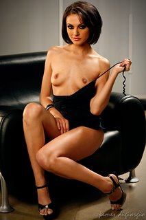
MUAs and assistants aside, the principal focus of a Diva's Diva-ness is directed at the shooter. It usually begins with the Diva providing an oral resume of her lofty accomplishments including, but not limited to, which well-known photographers they've shot with (and how good their images were and how they cannot be equaled), which magazines her beauty has graced, how she accepted this particular job as a personal favor to someone, and/or a recounting of all the shooters who have hit on her and how laughable, pathetic, and futile those attempts were. Example: "I was shooting with so-n-so for such-n-such magazine and he wouldn't stop hitting on me. It was so laughable. As if!"
Divas, of course, understand why shooters hit on them: Who can resist their beauty, charm, and sensual allure? The Diva often sees these incidents as comical in a gross-is-funny sort of way. They view the offending shooters as annoying, feeble, and pitiful but understand it's a part of the job their beauty condemns them to endure.
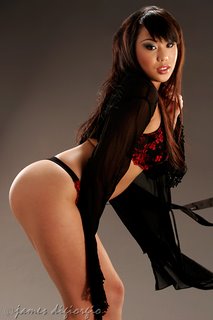
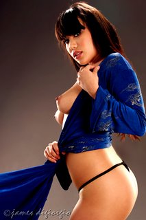
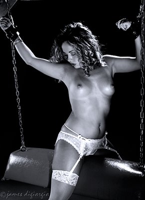
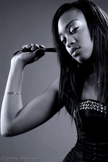
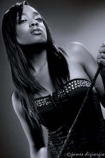
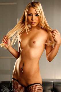
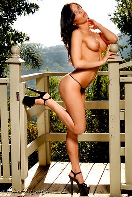
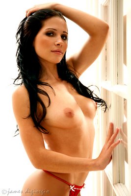
The usual and customary pretty girl pics accompanying this post are of Naudia. Please be advised I'm not infering that Naudia is a Diva because her pics are posted with this little essay. Naudia unabashedly describes herself as a Psycho Bitch from Hell and, as opposed to Divas, PBFHs are different animals altogether. MUA was Liliana. All captured with a Canon 5D w/85mm prime.
Thursday, August 31, 2006
Wednesday, August 30, 2006
Canon's New 400D
Just when you thought it was safe to purchase a new camera, they come out with something even newer. I'm not sure Canon, or other companies, realize how the proliferation of new camera bodies might actually cause some potential consumers to hold off on buying.
It's like computers: Everytime I think about getting something new I end up holding off on buying because I'm concerned that the moment I buy it, something newer and faster and better(?) and, let's not forget, less-expensive might be released.
Anyway, Canon's new EOS 400D (I believe they're calling it the Rebel xTi for U.S. distribution) boasts, amongst other improvements, 10.1 megapixels and a new DiG!C II processor. If you want to learn more about it, you can click HERE.
Personally, I think buying a new camera should have everything to do with your personal needs. When I bought Canon's 5D, it made sense to me as I was mostly interested in upgrading to a full-frame sensor. The megapixels weren't as important to me and, frankly, if the 5D's megapixel count were around 10 mp, rather than 12 mp, I still probably would have purchased. Why? Because I wanted to be shooting with a full-frame sensor so that my glass would perform as it's supposed to perform. The larger LCD on the back of the 5D was also a much appreciated addition but it wasn't a large part of my buying decision. The 5D's 2-1/2 inch LCD, by the way, is fairly useless outside, in daylight.
Photokina is right around the corner and some people are expecting yet another Canon product to be unveiled-- possibly a 40D? Who knows? Well, I guess Canon knows but they're not saying anything... yet.
The gratuitous eye-candy accompanying this post is Alexis. Sorry if I might have posted these pics before. I don't know if I did or didn't but it seems like way too much work to go back and look through previous posts to see if I've already posted them . Besides, if I did post her pics before, she's easy enough on the eyes to look at again.
Tuesday, August 29, 2006
Motion in Still (Glamour) Photography
I've noticed that, sometimes, an element that takes an image to higher levels of appreciation is the addition of a sense of motion or action in the photograph. It seems to me that many glamour portraits are static. Not merely static because they are a still image, but static when the image was captured. In other words, they are static images of static subjects.
That's not to say a static image can't be a fantastic image, it can, but as shooters we should remind ourselves that we live in a world in motion and although we are capturing frozen moments in that world, those frozen moments can sometimes have quite a bit of impact when motion is captured.
It's much like our attempts to add depth to our images. Photographic images are two-dimensional. But we often strive to add the illusion of a third dimension. We do this, for instance, with lighting or by manipulating the depth-of-field. We also occasionally accomplish this by adding elements to the foreground or by clever use of perspective. There are many ways to add a (seemingly) third-dimension to two-dimensional images.
But as I view many glamour images, my own included, I can't help but notice the element of motion is often neglected in many shots.
The most obvious way to capture motion in still images is to have the model in motion while capturing her. Shooting with flash photography makes it fairly easy to freeze motion while keeping it sharp. We've all seen, for instance, excellent examples of photography that captures a model leaping into the air. Sometimes these images are quite dramatic and made moreso by clever manipulations of the shutter, the flash, post-processing techniques, or a combination of these techniques. There are also less dramatic and obvious ways to capture motion that still can heighten appreciation of an image.
Let's say you've instructed the model to lose her top, i.e., remove it. Why wait for her to do so? Instead, why not have her slow the process down and have her dramatize it a bit--play with it--while you continue clicking the shutter? Most of us are shooting digital so it's not like we're burning film.
I've also noticed that, sometimes, the most engaging expressions take place while a model is in motion or is just completing some action or motion. One directing technique I sometimes use is to pose the model's body then have her lower her head--I mean really lower it so her chin is touching her upper chest--and have her look at her breasts. Then, I'll ask her to simultaneously (and slowly) lift her head and, as she does, to find the camera and make eye contact. Often, the resulting image includes both a subtle sense of (faux) motion accompanied by an expression that seems more candid and honest. I like having the model do this because I know that, somewhere in those images, odds are there's going to be a fairly dynamic keeper that includes many elements I'm looking to capture-- e.g., motion and a more realistic expression.
If you're not already doing so, try adding motion to your still images next time you shoot. I think you'll find some keepers of your own as a result.
The models accompanying this post are, from top to bottom, Kayla, Kori, and Andrea.
Monday, August 28, 2006
Pretty Boy Shooter?
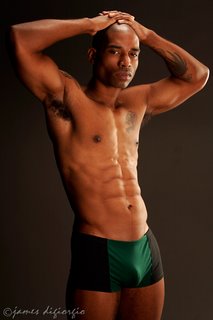
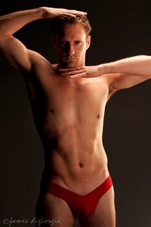
Not very long ago, I was hired to shoot for a small clothing company. It was for a new men's underwear line they were coming out with and they picked me because, according to them, I was more experienced shooting skin than the fashion shooters they were considering.
I had never shot this sort of stuff before. When I asked what they were looking for, the designer simply said, "A bit dark and edgy."
How dark and how edgy I did not know. After all, "dark and edgy" covers a lot of ground. But I didn't want to sound like we--the designer and I--weren't on the same page so I nodded and intelligently replied. "Aaaah. Okay." Synergy is an important thing, especially between a designer and the person who will photograph their designs.
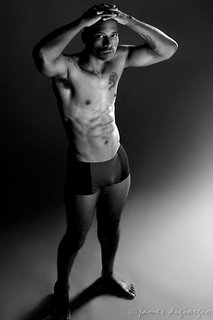
I did some homework before the shoot. This mostly consisted of combing the internet for images of men in underwear. I put concerns about my heterosexuality (remaining intact) on the back-burner as I Googled with key-words like, "men" and "male" and "underwear." This took me to plenty of sites with examples of good-looking, scantily-clad men with lean, muscular bodies, primping in their skivvies. I also Googled for "Calvin Klein" and "underwear ads" and those results were fairly helpful altho I knew the designer wasn't really looking to emulate Calvin Klein's ads. (Although the last image I'm posting with this entry sort of steals from that well-known Calvin Klein undie-ad featuring Marky Mark.)
Since the fashion folks wanted the images shot on a seamless, my biggest concern was posing the models. I was confident I could do something that qualified as "dark and edgy" lighting-wise without too much of a problem. Most of my experience, however, is with women: Posing them in provocative, sensual ways. I figured "provocative" should remain somewhat in the equation but I wasn't sure "sensuous" was what I should be going for. At least, not from the perspective of my personal definition of "sensuous."
I went to the forums and asked for advice. One forum contributor wrote that, instead of making an "S" with the models' bodies, I should make a "C." It seems "C's" are more masculine than "S's" which, I suppose, is a little-known quirk of the Roman alphabet. I thought about asking someone I know--someone who happens to be an English teacher--if that were true, i.e., if "S's" were feminine and "C's" masculine. But I tossed that idea out. After all, what do English teachers know about photographing people in the buff or near-buff, right? (Well, most English teachers, that is. I'm sure there might be a few who do.)
In the end, the shoot went fine. The models were easy to work with. They were very macho guys! Interestingly, the models were more concerned with me shooting them in a masculine manner than I was. The designer and the "fashion marketing consultant" he brought along with him seemed satisfied with the images. The MUA, Davia, was noticeably more happy working with these "hunks" than with the usual pretty girls.
Sorry, but I don't recall the names of the models. Images were captured with a Canon 20D w/ 85mm prime, ISO 100, f/4 @ 125th. As I recall, I used two light sources: A Mola beauty dish camera right and a little behind the models and a small softbox, boomed overhead, from behind. I also set a 3' x 5', white, reflective panel to bounce fill back in from the front.
Sunday, August 27, 2006
Photographic Alter-Ego
Do you ever get bored with who you are photographically?
Sometimes I do.
I have a comfort zone where I shoot most of my stuff. (Probably many of you who have one of these as well.) I know what I'm doing in that comfort zone. I know my way around it and I rarely become lost, dazed, or confused while there. It's safe and secure and I feel right at home in my photographic comfort zone.
Clients, when they hire me, most often expect images produced in my comfort zone. My comfort zone has consistency and dependability and they like that.
I have one client who became concerned when I shot a few images outside my comfort zone. My big mistake was including those images on their CDs along with the images they expected from me, i.e., the images shot in my comfort zone... the images they hired me to shoot.
"What's this stuff?" They asked.
"We had some extra time. I thought I'd try something a little bit different." I said.
"What are we supposed to do with these? We can't use these. They're too artsy or weird or something."
"I don't know," I said. "Do whatever you want with them."
"Well, we can't use these."
"Then don't use them." I advised. "Did I shoot everything you need?"
"Yeah." They said.
"Then what are you worried about?"
"We're not worried," they said. "We just don't know what we can do with them."
The lesson I learned was this: It's not always a good idea to give a client what they didn't ask for even if you've given them plenty of what they asked for, especially when you give them extra images, bonus shots, that aren't what they asked for or expected. (At least, some of my clients are that way.) It seems they don't want bonus images even when it costs them nothing more for the extra shots. (Unless it's more of the same-- the same being what they asked for to begin with.)
There are other risks associated with shooting outside one's comfort zone, other than confusing one's clients, that is. For me, the most obvious risk in shooting OMCZ (Outside My Comfort Zone) is that, since the images are unlike what I'm accustomed to producing, i.e., what I know--backwards and forwards--how to produce, they might suck. They might also be better than what I usually shoot but there's a greater chance they might suck. (Common Sense Note: Shooting images that suck while shooting on someone else's dime is probably not a great idea.)
But even when shooting OMCZ on my own time, the risk of producing images that suck might not be something I want to associate myself with. Yeah, I probably want feedback on them. But I'm not sure I want feedback with my name attached to them just in case the images suck even worse than I think they might suck.
So I'm thinking an alter-ego might be a good idea. You know, creating the guise of another shooter when trying out things that might have a good chance of not being received so well. This way, it's my alter-ego that risks a painful bruising; not my main, everyday ego.
So here he is, the new kid on the block: Photographer, Creme Rinze.
I'm thinking I'll let Creme run all the risks. And if Mr. Rinze comes up with some stuff that's half-way decent,I'll work the credit back my way. I might even let Creme write a few posts for the blog. He'll probably offer a totally different perspective than JimmyD does, I mean I do, and if it turns out he's out in left field, Creme, that is, that's Creme's problem not mine.
The images accompanying this post are of Kammi. They were captured by photographer Creme Rinze using a Canon 10D w/28-135 IS USM. They're not my style at all. And the post-processing is all Creme. But hey! Each to their own, right? In the future, I might let Creme borrow my 5D and see what he can do with that.
Saturday, August 26, 2006
Paralysis by Analysis
As someone who spends a fair amount of time on various photographer forums, I've noticed that, at times, images are overly critiqued by other shooters. I've never been one to endorse the simple Attaboy! critique or the That sucks! comment but, conversely, I think images can be over-analyzed and this can lead to artistic paralysis.
Sure, the Devil is in the details. Of that I am certain. But there's details and there's details and, frankly, some details are barely worth mentioning if at all. Or, they fall into subjective areas that are so hyper-critical (and a matter of personal taste) they serve no constructive purpose. Instead, they sometimes cause the photographer to over-analyze his or her own work to the point where the analysis itself becomes counter-productive to growth.
Back in the days when I was a corporate guy, I worked for a Fortune 200 company that, on and off, tried to be something of a Rennaisance corporation in terms of employee relations. ("On" when business was good, "Off" when it wasn't.) One of the phrases officially endorsed by top-level management (and largely ignored by middle management) was "Catch someone doing something right."
I think this catch-phrase is suitable for critiquing others' photography as well as one's own. Sometimes, far too much time is spent on finding something wrong in an image. Doing so can counter growth as much as the simple Attaboy! does nothing to enhance it or to tell the shooter what it is that "works" in an image. If you look hard enough, you'll certainly discover flaws in any image... even mine! (Hehehe... Just kidding.)
One forum I routinely visit used to have a rule that said anyone providing critique must also post an image (of their own) with that critique. I never understood that rule as it seemed to say that opinions were only valid coming from people who also pursue the same kind of work, whether professionally or as an avocation.
Photography, like most artistic endeavors, shouldn't merely be judged by its peers since it is largely intended for non-peer viewers. When it comes to art, everyone's opinion is valid as art's impact is in the eye's of the beholder and the vast majority of those beholders are probably not going to be artists themselves. Try writing and publishing a novel and expect its success to be based merely on the critical responses of other fiction writers. See where that gets you, commercially speaking.
Personally, I think the best photo critiques include both what someone likes and doesn't like about an image or, in the case of images that "Wow!" the viewer, a few words on why it does so. Critics shouldn't be looking too hard to find something trivial wrong with an image when, in fact, they like the image. On the other side of the coin, I think critics should look to find something right in an image even when, for the most part, they believe the image has serious problems. Both of my opinions in these matters are designed to facilitate someone's growth and not throw them into a constant state of self-doubt and, I'll readily admit, I don't always practice what I preach.
The gratuitious eye candy featured in this post is Aveena. Captured with Canon 5D, 85mm prime, ISO 100, f/5.6 @ 125th. MUA Terese Heddon. Assistant Cippy.
Friday, August 25, 2006
Phetish Photography
I find shooting fetish images creatively satisfying. I don't shoot them often but, when I do, it takes me to realms unlike most of what I shoot... and I find it refreshing.
When shooting fetish, it requires having a higher level of trust between the shooter and the model, especially so if there's a bondage element in the images. It's an uncommon model who will show up for a shoot with a photographer they've never met before--most especially if the shoot is of a TFCD nature--remove all or part of her clothing and allow herself to be restrained.
Sure, there are experienced fetish models who are more likely to be at ease in situations like this, especially if they're very experienced, but, for obvious reasons, these models are less likely to be participating in TFCD shoots.
When shooting fetish images, I try creating a somewhat ethereal quality to them. I attempt this through the lighting and by shooting the images from interesting, somewhat less-than-usual, angles. (Leastwise, somewhat less-than-usual for my usual.)
I also sometimes like shooting from a place where it seems I'm peeking in on what's going on, as if the model is unaware of my presence. Often, when shooting in this genre and once I start clicking, I try to be as silent as possible. It seems to me, for the model, and particularly if she's blindfolded, my silence heightens the tension between us and, sometimes, that tension translates to the images.
As for the lighting, one way to create an ethereal quality as well as a foreboding sense, is to put the mainlight low. (I've wrote about this before, right HERE.) Horror movie directors, for quite some time, have known this is effective gimmick. I'm not saying I try to make the images look like frames from a horror flick--I do try to fill some of the horror flick-like shadows--but a subtle form of horror movie lighting is, in my opinion, fairly effective when shooting fetish.
The model who put her trust in me while shooting these images is my good friend Kori Rae. Images were shot in my studio with a Canon 20D w/28-135. No models were (ever) injured in the production of these, or other fetish photographs I've snapped.
Thursday, August 24, 2006
Skill v. Talent
Yesterday, I blathered about the so-called "secrets" of glamour photography. In that post, I contended there are no secrets. I also may have sounded as if I was dissing the skills or, at least, the claimed "secret" skills of experienced and notable photographers. I still maintain that none of them know anything, skill-wise, that anyone else cannot learn. But skill and knowledge aren't the same as natural talent.
When it comes to photography, talent resides in what many call the "eye." You've seen the comments, "Great eye!" and "He certainly has an eye!" or "She has the perfect eye!"
The "eye" is another word for a photographer's inherent talent and natural, artistic, sensibilities. A natural eye for composition is a good example.
Sure, there are rules to composition and anyone can learn them. But some people have an eye for it. They see an image in their viewfinder and they automatically frame it or, in the case of pretty girl shooting, they direct the model in ways that the total composition of the image--framing, angle, pose, everything--whether it adheres to the rules or not, simply works.
I'm not sure you can teach stuff like this to anyone. Either they have it or they don't.
It doesn't mean without that natural and gifted "eye" photographers can't learn the rules and then go out and shoot some really great images. They can. For the most part, however, most of what they'll shoot, even when it's spectacular, will conform to learned rules. And it is often missing something that is, artistically, uhh... over the top. Something that I can't explain and don't fully understand myself.
Shooters with a great "eye" just naturally know when everything looks right in an image. Not just composition, but a whole host of other artistic characteristics. I suppose that's why some go on to become celebrated artists and most don't.
There are also varying degrees of the "eye." Some have an "eye" that takes them to the heights of artistic appreciation. Others have an eye for some things and not for others. ("He sure has an eye for color!") Others have a pretty good "eye" that takes them to lesser degrees of artistic appreciation but, perhaps, high degress of commercial success. Unfortunately, some people just ain't got it. The good news is, I've seen more than a few cases where photogrpahers, over time, have developed an eye. I'm not sure how this happens. It must be that shooters like this had the eye all along but it was latent and refused to participate in the artistic process until, all of a sudden, it pops out of the closet and says, "Here. Let me handle this."
Aneesha is the featured model for this post. (Sorry, she doesn't do nude.) I captured her with a Canon 20D w/85mm prime in my studio. Monochrome conversion done in post with the "channel mixer." In the second two images, I added a hint of blue. Don't ask me why... seemed like a good idea at the time.
Wednesday, August 23, 2006
Revealing Secrets
Since I began blogging about pretty girl shooting, i.e., glamour photography, I've gotten a fair amount of emails from people who have thanked me for sharing some of the (supposed) secrets of shooting pretty girls.
Go figure, right?
Even Walter Melrose, the inventor of the Mola beauty dish, who once wrote to me and commented on this blog, said "As a shooter myself, being honest and open about the work we shoot and how we shoot it is not something most of us are comfortable with."
First off, I don't get it. Photographers aren't Masons or members of a Photo Illuminati or some other secret organization whose practices are closely held secrets. At least, no one's invited me to join some secret order of photographers. (And I guess they never will after writing this blog.)
Photographers' techniques aren't closely-held trade secrets. Those shooters who think they know something no one else does are simply flexing their egos either for their own benefit or the benefit of all those who (they've convinced themselves) are awed by their skill.
I do, however, understand why some people seem to think a lot of this is secretive: Some people look at the work of others and can't figure out how it was accomplished. For this reason, they regard those images (that confound them) as being the results of magical, mystical, secret processes and techniques that the photographer has kept close to his or her vest... As if it's Photo-Alchemy.
Photographa's please! (Nod to Mr. Chris Rock.)
There is such an affluence of information out there -- be it on the web or in your library or at bookstores or through seminars and workshops -- designed to help novice shooters develop technique and style that it's almost overkill. (There's also a flatulence of information... but that's for another blog entry.)
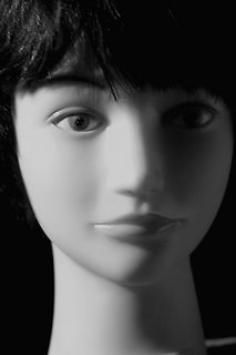
All anyone needs to do is take the time to seek out this abundance of information and learn from it and then practice what they've learned. You don't even need a live model to practice some of it--just get yourself a mannequin and shoot dummies till you get a live victim in front of your lens! That might not be as exciting as having living, breathing, eye-candy molding their bodies and expressions into sensuous forms, but you'll work out some of the kinks in your lighting and other techniques.
Personally, I can read photos. That is, I've done this long enough that I can look at what other people do and reverse-engineer it (for lack of a better term) and could shoot the same (or very similar) images based on what I'm reading in the photo. (Assuming, of course, I had all the same ingredients: Model, MUA, location or set, wardrobe, gear, etc.)
Recently, in one of the major photo rags, there was an article (with pictures) that featured a photographer recreating well-known glamour and/or fashion images. (Sorry, I can't remember which magazine or when.) The magazine showed the original images and the re-creations with some BTS shots (Behind-the-Scenes) of what it took to accomplish the image facsimilies. It was uncanny how well the original images were re-created. So much for the closely-held secrets of some Masters of Photography.
I guess what I'm saying is that as technology makes it easier and easier for people with minimal knowledge and experience to capture passable images, many people have become lazier and lazier in terms of learning the basics of the craft. Unfortunately, this reliance on technology almost guarantess that, for those who strictly rely on it, "passable" images are all most of them are ever going to accomplish.
I don't know about many of you, but I'm not satisfied shooting "passable" images. While some of you might believe I've reached a level of skill and experience that allows me to frequently shoot above the just "passable" mark, I still spend considerable time researching-out and learning new ways to capture images that aspire to higher levels of competency. It's about taking the time to learn and practice and hone one's craft. It's called paying one's dues. Something I see less and less willingness to do amongst younger photographers these days.
I've said it before and I'll say it again: When it comes to learning how to produce quality photography, there is no instant pudding!
Okay, I'm off my apple box and done lecturing. The lovely lady accompanying this little mini-rant (not the dummy, the other one), is Alexa Lynn. Images were captured with my Canon 5D with an 85mm prime hooked to its bow. ISO 100, f/5.6 @ 125th. MUA was Lilliana. Three light sources were used: A Photoflex 5' Octadome for the mainlight, a Chimera strip behind her on one side and a small umbrella overhead and behind her from the other side.
Tuesday, August 22, 2006
Light Power
A friend of mine called me today. He's a gaffer... a lighting guy. He's just getting into glamour photography and wants to buy some strobes. This is a guy who has just about every professional, motion picture, hot-light known to man (and plenty of each) plus a 5-ton, fully-loaded, grip truck and now he wants strobes.
Anyway, he's looking at a bunch of different monolights and he asked about power, as in wattage, make that watt-secs. Apparently, he came across a decent deal on some off-brand strobes but he's concerned they're not powerful enough. He said they're 500 watt-secs. I said that's plenty. But he keeps thinking he needs more power, like 800 watt-secs or more. I asked him what for? I continued by telling him if he's going to shoot glamour girls, he'll be keeping those lights in close. "You don't want hard lighting on the girls, do you?" I asked. "Not for glamour," I added. "At least, not generally."
He said he didn't and I said okay and added he'll want soft light and to get soft light he'll need to keep the light in close, probably bouncing off an umbrella or shooting through a softbox. After all, when you move the light further away (which does take more power) it will also cause harsh shadows, "So what do you need more power for?" I asked. (Power which, BTW, was going to cost a lot more money.)
He began to see my point. In fact, he told me he can almost purchase two of the 500 watt-sec monolights for the cost of one 800 watt-sec. "No brainer!" I said. "You need at least two monolights."
Then we got to talking about other characteristics I might look for in a monolight and, just as I told him, I'll share here my short, personal list of important characteristics for monolights to be used in glamour photography: Durability, recycle time, how well the light maintains color temperatures at the lower output settings, and the ability to variably adjust the power output. Oh, and a modeling light too! Preferably, one that "tracks" with the power output setting.
I also told him I'm quite happy, power-output-wise and everything else, with my Novatron M-300s and M-500s which are 300 and 500 watt-secs respectively at their high settings and less than half at the lower settings. Each of them, by the way, allow me to "switch" and/or "dial" variable output settings.
The model accompanying this post is Riley. I shot her last week at a location where I shot a few other pretty girls I posted here. MUA was Melissa. Assistant Reno. Captured with a Canon 5D w/28-135 IS USM, ISO 100, f/5.6 @ 125th. Here's another of the lovely Riley below.
Monday, August 21, 2006
The Octadome
Prior to a year or so ago, before buying my Mola Beauty Dish, my most-often used mainlight modifier for glamour photography was a 5' Photoflex Octadome. Since purchasing the Mola, I haven't once used the Octadome. But all that came to an end on Saturday. After spending a week on locations using umbrellas, I decided to pull out my Octadome and take it with me to Saturday's location.
I've been spoiled by the excellent lighting characteristics of the beauty dish and had somewhat forgotten that octadomes also produce superb lighting characteristics for pretty girl shooting, most especially the Octadome's wrap-around qualities.
Sure, you lose the fall-off inherent with the beauty dish, and the dish also produces nice wrap-around lighting, but Photoflex's Octadomes provide terrific glamour lighting. Personally, I don't own a grid for my Octodome but, even without one, this softbox provides better light control than a large umbrella which scatters light everywhere.
The model accompanying this entry is Kat. MUA was Liliana. Images captures with a Canon 5D w/85mm prime, ISO 100, f/5.6 @125. Photoflex 5' Octadome used as the mainlight with a Chimera strip behind and to the left and a small, silver umbrella behind the model from the right and above.
Sunday, August 20, 2006
I've Been A Workin' Fool!
No rest for the weary. It's tough to maintain this blog when I've been working almost everyday. Not that I'm complaining. Work is good. Make that, making money is good.
If any of you are, like me, self-employed, you know it can be feast or famine unless you're already wildly successful... which I certainly ain't. Since everything seems to run in cycles, this past week or more has been an up-cycle which also means I'm off and running early in the day and not back till late at night. (This most recent up-cycle has been a location cycle, a shooting-somewhere-else cycle, that is, a shooting somewhere other than my studio cycle.)
Yesterday, for instance, I had to be at another studio at 8:00 A.M. That hurts! I ain't a morning person. My idea of a civilized call time is noon. Being at a location by 8:00 A.M. means I have to get up at 6:00 A.M. which, to me, is still night-time. And then, sometimes, like yesterday, the shoot goes until 1:00 A.M. and by the time I pack my stuff at the location, drive back home and unload, it's 3:00 A.M. and then I have to unwind so I don't end up crawling into bed till about 4:00 A.M. or so and, frankly, that's way too many A.M.s for my liking.
In all, I shot six pretty girls yesterday. Two of those models, Charlie and Nautica, accompany this post and are from yesterdays bevy of beauties. Charlie is at the top, then Charlie and Nautica, and finally Nautica, by herself, in the last image.
All the images were digitally captured with a Canon 5D with an 85mm prime on board. I shot at ISO 100, f/5.6 @ 125th. MUA was Liliana. No assistant so I'm doubly tired today. I used three lights for everything: A 5' Photoflex octagon for my mainlight, a Chimera strip and a small umbrella from behind and on either side.
Friday, August 18, 2006
90% There
I hate it when I can't quite capture the images I want. It's like the images are 90% there but that missing 10% really pisses me off. When this happens, the more I try to get that last ten percent, the more frustrated I become. Yesterday, that's what my day was like.
It's not that the images are bad. It's that they're not quite what they could be or should be or, more importantly, what I wanted them to be. To make matters worse, in most of the images I can't always put my finger on what the missing part might be. And it wasn't that each image had the same thing that wasn't right or seemed slightly not quite there, it was that each image seemed to have something different wrong or not quite going for it!
Was it the light? Exposure? Framing? Me? Her? The photo Gods? Something else?
It's alwasy easier when I can blame the model. But, in this case, I can't. She was great: Easy on the eyes, quite sexy, experienced in front of the camera, workable, pliable, flexible, and amenable.
I wanted to blame the sun because it was being difficult in terms of the time of day and the orientation of the location's property to it but that's just technical stuff and I should have been able to overcome that.
My assistant, Tim, was sensing my frustation and did his best to be my third and fourth hands. He also kept his mouth shut which is a good thing when I'm becoming flustered. Unfortunately, that didn't really help.
I suppose, in the end, I can only blame myself. In fact, that's exactly what I'm doing. But blaming myself would be a whole lot easier if I could put my finger on what's missing or wrong or not quite there in the captures. In other words, I still can't really figure what it was I was doing that wasn't getting the goods and that really drives me nuts!
Oh well, by the time I shoot my next victim I'll have forgotten all about this set of almost good images. The client was happy and I suppose that's what mostly counts.
The model is Vanessa. The MUA flaked--which did'nt help--so Vanessa did her own makeup. Tim was my Aziz. Canon 5D w/ either a 28-135 or an 85mm prime. ISO 100, various apertures in and around f/8 or so @ 125th. Here's another of the lovely Vanessa.

Wednesday, August 16, 2006
Language Barriers
Interesting shoot today: The model spoke no English and I speak very little Spanish -- about enough to order food in a Mexican restaurant -- and, to make matters worse, Rebecca is from Barcelona, Spain. Why is that worse? Because, if I'm not mistaken, they speak Castilian in Barcelona and Castilian ain't the same Spanish I order my burritos with... so my limited Spanish language skills were even more useless.
I was also not in the best of moods when I arrived at the location. I had just come from my doctor's office where I had a physical. About half-way through it, as he was checking for a hernia, asking me to cough, and I was trying to say something along the lines of, "So, how about those Mets?" the good doctor told me he had some bad news. I said, "Give it to me, Doc." And, with that, he explained he needed to perform a prostrate check as he slipped on the latex gloves and produced a tube of lube from a drawer in the examination room. If you know what prostrate exams are all about you know why I wasn't in the pleasantest of moods.
Back to the shoot.
Since Rebecca spoke no English and there was no one on the set to translate I was forced to resort to sign language and demonstrations.
Usually, when I demonstrate poses I preface them with warnings of how silly I'm about to look and assurances of my hetero-masculinity as I make like Madonna and strike a pose or two or three or more. Maybe I'm being homophobic but, regardless, since Rebecca was mono-lingual in Castilian I couldn't make excuses for how, uhh... un-manly my demonstrations might seem. Bear in mind, I'm in my fifties and I'm only in shape to the extent that round's a shape so you can imagine what I look like demonstrating pretty girl poses for a luscious young lass.

That's two embarassments in one day, albeit I was much more comfortable with this, the second one.
For those interested in how I lit these images, Rebecca is in a very white entryway with French windows-and-doors running down one side of it. There was a large, overhead, transluscent skylight above. We shot these in early afternoon so the sun was high in the sky. I placed a monolight on the other side of the French windows on a stand with a small, silver, umbrella. To Rebecca's left, I set another monolight with a large silver umbrella. She was front-lit with daylight coming in from the skylight and reflecting off the white walls and white stone floor. Reno, my assistant, held a large, round, gold reflector to warm her up a bit. I shot with the white balance set for strobes. I metered for exposure to the ambient daylight and stopped down a little. The strobes were set to fire a bit hotter than my exposure.
BTW, there's not much post-processing to these images. Rebecca might appear as though I liberally applied Gaussian Blur but, in actuality, I applied almost none. The light was incredibly soft in that entryway. Mostly, the post consisted of a little cropping, levels adjust, and clone-stamping out a few stray hairs and a couple of body blemishes.
Credits: Model Rebecca, MUA Melissa, Assistant Reno, Canon 5D w/28-135mm, ISO 100, f/9.0 @ 125th.
Here's another shot of Barcelona's wickedly-cute, Rebecca.
Monday, August 14, 2006
Who's That Behind Those Foster Grants?
I'm probably dating myself but I can remember when the famous Foster Grant eyewear advertising campaign began. According to Advertising Age Magazine, it was one of the Top 100 ad campaigns of the 20th century. Of course, I'm talking about Foster Grant's "Who's that behind those Foster Grants?" campaign which began 1965.
Yeah, I can still remember when those ads first started to appear. And I remember thinking, "Damn! Those people do look good in Foster Grants." I wasn't sure I wanted an actual pair of Foster Grants and, since I was still in public school, I was pretty sure I couldn't afford them. But I was also sure I'd look way cool sporting some kind of dark-glass eyewear. At least, I was sure of it regardless if anyone agreed. In fact, to this day I feel naked if I'm out in the daytime without a pair of shades on. I'll bet some of you feel the same way.
Even though I hate covering a model's gorgeous eyes, I still like shooting them wearing shades. Often, when I'm shooting, I'll ask the model if she has a pair of sunglasses with her and, if so, I'll have her put them on and snap a few. I also go to thrift stores frequently--looking for props and sometimes wardrobe--and I always look to see if they have any cool sunglasses for sale. What makes it even cooler is, if they do have some interesting pairs of shades, they're usually priced at 99¢ which is right in my thrift store price range. Just the other day I found a bomb pair of shades with dark magenta lenses and (sort of like) tortoise shell/cheetah skin frames. I haven't shot them yet but I will. Soon.
If you're wondering who's behind those Foster Grants in the pics I posted with this, her name is Paris. MUA was Terese Heddon. Images were captured with a Canon 20D (before I bought my 5D) with an 85mm prime on board, ISO 100, f./5.6 @ 125.
Here's another shot of lovely, eighteen-year-old, Paris.
Subscribe to:
Posts (Atom)