I'm in the middle of moving and there are few things I dislike doing more. I'm confident there are more than a few of you that feel the same. The move might disrupt updates for a day or two or three. I'm hoping that won't be the case but it may end up that way.
To make matters worse, with all the preparation for the move I haven't had an opportunity to shoot for a couple of weeks and I'm Jones'ing for a good looking model in front of my camera.
Did I mention that moving sucks? It does. It sucks. Moving sucks!
Since today is Halloween, I thought this ghoulishly-processed image of Monica might be appropriate.
Tuesday, October 31, 2006
Sunday, October 29, 2006
Is CG the Future of Glamour Photography?
There are those who believe CG (Computer Generated) is a big part of the future of glamour photography. It's certainly true that CG has improved by leaps and bounds in the last few years. Realism in photo-quality CG is already causing people to look closely at images to determine how much of it is real and how much is, as that old commercial for audio tape once said, "Memorex." When you consider how realistic talented CG artists can now render an image, it's not hard to imagine what it might be like a few more years down the road.
Hollywood jumped on the CG bandwagon years ago. CG effects in movies are now more realistic than ever before and it's only going to become more genuine looking as technologies continue to evolve and emerge. Will they even need actors in the future or will the craft of acting be replaced with real-life-looking computer animation in ways we can't yet fathom?
What about glamour and fashion and commercial modeling? Will we need models in the future? Will they be replaced by the imaginations and skills of animators and computer geeks? I don't know.
But I'll tell you what I do know. Computer animation will never replace or mimic the human soul. No matter how realistic the images become, there will always be a nagging doubt in the eyes and minds of those image's viewers and a feeling that something doesn't look or seem quite right. Computer animators might continue to be able to render life-like images in ways never seen before, but they will never be able to render the human spirit. Human beings will always be able to tell the difference. When it comes to recognizing humans, it takes one to know one. Sure, perhaps some of the people will be fooled some of the time but that's where it ends; with just some of the people.
Here's and example of photo-realistic CG from the artist's intitial sketch through completion. As good as that image becomes as you view each frame in its evolotion, it still doesn't completely capture the essence of a beautiful, sexy woman. I hope it never does.
The real-live, fully-human, model pictured in this post is Alexis. I know she's real because I've touched her... something no computer animator will ever be able to do with their subjects.
Saturday, October 28, 2006
Photographer Mark Daughn
Every now and then I stumble on some other shooter's work I think is worth calling attention to. It's not that I consider myself a critic or anything like that. For the most part, I'm not a big fan of critics. But I do think I'm critically-qualified enough to know exceptional pretty girl shooting when I see it. Mark Daughn is just such a shooter.
Mark is an Austin, Texas, based photographer highly admired for his glamour and pin-up work. He's best known for his work with Mystique Magazine, an online e-zine that features some of the world's most beautiful and sexy women. Mark's also worked with Playboy and is a fashion shooter as well.
Mark's website, which you can visit by clicking HERE, includes terrific examples of the many incredible women Mark has shot. He also shares a bit of his photo-philosophy with his site's visitors. And some of that philosophy -- wouldn't you just know -- agrees with some of my own. For instance, according to Mark, "Anyone can learn lighting. After that it's all about the rapport with the model and your vision."
What have I been telling you people? So much of the "art" of pretty girl shooting is as much about communications and building rapport with the models as it is about photography! Here's an example of one of the ramblings I've made on this subject, RIGHT HERE.
Mark also says, "Live each day to its fullest... you are dead a long time."
I've got to give a thumbs up to that philosophy as well.
BTW, Mark also holds workshops. He has one coming up here, in L.A., in mid-November. If you're interested, you can find out more by clicking HERE.
The pretty girl with the 0% body fat is Naomi. I've posted pics of Naomi before but not these two. I know this as I just monkeyed with them in PS today. The images are from different shoots but both were shot with a Canon 5D w/ 85mm prime, ISO 100, f/5.6 @ 125th.
Friday, October 27, 2006
The Barbie Syndrome
I don't know about many of you, but I look at a lot of pretty girl images that other shooters post on forums and elsewhere-- Some of them are great images, some of them are extremely artless and unskilled, and a lot of them fall somewhere in between; my own included.
For the most part, images I personally rate abysmally low on the quality scale are generally the results of poor photography skills, poor processing skills, and, often, both. The criteria I use when assessing the quality of pretty girl pics are too many to list and many of them are, I'll admit, fairly subjective. But one of the big ones is what I call The Barbie Syndrome.
The Barbie Syndrome is easy to spot: Photographers, usually through post-processing techniques, utilize skin-processing tools that are so over-applied the model's skin ceases to look remotely lifelike. In other words, it looks plastic, synthetic, and very much like the artificial skin of a Barbie doll. The usual suspect? Photoshop's "Gaussian Blur" tool.
Obviously, glamour images (as well as many fashion and beauty images) seek to create a certain level of fantasy and illusion. But it's the level of fantasy and illusion that can make or break an image. Initially, a good MUA goes a long way towards creating the illusion. Soft light and aesthetically pleasing shadow also contribute to the fantasy. Finally, post-processing is the icing on the cake.
Really good processing skills require subtlety in their application. The trick is to hide the manipulation of pixels, i.e., to enhance the image by creating an end-result that looks great without looking artificial. Unfortunately, this isn't always so easy to accomplish and requires greater skill to pull off.
There are many techniques and tools that are designed to help photographers accomplish fantasy and illusion -- as it applies to a model's beauty and allure -- without it appearing fake. There's a term that relates to this: Suspension of disbelief. The term refers to the abilities of viewers (of an image or a movie or whatever) to suspend disbelief in order to go along with what the image or movie portrays as reality. When photographers over-use certain processing tools to create beauty and allure, viewers find it more difficult to suspend disbelief and, as a result, simply don't buy into the model's (phoney) physical attributes; attributes like perfect, porcelain, plastic, skin.
My best advice is to use these post-processing tools discriminately and subtlely. If the results of your processing applications seem artificial to you, I guarantee they'll seem artificial to others. I'm not coming down on tools like "Gaussian Blur." That particular tool can be a fantastic part of your pretty girl processing arsenal. The level in which you apply it, however, can be your worst enemy. BTW, I suggest you always apply this tool in a separate layer. And don't forget there's also an opacity slider that allows you to control the amount of blur that is effecting your image. I am definitely a practitioner of fantasy and illusion but within certain constraints. (Sometimes I practice fantasy and delusion, but that's another, more personal, story.) The bottom line is that less, or the appearance of less, is often more when it comes to post-processing. Let's make pictures of beautiful, sexy women, not beautiful, sexy Barbie dolls.
I finally managed to add a few pics to this post as blogger-dot-com's file upload utility is again working, albeit, barely working. Boy, they've been having a lot of technical difficulties lately! Anyway, the pics are of Nautica who has naturally creamy skin and requires little in the way of Barbie-fication.
Below is a behind-the-scenes shot for you BTS aficionados. I captured this set of Nautica with a Canon 5D w/85mm f/1.8 prime, ISO 100, f/5.6 @ 125th. Sorry if I've posted these before. There's no easy way to go back and look at the images I've posted in the past. Knowing what pics I've posted is mostly guesswork and reliance on my memory which, sometimes, isn't as reliable in these matters as I'd like it to be.
Wednesday, October 25, 2006
New Nip and Tuck Procedure
A new procedure in cosmetic surgery is all the rage: It's eyelash transplant surgery and it's being touted as the new "must-have" surgery for women seeking to enhance their beauty.
This procedure uses the same techniques used on balding men and women by implanting hair from other parts of their heads and bodies. I don't want to think about where the hairs come from when someone wants some curl in their eyelashes.
I'm starting to think pretty girl shooter's who rearrange and modify pixels to enhance a model's appeal -- with Photoshop or other image processors -- have nothing on these cosmetic surgeons.
I suppose models who go through this procedure will spend a bit less time in the make-up chair. After all, applying fake eyelashes is de rigeur when making up a model.
Most common cosmetic procedures aren't something the MUA can do much about. These include breast enhancements, nose jobs, tummy tucks, lip treatments, and a whole variety of other implants and procedures (butt, cheekbones, liposuction, etc.) that have become somewhat commonplace amongst models and many others in Western, First World, female populations.
The pretty girl featured with this post is Natalie. I'm guessing Natalie is no stranger to a cosmetic surgeon's knife. Images were captured with a Canon 5D w/85mm f/1.8 prime, ISO 100, f/8 @ 125th. I used a 5' Octodome for the mainlight/fill and a small umbrella for a kicker in the first image. The sun provided the rest of the light. I don't think Natalie needs to worry much about drowning in the pool. Those internal floatation devices probably provide a lot of buoyancy.
Tuesday, October 24, 2006
StatCounter
I use StatCounter to keep an eye on whether anyone's actually reading my ramblings here. It's a great tool. Not only do you get to see how many people visit your site--and you can look at that data in many ways--but where they've come from. Every now and then, I get a huge spike in traffic. When that happens, it gets my attention. "Wow!" I'll think. "Where are all these people suddenly coming from and why?"
StatCounter always answers that question. By looking at the "Recent Came From" statistics, I can see the sudden surge of surfers are usually coming from a specific URL. I then click on that URL to see why all these people--sometimes thousands of them--are suddenly showing up for a look-see at my blog.
Yesterday was a good example: All of a sudden my traffic doubled and my "page loads" quadrupled and a lot of it was coming from the photography website, Digital Photography Review, AKA dpreview.com. Not only will StatCounter tell you where your site's visitors came from but, in the case of forums, it will direct you to where in that forum they came from. Cool stuff, no?
Regarding yesterday's traffic spike, it seem there was a thread on DPreview in which beauty dishes were being discussed. Someone in that thread mentioned that I had written about the Mola Beauty Dish and suggested others on DPreview have a look. Obviously, the poster included the URL to my article. Then, "Boom!" I get this huge traffic spike! I also looked at the "Page Loads" data and found that, after perusing my Mola post, many of these people decided to look around at a bunch of other pages for some reading or looking at the babes or both.
If only StatCounter could tell me whether people view my site for the photography babblings I author or for the pretty girl pics I post? I guess it really doesn't matter much. Both the words and the pictures are of my making so my ego remains stroked and/or intact either way.
Today's images are of the lovely Leah. MUA was Charlene. Ya gotta love the heart that's in the image at the top. BTW, if you're detail-oriented and you think something looks a little odd with Leah's teeth in the first shot, it's because she has braces... and yes, she's over 18! She's in her twenties actually.
Posted below is a behind-the-scenes shot of the lighting setup for those of you who like seeing that stuff. All shot with a Canon 5D. (Except the BTS shot which I snapped with a Canon 20D w/28-135 zoom.) I used a Canon 85mm, f/1.8 prime with the 5D, ISO 100, f/5.6 @ 125th.
Monday, October 23, 2006
Artist or Craftsman?
According to dictionaries, the words "artist" and "craftsman" overlap each other in their meanings.
A craftsman, so says Dictionary.com, is 1) a person who practices or is highly skilled in a craft; 2) an artist.
Maybe the question I should be asking is whether photography is an art or a craft?
An artist, on the other hand and per the dictionary, is more definitive: 1) person who produces works in any of the arts that are primarily subject to aesthetic criteria; 2) person who practices one of the fine arts, esp. a painter or sculptor; 3) person whose trade or profession requires a knowledge of design, drawing, painting, etc.: a commercial artist; 4) a person who works in one of the performing arts, as an actor, musician, or singer; a public performer: a mime artist; an artist of the dance; 5) person whose work exhibits exceptional skill.
Personally, I consider photography more of a craft and myself a craftsman even if the dictionary doesn't differentiate all that much between the two. That might sound sacreligious to some. I agree that exceptional photography includes many artistic qualities but, at the same time, it usually contains highly-skilled technical qualities for it to be considered exceptional.
Pretty girl shooting sometimes falls into the traditional perceptions of what constitutes art. Often, though, the aesthetic criteria applied to a pretty girl image has more to do with the beauty and appeal of the model rather than the artistic abilities of the photographer.
Who cares about art when she looks like that!
I know this because, more often than not, when I've shown images I've shot to others, it seems like I received more responses like, "Wow! She's beautiful!" than, "Wow! That's a beautiful photograph!" I don't think I've ever had someone say, "Now that's a work of art!" Unless, of course, they were refering to the model herself. I'll admit, some of my work as been accused of being "artsy" but I'm not sure I was being complimented at the time.
While it sounds like I'm going all philosophical with this, it's something to write about and it's not always so easy coming up with subjects to write about nearly every day.
The pretty girl pics accompanying this post are of Aveena who is, IMO, a curvy work of art.
Sunday, October 22, 2006
Photography: A Rodney Dangerfield Profession?
Considering the skill, creativity, and know-how it takes to snap decent images, you'd think photographers would get plenty of respect, right? I'm talking about those who shoot quality images, regardless of genre. And you'd think they'd get that respect not only for their abilities, but for the investments they make in terms of cameras and other gear.
In many people's eyes, though, being a photographer isn't considered a "real" job. And there's a reason for that: Most photographers, it seems, aren't paid very well. Not too long ago, a "photographer," posting on a photographer's forum, told me I should get a real job. This, from a guy who calls himself a "photographer." (Albeit he doesn't claim professional status.) He also is a guy who regularly participates on that particular forum and who attends workshops and other events. Go figure, right? Could it be that part of the problem is photographers respecting each other? I don't know. I'm not a... uhh... whatever people who study those kinds of human behaviors and attitudes might be. A sociologist, maybe? (Sorry if my ignorance is showing.)
According to the U.S. Department of Labor, recent earnings statistics seem to bear this out:
"Median annual earnings of salaried photographers were $26,080 in May 2004. The middle 50 percent earned between $18,380 and $37,370. The lowest 10 percent earned less than $15,000, and the highest 10 percent earned more than $54,180. Median annual earnings in the industries employing the largest numbers of salaried photographers were $32,800 for newspapers and periodicals and $23,100 for other professional, scientific, and technical services.
Salaried photographers — more of whom work full time — tend to earn more than those who are self-employed. Because most freelance and portrait photographers purchase their own equipment, they incur considerable expense acquiring and maintaining cameras and accessories. Unlike news and commercial photographers, few fine arts photographers are successful enough to support themselves solely through their art."
Obviously, these statistics include all kinds of photographers: Including those employed by companies like Sears and K-Mart and who work in those company's in-store studios mostly shooting babies and young children for proud parents. Photographers of that variety aren't paid well at all; not much more than minimum wage. I also believe the USDL's statistics might include shooters who claim they're pro photographers on their tax returns, but who use that claim as a way to write-off expenses for, what amounts to, an expensive hobby.
When it comes to becoming a professional photographer, especially in certain genres, some good advice to those just starting out might be, "Don't quit your day job just yet." And for those who struggle and it just ain't happening? Well, either you should Keep on keepin' on! or, at the risk of offending a few people, you might consider getting a "real" job.
Today's dark and less-than-good-news update is accompanied by images of Margo shot in a dark, B&W, 50's, B-movie style. I used a single light source: A monolight mounted inside an old, gutted, Mole-Richardson 1K Baby with the light focused through a Fresnel lens.
Friday, October 20, 2006
"Holy Hottie" Airs in the U.K.
Besides photography, I also work as a videographer. Recently, I worked on a show for the U.K.’s Channel 4 called “The Holy Hottie.” (Channel 4 is similar to Fox, here in the U.S.) “Holy Hottie” is a documentary about Heather Veitch and her JC’s Girls.
Heather, along with two other women from her church, founded JC's Girls a couple of years ago and they've been featured quite often in the media.
JC's Girls brings the Word of the Lord to strippers, porn stars, and other women who ply the flesh trades. They do this, for example, by going to strip joints and purchasing lap-dances but, instead of enjoying the salacious thrill of a hot babe on their laps, they spend their lap-dance time talking with the girls about God and letting them know they're spiritually there for them and inviting them to their church. JC's Girls also attends porn conventions and reaches out to the women of that industry. JC's Girls doesn't seek to entice these women from their chosen occupations with promises of salvation. Rather, they want to let them know that Jesus loves them and they're welcome in their church. The documentary, "Holy Hottie," examines Heather's life-- from stripper to soft-core sex actress to Christian missionary.
My good pal, Bill Day, a documentary filmmaker, was the producer, director, and editor for this 1-hour show.
Your’s truly is featured in Bill’s Channel Four, “Holy Hottie,” documentary (as the pretty girl shooter I am) plus I shot second-unit camera for some of the show’s steamier stuff and provided a few other services.I should note I've photographed Heather and the JC's Girls, two or three times-- for their website and for other uses. In fact, my images of Heather and the girls have netted me more than a few tearsheets in international publications, including an upcoming issue of Playboy magazine in Brazil.
According to Channel Four, “Holy Hottie” received a 9% share of television households for its first airing. That means 1 in 9 people in Great Britain (who were watching the telly at the time) were tuned in to the “Holy Hottie” broadcast. Not bad for a documentary, no? Word is, Channel 4 is very pleased with these ratings. Congratulations Mr. Day!
On the flip-side, Heather isn’t too thrilled about the “steamier stuff” I shot. It consisted of 4 or 5 models, naked and semi-nude, shot on a set made to look like a strip club environment. I should also mention that full nudity is fairly common on British national television. Bill Day and I have some other projects in the works which involve various aspects of the sex trades that might end up on Channel Four. I’ll keep you posted on developments.
Heather has a whole bunch of other projects on her plate, including a reality show with actor-turned-Christian-activist, Stephen Baldwyn, and a possible book deal. It seems sex and the skin biz is sometimes more lucrative for those only indirectly involved rather than those who make their livings from it. Some might say that’s God’s way of rewarding the faithful, others might say it’s the nature of the media beast.
Below is a pic of your's truly with the JC's Girls. I was wearing a tee-shirt that read, "Bad Girl Trainer," and Lori is holding a sheet of paper with the word, "Good," covering the word "Bad." Heather is making a halo over my head with her hands. Yeah, right! As if! JC's Girls work diligently trying to save me from, uhh... me.
Thursday, October 19, 2006
A Future Tearsheet
I received an email this morning from the editor of The New Nude magazine. He inquired about including an image of mine in an upcoming edition of The New Nude, whose publisher is uber-nude-chick photographer, Petter Hegre.
The image they want to use is one I called, "Insanity," which recently won their Photo-of-the-Week contest for their online version of The New Nude. (You can view it by clicking HERE)
I'm pretty happy about this. I've had numerous images of mine in various "girlie" magazines but this rag is definitely of an upscale, art-nude, variety -- you'll find it in the "Photography" section of magazine racks at bookstores and newsstands -- plus, it's an image I shot for fun rather than for a paycheck. Although I always prefer being paid for my work (Who doesn't right?) this request from The New Nude feels good from an ego point-of-view even though ego-strokes don't pay any bills.
Assuming all goes well, I'll announce when the image is published.
Wednesday, October 18, 2006
Image of Muse
Surfing around for glamour and pretty girl sites (as usual) and I came across one called Image of Muse.
Muse is a model with brains and beauty. Let me re-write that last sentence: Muse is a Goddess with brains and beauty. She is an exceptionally captivating model who regards herself as an artist instead of a prop. My body and my face are the tools that breath life into my visions; the photographer is the eye through which my imagination is revealed to the world, Muse waxes poetically on her site. Damn! I wish more models understood the artistic power they wield in front of a camera. Now I have to figure a way to have this artist reveal some of her visions through my eye!
When I clicked on "About Muse," the first thing I read was a quote attributed to Michelangelo. Michelangelo's words go a long way towards summing up my own view of shooting beautiful, unclothed women: What spirit is so empty and so blind -- that it cannot recognize the fact that the foot is more noble than the shoe, and the skin more beautiful than the garment with which it is clothed?
Apparently, Muse is also a social activist. Her activism, as it pertains to artistic nude photography, rails against the forces that seek to suppress access to nudity and to vulgarize the naked human form. Personally, I think any attempts to suppress images of Muse's naked form, and to call them vulgar, should be a crime in itself.
Check out Muse's site by clicking HERE. Muse's site is a combination free/paid site and there's plenty there for free that will make your visit worthwhile. Of course, if you love what you see, don't be shy about parting with a few bucks and supporting Muse's art. (And "No," I don't get a kickback for any traffic or memberships that might result from this bit of cyber-pimping I'm doing. I simply liked what I saw and read upon visiting her site.)
The pretty girl pics I posted with this are of Alisha. I shot Alisha a few months ago. These were test shots her agent asked me to shoot. It was Alisha's first time in a studio setting. She had limited wardrobe. (Who needs wardrobe?) She did her own makeup and hair. (Without fussing much with it and, frankly, without all that much skill.) But she really came alive in front of the camera and that, in itself, if quite gratifying for a pretty girl shooter like myself.
Tuesday, October 17, 2006
The Illusion of Perfection
In the world of glamour photography, the search for perfection never ends. Not only do we hope to photograph models who are as close to (our version of) perfection as possible -- i.e., perfection in beauty as perceived, for the most part, by Western standards -- we then try to come even closer to perfection with the various forms of post-processing we apply to the images. In other words, we're creating fantasy and illusion.
A lot of people take exception to this practice. They believe, and possibly they're right to some extent, that we're creating standards of beauty that girls and young women aspire to, but can never reach. But isn't that true with many things in life? Don't professional athletes, pro baseball players for instance, set standards of baseball playing excellence that most young boys will never reach?
The worlds of beauty and glamour are fantasy worlds. Often-times, the real problem, at least in my mind, is that too many young people cannot seem to distinguish reality from fantasy. They see an image of a model and seem to forget that this model may have had various forms of cosmetic surgery to enhance her beauty. That makeup artists and hair stylists have worked hard to enhance her beauty for the benefit of the camera. That the photographer then manipulated light and shadow to further enhance the model's beauty and attractivenness. Let's also not forget the work of the post-processor who then re-arranged pixels to hide flaws and blemishes, who used software tools to create perfect looking skin and even to modify body parts to create the illusion of perfection.
Some say "Reality sucks!" And when you boil it all down to the basics, that's the driving force behind all these manipulations designed to create the fantasy and the illusion of perfection.
Take a look at this short film from Dove, the soap people. It's a great example illustrating how an attractive, although somewhat average-looking, model is transformed into something else-- something nearly perfect in terms of our perceptions of beauty.
Instead of worrying about the unachievable standards of beauty and sex appeal we set for young women, maybe we should be educating them in the differences between reality and fantasy and how to recognize those differences?
The pretty girl pics accompanying this post are of Stefani. I didn't do much post-processing on these because, when young women look like Stefani, I don't think reality sucks at all.
Monday, October 16, 2006
Saturday, October 14, 2006
Better Gear Better Pictures?
The recent review of AB's new ringlight, by John Fisher, a pro-shooter from Miami Beach who makes most his living shooting fashion (catalogue, for the most part) has sparked a small debate regarding the differences between lower and moderately-priced gear and more expensive gear. Alien Bee's new ringlight being the example debated.
Like clothing apparell, name brands often cost more: A plain, black tee-shirt will often cost little. Add a Nike logo and the price increases exponentially. Are Nike's tee-shirts better quality than the generics? Maybe, sometimes, and sometimes not.
The same holds true, to varying degrees, for photography gear. Lighting equipment is a perfect example: Will Profoto gear make better pictures than, say, my Novatron monolights? Abosolutely not; not automatically. Does Profoto gear cost more than my Novatrons? Absolutely yes, quite a bit more. Does Profoto gear out-spec my Novatrons? The answer is yes again and it does so in many ways. Are the performance differences between my Novatrons and Profoto lighting worth the big difference in costs? Well, that's a matter of my needs, isn't it? (i.e., my expectations regarding the performance of the gear.) Finally, does Profoto gear produce photons of a different quality and natural-design than my Novatron's? Hell no! I don't care how much money this brand or that brand of lighting manufacturer spends on the design and production of their gear, or how much they charge their customers, photons are photons and no one has redesigned, recreated, or restructured the physics of photons. Light is light. Sure, there are different kinds of light, e.g., color temperatures, wavelengths, and all that, but when it comes photography, light is light. How a photographer uses light, modifies it, controls it, wields it, and captures it is one of the key elements to great photography.
I'm not bashing expensive, high-end gear. In many cases, you get what you pay for in terms of performance, reliability, and durability. But, at the same time, I'm not convinced so-called "better" gear is always worth the price tag. Once again, it depends on an individual shooter's needs. So next time you're trying to decide how much you should spend on this or that, don't be led by the nose by name branding. Determine your individual needs and buy what fits those needs the best and at the best price.
The young lady's images accompanying this post is Kayla. She's such a sexy lil' thing! I don't remember if I've posted these pics of Kayla before. I'm too freakin' lazy to go back through all my posts to see if I've done so. So sue me if I have.
Friday, October 13, 2006
Girl Times Two
As if capturing decent pretty girl images isn't tricky enough, when you add a second victim into the mix it's twice the challenge. Suddenly, you have way more to consider-- For instance, how the lighting is working on each model individually and as a pair, the pose and expression of each model and how thoses poses and expressions interact together. Simply giving direction becomes confusing at times.
"Move your left arm back towards your body a bit... not you, Lorena, you... Tiffany. Lorena, put your arm back where it was, please. Thanks. Lorena, tilt your head up. Tiffany, tilt your's down. No... too much... a little less. I mean you, Tiffany, your's is good Lorena. Kick your hip out a bit, Lorena... the other way. Tiffany, no, keep your head down where it was and let me see a little more cheek. No, I meant butt-cheek. Great. Both of you-- Shoulders back, tits up, arch your backs... Beautiful."
Sheesh!
Other problems sometimes creep into the mix. Girl stuff. Catty girl stuff. Maybe the models aren't overly enamored with each other? (Moreso a problem when your images intend to convey subtle Sapphic messages.) Maybe there's some just-below-the-surface hostilities brewing? Maybe the lack of appreciation for each other started in the make-up chairs and you, the shooter, don't have a clue. Maybe, maybe, maybe.
Here's some advice: Make sure you treat and interact with each model in exactly the same way. Don't show any favoritism, whether it's real or imaginary, i.e., imaginary in one of the model's minds. Keep a compliment score card in your head. Everytime you heap a compliment on one of them, make sure the other quickly gets one as well. The same goes for perceived criticisms.
"Honey, keep that tummy sucked in... uhhhh... you too, sweetie."
Ooops! Here's some more advice, don't use terms of endearment like "honey" and "sweetie." You probably won't be endearing yourself to the models. Save those for your wives and girlfriends unless the model is your wife or girlfriend.
Pay attention to the shadows. It's easy for one of the models to block the light from the other. I once shot a couple of babes and one of the models was quite experienced and the other wasn't. The experienced model was quite masterful at making sure she hit the best light and, at the same time, managed to cast a shadow on the inexperienced model. Pay attention!
Conversely, pay attention to the highlights. Don't blow them out in the wrong places like I did in these pics. If you're taking meter readings, don't just take one reading, e.g., reading the mainlight at her chin and assume you're exposure is where you want it to be for the rest of the model's body. Pay attention to your lighting ratios! That hot kicker might be doing one thing on one model and something else on the other. Like I said, it's all more of a challenge when there's more than one model in the mix.
Pictured are Lorena and Tiffany. I'm not saying all the possible problems I listed in this update were taking place while shooting these two. I'm also not saying some of them weren't.
Thursday, October 12, 2006
The AB Ring Light: A Shooter's Review
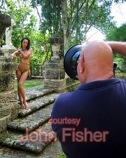
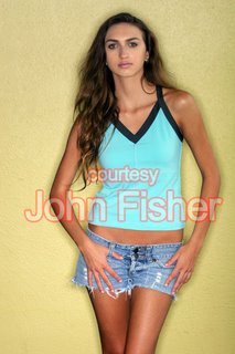
Another cyber-buddy of mine whom I've never actually met but hope, one day, to meet is John Fisher. Fish is a commercial, editorial, and fashion shooter in Miami Beach, Florida.
Everytime John posts something, like he did today on the Glamour1 forum, I'm always attentive to what he has to say. (Some guys are the kind of guys you pay attention to.) John's been around the photo-block more times than he probably cares to admit, so his words are always well worth the time it takes to read them. Today, John wrote up his personal review of Alien Bee's new Ring Light and, with his kind permission to re-print it here, I thought many of you might also be interested in Fish's take on this new product. (Plus, I love it when someone else ends up writing the blog for me.)
Don't forget to check out Fish's website by clicking HERE or on his name above.
Here's what John Fisher had to say:
A Ring-ing Endorsement
Alien Bees has introduced their new ring light to the market place as many have mentioned recently. I was fortunate to have one sent to me in time to use on an important editorial assignment, and once I had an opportunity to play with the light, it delivered the results I'd hoped to see.
First, a ring light is a strobe which is fashioned in such a way to wrap itself around the lens of your camera. Originally, these lights were small and designed for macro and medical photography. A standard flash extending up from the camera body would often be positioned in such a way that it would be impossible to properly illuminate a subject located very close to the lens. These original ring lights were small, fit only a few lenses (usually a macro 50mm), and were very lightly powered. Eventually a fashion photographer would take a picture of a model using one of these things and we would be inundated with the distinctive lighting of the ring light.
So, what is that distinctive lighting effect? First, using a ring light to do head shots creates an almost perfect beauty light. The reason for this is that the flat light going straight into the face produces virtually no shadows. Remembering that a print (or a picture on a printed page) is a two dimensional representation of a three dimensional object, you notice that we can't see depth. What we see is perspective and shadow. Eliminate shadows and you eliminate almost all common blemishes on the face, particularly lines around the mouth and eyes and creases in the forehead which disappear like magic. No shadow, no lines.
Another unusual characteristic of the ring light is that it reflects most strongly the surfaces which are flat to the lens. Take the legs and arms, the center line of the arm (or leg) is flat to the lens (and therefore brighter), and as the arm curves away from the center line, it reflects less light to the camera. This gives the effect of creating a harder edge, an effect we would normally use black reflectors to create in the studio.
Another (and frequently observed) effect created by a ring light is that any object placed close to a wall or backdrop will display a shadow on both sides! The closer the object is to the backdrop, the tighter (and harder) the shadow will appear. The further away the object is from the backdrop, the wider and less distinct the shadow will be. The resulting shadow will be similar in many ways to the drop shadow we use in type setting to highlight text and to give it depth.
My thanks to Kaila Rainey (above left) who agreed to allow me to do this simple picture to demonstrate the ring light effect.
Hand holding is possible. (Assuming you can leap tall buildings at a single bound!)
Modern ring lights used in fashion and glamour have been around for a while, but as the power has gone up, so has the cost and the weight. The pack and head systems we normally associate with the larger ring lights frequently cost many thousands of dollars, and are difficult to use outside of a studio setting. Alien Bees are famous for their relatively inexpensive monolights which have proven to be both durable and reliable. (They may look weird, the controls a bit cheesy, but they work!) The ABR800 (the designation for Alien Bees ring light) is a mono light (no separate pack required to drive the strobe), it is relatively light (relative is a relative term as the pictures will show), and can be driven effectively in the field using the portable Vagabond power source. The Vagabond has been around for a number of years, it uses a rechargeable battery to produce 110 volts to drive the AB monolights when a wall plug is not available.
Pictured Right: The ABR800, EOS 20D, and the 70-200L 2.8 mounted on a tripod with the Vagabond power source.
Okay, now to actually using the ABR800. The first thing you notice is that assembling the light and attaching it to the camera is not something you want to do in the field until you have done it several times with different lenses on your dinner table. This becomes even more obvious when you want to put the camera on a tripod. Certain lenses (like my 70-200L 2.8 zoom) represent a real challenge, but once you have done it several times it's still a pain but the results are clearly worth the effort. I ran into a problem with certain lenses which wouldn't allow the hood to remain on the lens and still fit into the ring light. In it's current configuration, the diffuser which fits over the flash bulbs is translucent (as you would expect), but the portion which extends into the throat of the ring light is also translucent (it appears to be silver, but it is not opaque). This can (and often does) cause a problem with flare. The solution is simple, black duct tape placed on the portion of the diffuser which extends into the throat of the ring light will eliminate the flare (or jamming the hood for my 70-200 into the throat works as well!).
The original mounting post on the ABR800 wasn't long enough to allow you to center lenses in the ring light if your camera had a grip attached (as both my EOS 20D and EOS 5D normally do). No biggie, just remove the grip, which has the additional advantage of reducing the over all weight of the light and camera assembly. A bigger problem is if you have an EOS 1 series camera which has a built in grip which is not removable. Alien Bees does have a mounting post extender available, and is now shipping all units with the extender as part of the initial package.
The last problem I ran into is that the basic mounting assembly is designed in such a way that it can be used for hand holding the camera and light (which I prefer), or to mount the camera and light on a tripod, and finally to mount the light off camera on a separate light stand (where it works much like a beauty dish!). The problem is that you have to add or remove a lot of parts as you move from one configuration to another. In particular, the mounting hardware for the light stand consists of a number of small parts (including a number of different sized washers) which can easily be dropped and lost. The answer is to have at least two mounting brackets, one for the light stand which can be left fully assembled and a separate one for hand holding or using a tripod. I believe this will become part of the final package as AB sorts out all the reports from the field trials of this new unit.
Given the complexity of producing a powerful, light weight, and reasonably inexpensive ring light, with the legendary reliability of the Alien Bees monolight system, I believe AB has hit a home run with this new product. Currently the light is available for $399(!), or a fraction of the cost of similar units from other vendors. The product is not advertised on their website when I checked last, but if you are interested (and have an adventurous side!) contact them by phone and they should be able to put you on the list to receive one as they are assembled.
The model (left) has appeared on the cover of virtually every major fashion magazine, and has done many of the big collections. I paid for overnight shipping just to make sure I had the ABR800 in time to take this shot.
As a disclaimer, I have been pushing AB for two years to produce this light. However, I am not part of Alien Bees and pay full retail for all their equipment I use. (I'm not particularly proud of this fact. As all who know me will attest, I invented cheap and prefer free.)
John
- - - - - - - - - -
Flash! Hold the presses! This just in-- Fish responded to a number of questions posted on the forum in response to his AB Ring Light review. I thought I'd add the new info to today's blog update as it might answer some questions that are rolling around in some of your noggins.
More from Fish:
Now, on to questions! First understand that the ABR800 is a work in progress. Making a ring light compared to a standard studio strobe is like comparing going to the moon to flying a glider. First, the ring light is a system, the light really must work in combination with the camera and lens. Yes, you can put the light on a stand and use it like a regular strobe, but that defeats the purpose.
Now, from a design standpoint, the designers must take into account all the cameras and all the lenses that every whack photographer is likely to attach to the ring light. This adds a layer of complexity that would simply drive most away from the project in the first place. If I'm going to make a specialty light and sell it for a bazillion dollars, the problem is simplified by the fact that the photographers likely to buy the light use a class of cameras and lenses which are of a more limited size range. (An EOS 1 series camera and the Nikon pro cameras may be different, but they and the lenses used with them are almost exactly the same physical size).
In addition, wide angle lenses are all over the map in physical size. Both Nikon and Canon make specialty wide angle lenses which are designed for the smaller foot print you get when the recording chip is smaller than a strip of 35 mm film. Canon also makes several digital cameras which are full frame, and those lenses don't work on that class of camera. The wide angle lenses are the ones which are going to give the engineers headaches because where the end of the lens is physically located on the mounting bracket for the ring light will determine whether you get flare or vinyetting.
Given all of this, I believe Alien Bee did the right thing. Do the best you can, get the light out into the market with a limited number of photographers who understand what they are getting into, and resolve the issues as they arrise in the field. The reason many of us were pushing AB to develop a ring light is that the company (and it's parent, the Paul Buff companies) have been on the cutting edge of using the latest technologies to produce high powered, reliable and inexpensive studio strobes. If anyone could figure this out, it would be Paul Buff. The down side for AB is that everyone will want one, and most consumers have no idea how complicated these lights have to be (and I suspect designing the light itself was probably the easiest part of the problem).
I have used the ring lights made by ProFoto and they are amazing. In the studio you can get wonderful results, and in the field as long as you have a couple of sturdy assistants and the budget for generators and production vehicles you can also produce fantastic images. But if you want a ring light that works, is designed for use in the field, and will not force you to sell the Ferrari to own, then the Bee is a great choice.
This picture of Brandi (the headshot from above) was taken with an EOS 20D, using my 70-200 2.8L, with the camera and ring light mounted on a tripod. The ABR800 was powered using the Vagabond portable 110v power source (designed and sold by Alien Bees). The shot was done at ISO 100, f 5.6, and 1/200 of a second. We were outside on the big deck at sundown (you probably recognize Shaquille O'Neal's house in the background). Metering is always a challege as when you move the output from the ring light must be adjusted. Fortunately when using a zoom on a tripod, you are able to frame the picture differently without moving very much.
______
Wednesday, October 11, 2006
Best of the Best
Some of you might know about MavTV: They're a cable broadcaster. Although they're not where I'm at yet, i.e., in the L.A. cable marketplace, they seem to be growing nationally. One of the shows in their line-up is called Best of the Best.
Best of the Best is a reality TV show where photographers and models compete in exotic locales for the coveted title, Best of the Best. Truthfully, I don't really know how "coveted" the title is but a free trip to somewhere cool to shoot a bunch of hot babes along with a chance to win some prize money and other stuff ain't too bad a deal... coveted or not, right?
Anyway, the show is sort of like SI Swimsuit meets that Tyra Banks modeling show with some photo-instructional segments and a side-order of annoying, Model-Diva attitudes tossed in. (I guess the "Diva" part is where the show becomes a little like Tyra Banks' show.)
A back-East photographer, Mike Newbern, who is a cyber-acquaintence of mine and an all-around cool guy recently won Best of the Best 2. Way to go Mike! Mike shoots everything from weddings to commercial stuff to glamour babes. Some of his work can be seen on his site, EnchantingMedia.com. Mike's also heavily involved -- as a shooter and a writer and probably a whole lot of other things -- in an online biker-eZine, Brain Bucket Magazine.
If you don't see MavTV in your local listings and you want to check out Best of the Best, don't fret. They also stream their programming. I checked out a couple of episodes and they're pretty cool. They're sponsored by OneModelPlace.com, a.k.a., One Model Flake, but hey! I won't hold that against them. Besides, that's just my personal opinion regarding many of the model-wannabeez on that site and doesn't reflect the official corporate policy of this website... leastwise, assuming this site actually has an official corporate policy, which it doesn't.
The newest Best of the Best episodes includes an appearance by legendary Playboy photographer, David Mecey. Now you just have to check this out, right? So click HERE and you'll be transported to MavTV's website. Once there, I'm sure you're clever enough to find your way to the Best of the Best episodes and watch the streaming videos. I mean, you're here, reading my ramblings, what else more important do you have to do? Nothing, am I right?
I tossed in a couple of pics (above and below) of Tera Patrick, whom I shot a few weeks ago, because A) I can; and B) When it comes to glam-girls, this been-on-the-covers-of-Playboy-and-Penthouse super-glamour-model is defnitiely one of the best of the best!
Tuesday, October 10, 2006
A Glamour Manifesto
I drove down to Huntington Beach today for a production meeting. Looks like I'll be directing a pilot for an independently-produced reality-show in Las Vegas next month. (Assuming everything goes according to plan.) I'll also be the DP (Director of Photography) plus shooting one of the video cameras as well as some glamour stills.
Yes, I'm aware I'm possibly biting off more than I can chew but I'm a hearty eater. No, the money's not all that great but I'm not greedy. Yes, it should be fun and, probably like many of you, fun is something I'm quite partial to. (The gig includes beautiful women, residing for a week in a 7,000 sq. ft. mini-mansion not far from "The Strip," and did I mention the beautiful women?) BTW, I should add this-- No, I can't tell you what the show will be about because they had me sign a non-disclosure agreement. ("The first thing we do, let's kill all the lawyers." --Shakespeare)
If you're at all familiar with the traffic on California's 405 Freeway, you might know what it's like driving from the San Fernando Valley down to Huntington Beach and back: Freakin' brutal!!!
When I returned home, I needed something to stimulate my brain. My ass was numb from sitting in traffic for more than two hours on the return trip and my brain was even number from... well, from sitting in traffic for more than two hours.
I logged onto the Glamour1 forum and the first thing I noticed was a post by a back-East shooter (Stamford, Connecticut) whom I've developed a cyber-friendship with. (Based mostly, at this point, on a photographic, cinematic, and artistic kinship.) Hopefully, sometime in the future, we'll meet and our somewhat similar backgrounds, skill-sets, and creativity-connections will evolve into an actual and real-life friendship.

His name is Matthew Cherry and he has a website, Paramour Productions, which I recommend you visit. There's a very cool, behind-the-scenes, video from one of Matthew's glamour shoots on the site that I think many of you will enjoy viewing. Matthew's site is still undergoing some construction and further development but there's enough there to give you an idea of what Matthew is about.
Reading the following, however, will give you an even better idea of what Matthew is about. So sit back -- it's a bit of a long read by blogging standards -- be warned that your ass, like mine when I returned home this afternoon, might also become a little numb by the time you're done reading. After reading, however, I can almost guarantee your brain won't be... numb that is.
Here's what Matthew wrote for his Glamour Manifesto:
"There is more to life than seeing breasts, isn’t there?
I’m sure I didn’t always feel this way. I remember the delight I once felt as a kid upon finding my older cousin’s stack of playboys. It was a long time ago, but I’m pretty sure that at the time, seeing breasts was an all-encompassing obsession. Truth be told, I still enjoy seeing them, it’s just not quite the sole focus of my existence anymore, but yes, indeed, the site of a beautiful woman sans clothing, staring back at me from another time still makes me feel good. It is no longer arousing to me as it was in my youth, but it makes me smile. It makes me happy, I think, because it reminds me of those summer days, outside with my friends, huddled around an old worn-out copy of Playboy and looking at it with shear wonder and amazement. I didn’t really understand what I was seeing, and yet I did. It had an impact.
There may be some reading this who are quite a bit younger than I am, and may not fully appreciate what that impact was. See this occurred before the days of the “Lad Mags”. There was no Maxim or FHM or Stuff or any of the other over the counter gadget/tease magazines that are out today. This was the late 70’s and our country had been going through, and coming out of, some pretty ugly times. This ugliness seemed to permeate every aspect of my society, from fashion to attitudes. Even that which was held out at “fashionable” or “beautiful” had a darker edge. I’m sure that adults understood this and that it worked as a metaphor for the times, but seeing some hard-lined model who looked as if she just came off a coke-fueled night of partying, with an expression that said, “go screw yourself”, didn’t do anything for a twelve year old kid who had been raised on a $1.50 matinee diet of old Cary Grant and Ingrid Bergman movies. Glamour had left Hollywood, it had left television, it had left fashion and it certainly wasn’t at the newsstand, at least nowhere I was allowed to look. It seemed that the whole world was covered with a thin film of sludge made up of equal parts fear, depression, despair, loathing and self-absorption. If you watch many films from that time you will see they tend to have a sort of grey desaturated look to them. I know that much of that has just come from time, but to me, that was how the world actually looked.
While there may not have been any lad mags, there were men’s magazines. At the time these fell into two categories, Playboy and pretty much everything else, and most of that “everything else” was pretty awful (Penthouse probably being the one exception depending on what issue from what year you looked at as it’s imagery tended to vacillate quite a bit between harder and softer fare). While the harder magazines (the everything else bunch) may have showed everything that two people could possible do, and as such were educational resource to be sure, they were far from glamorous, or even beautiful. They were the women of the real world, covered in that same sludge of despair which they tried to mask with too much makeup and a softening filter. We looked at these women much as we would look at a sideshow freak at a circus, awkwardly interesting to look at, but only from a distance, and not too often.
Then there was Playboy and in it’s pages, were real girls. Beautiful girls. Smiling, happy, vivacious girls with angelic faces. These were just like the pretty, older, neighborhood girls that walked by on our Chicago streets. Old enough for us to stare at from our front stoop, and yet still young enough to not have been hardened by the bleak, grey world around them – and they were naked! They didn’t look “dirty” or like the old washed up whores that we sometimes saw walking home early in the morning. They didn’t look like the women in those other magazines, these girls were soft and pretty and beautiful and, well, glamorous…
I think a lot of us who shoot glamour today were inspired by those images. While our concept of “glamour” may have evolved to include different types of images, both past and future, those images from our youth continue to serve as a cornerstone of what glamour means.
The heyday of glamour began prior to the first issue of playboy though. Most of us feel it’s golden age came along with the golden age of Hollywood, a time when studios carefully crafted the image of each of their actors. America had been going through some hard times then as well. We had just been through one Great War and we were getting ready for another. The depression had taken much of the nation’s pride and FDR was trying to instill hope with a New Deal, while Mother Nature transformed the great plains into a bowl of dust. Movies were not just another option for something to do on a Saturday night, they were an escape from the hardships that many faced, and Hollywood delivered. They gave us stars that were larger than life, beautiful and provocative, strong and dashing, and as sensual and erotic as the times would allow. They were glamorous.
When our young men went overseas to fight yet another world war, they took these images with them. Pinned up in lockers, tucked away in flak jackets and painted on planes, these were the images that inspired a generation of fighting men to endure the hell that had erupted around them. Some think that that these were just artistic expression devoid of sexuality. Others opine that those images were the porn of their day. They are both wrong. There was hardcore “stag” material available back then, in fact it has always been available, only the medium for presenting it has changed. Yet it was not those images that went to war. But make no mistake, these pinups of the 40, the provocative pictures of girlfriends back home, the movie starlets and the Gil Elvgren paintings, were still selling sex, but they were selling more too. These were not the girls you just looked at with a lurid glance; these were the girls you fantasized about, both sexually and romantically. These were the girls you wanted to come home to.
After the war, Playboy picked up on this theme. They weren’t selling sex by itself either. They were selling a lifestyle, albeit a different one. But the basic premise was the same; if you were a sophisticated man with a taste for fun and the finer things in life, then these were girls you wanted to meet, the girls you wanted to date. For men they embodied a fantasy that went beyond sex – like the pinups of the preceding generation, these images were representational of the hopes we had for our future and the lives we wanted to lead. They were our fantasy, our escape and our desire.
That is what glamour has always represented, at least to me. It’s not simply the obvious depiction of what is, but the promise of what could be.
Fast forward to another millennium and the world is still enduring hardship, and we still have glamour. But modern glamour encompasses more doesn’t it. It is a retro pinup on the cover of Rolling Stone Magazine and it is booty shot in King Magazine. It is a Snap-On Tools calendar and it is single-girl adult pay-site. It sells us Pepsi and Budweiser and promotes tuned-up cars and shaving gel - and it is sexier and more explicit than ever. The depictions are obvious, but do they promise us anything – are they glamorous?
Why am I writing all of this? Because as a shooter of glamour I feel a bit lost. I love glamour and I enjoy seeing it, but so much of it today is utter crap – my stuff included. All one has to do is surf the web or pick up a third tier lad mag and you can see it. Poorly composed, poorly lit, poorly retouched shots of girls that look like check out clerks at the local Winn Dixie. Is this a result of slew of new “photographers” coming in due to the ease of digital capture? Is it just lazyness? Is it that we’ve forgotten what glamour is all about? I go to a lot of model portfolios on various sites, and look at the images. I’m astounded at what is there and, even more so, by the comments left behind by other photographers, praising images that lack any photographic technique, a compelling model, an interesting pose, a unique location or set – but by god there are breasts… And apparently today, that’s enough….
Now please don’t get me wrong. I have nothing against images of naked girls or of “tease” glamour. But the over abundance of bad imagery is taking it’s toll, not just on those who shoot it and model for it, but on the very conceptual foundation of what glamour is. The “glamour” in glamour photography does not come from what the girl in the image isn’t wearing, but from the story the image tells, the mystery it creates, the feelings of desire it promotes. These things can all be crafted, just as they were crafted years ago, and still are today, if we just take the time to produce work with high-production value. I see shooters all the time deride Playboy for their formulaic approach, yet then I look at their ports and I see nothing of substance. You may not like glamour, or you may like glamour and not like Playboy style imagery, but it is produced to a very high standard. Do you want to produce something different? That’s great! But try to produce something of the same caliber, with the same level of professionalism. When I look at your photo let me see an image that was carefully made, not just a snapshot that anyone could have taken anywhere – but with a set of tits showing in it.
If someone is shooting editorial fashion, they understand that to create a compelling image takes time and thought and a team of individuals coming together to create a unique and compelling image, yet it seems that glamour shooters increasingly think that all you need is a scantily clad gal and a wrinkled bedsheet. It wouldn’t be so bad if these were just “amature” shots done for fun, but I see images like these in commercial venues and it is embarrassing to all of us who shoot glamour. Why should anyone else take us seriously if we don’t even take ourselves and our own work seriously?
And by the way? We should be taken seriously. Good glamour is damn hard to produce. It is technically difficult, often using complex lighting plans operating with narrow tolerances which are far more complicated than most fashion shots. It requires intriguing or fun sets which add to the fantasy. It requires a skillful makeup artist and good styling (yes, even if it’s “glamour nude” shoot, it still requires styling”). All the things that go into creating a good fashion or editorial image go into creating a good glamour image and the faster more of us understand this, the better off we will all be.
I was recently talking to an internet acquaintance of mine, JimmyD. Jimmy shoots adult fare and we were commiserating over the state of glamour. I told Jimmy that I was trying to find my own voice in the field, trying to figure out what it is I see in my mind’s eye behind the haze of confusion. I don’t have it fully formed in my head yet, but if you took a Playboy, a “V” Magazine, a classic pinup, an Old Navy ad, Ingrid Bergman and Tera Patrick and put them all in a blender and hit frappe – you might get what I’m after. But, as a slightly older and more experienced shooter, Jimmy cautioned me to be careful. To paraphrase him, that’s not what the market wants, and if you take too many chances the phone will stop ringing. “Can’t have too many shadows, that’s not what sells”
I know…
I had a model come in from out of town to shoot with me. We were going to do some glamour work for some magazine submissions. Yet once she arrived it was clear all she wanted was some “pay-site” shots. I actually had to tell her to cover up to get the shots I wanted. Me… Tellling a girl to NOT take off her g-string… Somehow it doesn’t seem real, it doesn’t seem right, but I know it is. While I got some nice images, ultimately the shoot didn’t work out, but it has made me think about this art we call glamour – a lot.
I realize that my drunken, Jerry MacGuire-esque Manifesto is not likely to win me a lot of friends, but that’s ok. It had to be said, if not for others, for myself. I’m not going to stop shooting glamour but I may define it differently in the days and weeks to come. I hope I will produce some exciting, classy, provocative images. I hope that when you look at them they will be hot as hell.
I hope that they promise you something…"
Once again, Matthew, well said! Let me repeat what I said in my reply to your Glamour Manifesto on the Glamour1 site-- If Studs Terkel amassed an oral history of glamour photography covering the last half a century or more, what you wrote would make a truly eloquent introduction to that book.
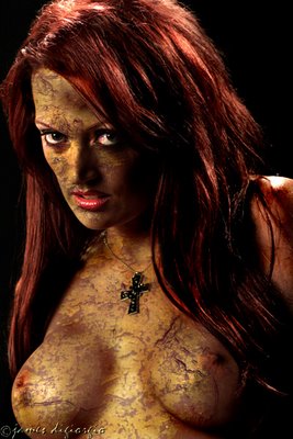
The gratuitous eye-candy I've posted along with Matthew's Glamour Manifesto is Naomi. I shot her this past weekend while working for the Brits. It's the second time I've shot Naomi and I can't emphasize enough how intriguing I find her, and that extremely lithe body of her's, in front of the camera.
Sunday, October 08, 2006
Three Days Shooting
Whew! I'm beat! Just finished three long days shooting at a couple of location houses. I was working for some people from the UK. They were here producing for a late-night, European, cable show that was heavy on the T&A (with a good-natured "raunch" factor) and included a group of regular guys, also mostly from the U.K., hanging out with a group of babes who make their livings in front of cameras.
The chicks were both British and American and they spent the three days in varying degrees of dress and undress in front of the video cameras as well as my camera. There were some "field trips" also included in the production--to various tourist spots as well as nightclubs--but I wasn't part of that aspect of the show. I could have tagged along, to the nightclubs, just for fun, but after a twelve-hour production day my bed seemed like a more sensible and attractive choice. I ain't getting any younger, ya know?
The head guy, the producer, is Scottish so I've spent the last three days using my considerable skills speaking with a Scottish accent. I just wanted him to feel, uhh... you know, at home. I was going to surprise him with a bowl of haggis but I couldn't find a fast-food joint that made it to-go.
I didn't have an assistant which meant I schlepped my own gear each day. (Yeah, yeah, I know-- Poor Jimmy!) Fortunately, the second two days were at the same house so I left some of my gear there overnight between days two and three-- not my cameras and laptop, but my lighting gear. (Softboxes, monolights, stands, etc.)
The owner of the home we were at, i.e., for the second two days, is a musician. He has a pretty nice home, make that very expensive home, nestled in the hills between the San Fernando Valley and Beverly Hills. He looked familiar but I never asked him who he might be. Ordinarilly, I would ask but he seemed like he was a bit annoyed that no one knew who he was and, to his way of thinking, everyone should have known. That's plenty enough L.A. attitude to make me not ask... just to torture his ego a bit.
Mostly, I shot everything with two light sources: A monolight fitted into a 5' Octodome softbox and another, either in a Chimera strip box or a small umbrella.
Since the "guests" were also encouraged to shoot the girls with their cameras, everytime I shot them I had about a half-dozen or more guys crowded behind me also shooting. Plus two or three guys with video cameras! It was fairly claustrophobic and felt a little like a photo-gang-bang. Some of the guys told me they'll email me some behind-the-scenes pics of me shooting the girls. If they follow through, maybe I'll post some of them at some later date.
The lovely lady in the pics is Jayna. These were shot on a backyard deck at the house we were at for the second two days. I was hoping to shoot these during Golden Hour but, somehow, the model didn't end up on the deck until after the sun had set. I was a bit unhappy with the chain of events that led to missing the Golden Hour opportunity as the deck was oriented nicely to the setting sun, that is, with the sun perfectly aligned behind her, but that's show biz I guess.
Saturday, October 07, 2006
A Mid-Day Shoot
I had a gig yesterday that presented an interesting challenge. We would be at a home in the hills above the San Fernando Valley. The backyard of the property overlooked the valley but, unfortunately, we would be there at mid-day. Also, the way the property was oriented to the sun meant, in order to place the models with the valley behind them, they'd be looking into the bright sun. (Few things worse than squinting models.)
Fortunately, there was a large awning over a patio area in the backyard. It provided complete shade. I had brought along a couple of monolights with stands, a 5' Octodome, and a small, white umbrella. I also had a large, silver reflector.
I figured I could place the model in the shade and frame her and light her so that it appeared she was standing in the direct sunlight with the valley behind her. The clients, btw, did not want the home, as nice and upscale as it is, as the background to the images.
I used the Octodome as my mainlight, set the umbrella behind her, camera-right, and enlisted an assistant to wield the reflector, also from behind her, camera-left, to add some subtle highlights. The sun kept going in and out of clouds which meant the reflector was sometimes effective and sometimes not.
Time was also an issue as we only had the location for a few hours. Also, the client had many guests at the shoot, most of whom had cameras, and nearly all of whom wanted to ask a lot of questions regarding why I was doing this and that. Of course, they also wanted to interact with the models which made keeping the model's attentions focused and directed towards me difficult. It was a bit strange having more than a half-dozen guys standing behind me while I was shooting and, every time I snapped a shot, there would be a barage of on-camera strobes going off right after I'd click one off.
One of the models the client hired for yesterday's shoot was Natalie. I've posted a few shots of her along with today's update. Natalie's from England and only in the States for a few days.
Thursday, October 05, 2006
How Much Power Do You Need?
A friend of mine recently bought some monolights. He bought them from one of those so-called "power-sellers" on Ebay. The lights are off-brand, very inexpensive, and manufactured, no doubt, in Hong Kong or some similar place.
Now don't get me wrong: I think there's a lot of useful stuff made in Hong Kong that is way cheaper, i.e., inexpensive, than the name brands of similar items. And these Hong Kong specials often get the job done perfectly well. My radio/wireless trigger system is a good example. The kit consists of a 4-channel transmitter that sits on the hot shoe with an extremely low profile and a reciever that takes four, "AA" batteries. It has a range of 100 feet and has never let me down. It cost me $39.95. I bought two sets. Compare that with the price of a Pocket Wizard. Sure, the PW has a range of 1600 feet, more discreet channels and other bells-and-whistles that are fairly impressive. A Pocket Wizard system, however, is (I think) around ten times the cost of my Hong Kong specials.
I don't know about any of you, but as a pretty girl shooter I've never found myself more than 100' away from my models-- certainly not in the studio. And I'm never competing with other shooters who are firing the same strobes and, potentially, creating frequency conflicts. I mean, what are these trigger systems? Technologically, they're glorified garage door openers when you come right down to it.
Back to my pal's new strobes.
Before he purchased them, he asked what I thought were the important qualities in a strobe. I told him recycle time, maintaining color temperature, recycle time, durability, a modeling light, and, uhh... recycle time.
"Not power?" he asked.
"How much power do you think you need?" I answered.
He then started on about watt-seconds and "more powerful is better" and all that. I reminded him he was going to be shooting female subjects and, because of that, he'd probably be modifying his lights, certainly his mainlight and also, if needed, the fill in order to make them soft. That would mean moving these lighting sources closer to the subject. I told him that, although the moderately high-power monolights he was going to purchase have the ability to adjust the output, he still might find, at a minimum, they put out too much power when moving them in fairly close with a soft-box or whatever. Plus, he might want to be shooting without too much depth-of-field and a lot of power might present some problems.
Fast forward...
He bought the lights and tried them out for the first time. He's relatively happy with them but, "Jeez!" he said. "I can't get the softbox in close enough without turning the strobe all the way down and it's still too much. I'm going to have to further dampen the light with some diffusion."
I then asked him what else he wasn't too thrilled with regarding his new lights.
"Recyle time." he said.
Nikita Lea is the power-model with this post. Niki's been seen in many magazines and is both a delight and a true pro in front of the camera.

Subscribe to:
Posts (Atom)